TUCM
Design System
Building TransUnion's global design system from audit to adoption — responsive symbol libraries, a written guide, and the TrueCredit consumer rebrand that put the system to work.
Making the case
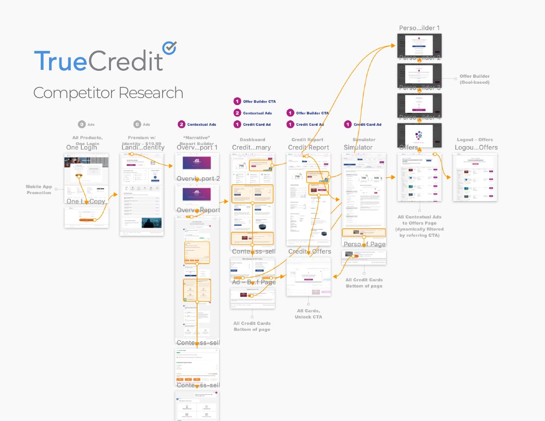
TUCM started the way every honest system does: with an audit. I mapped the existing credit-view experiences — every component, color, and pattern in production — into a single research artifact that made the fragmentation undeniable and gave the system its priorities.
Audit → argument → architecture. That's the pattern I've reused on every system since. The audit isn't just discovery; it's the business case before a single component exists.
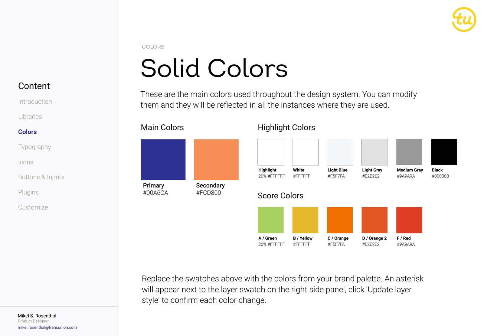
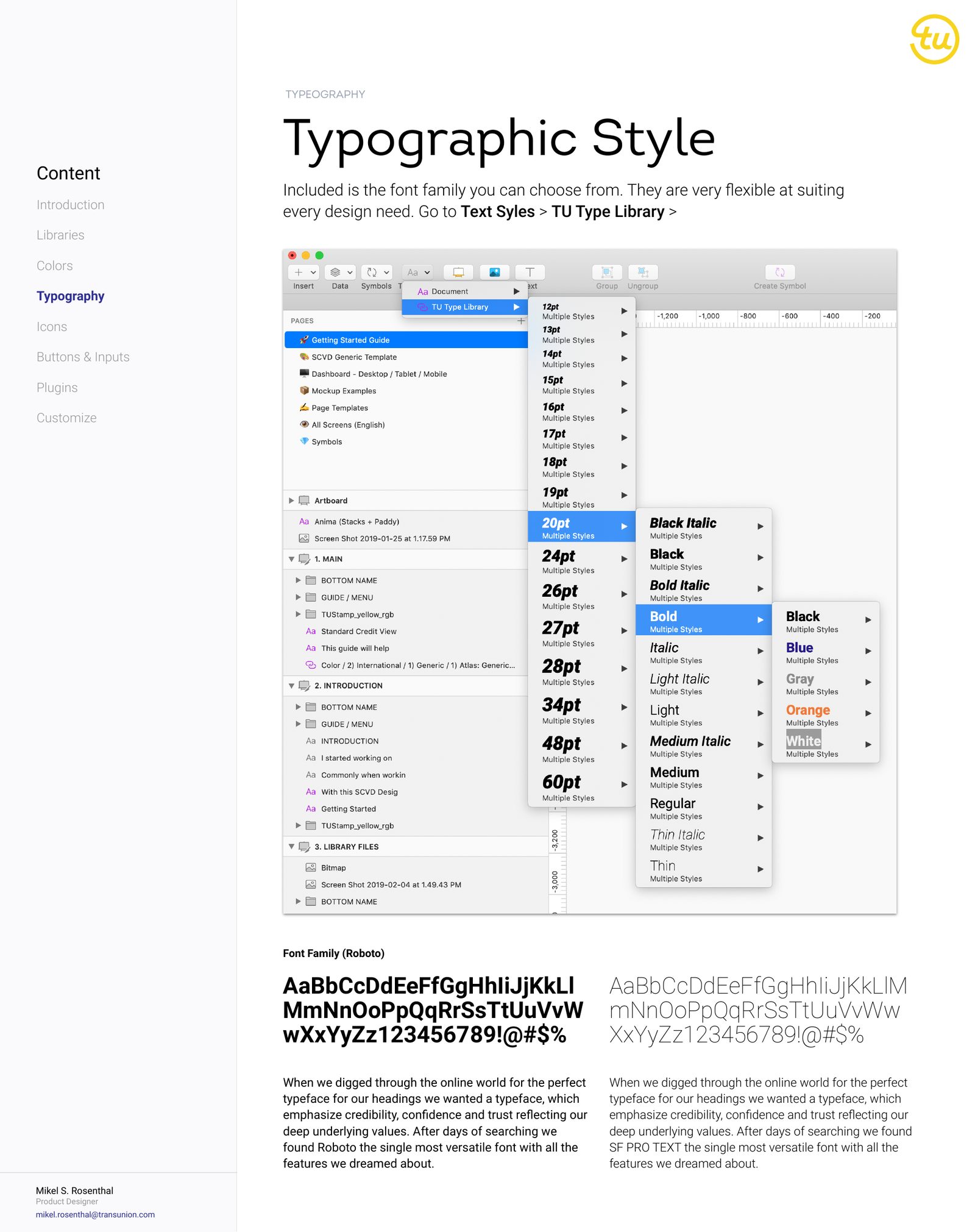
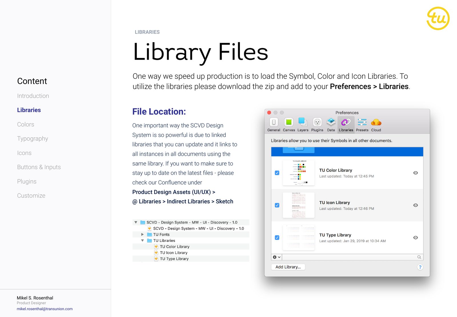
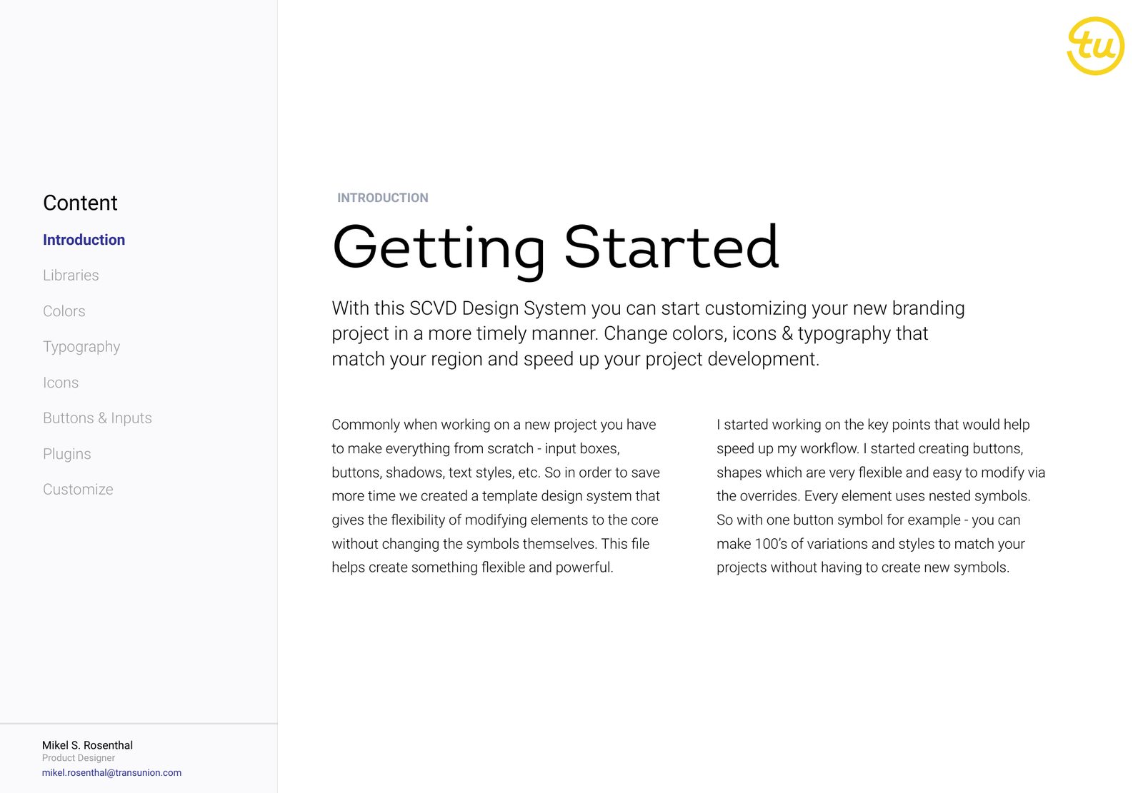
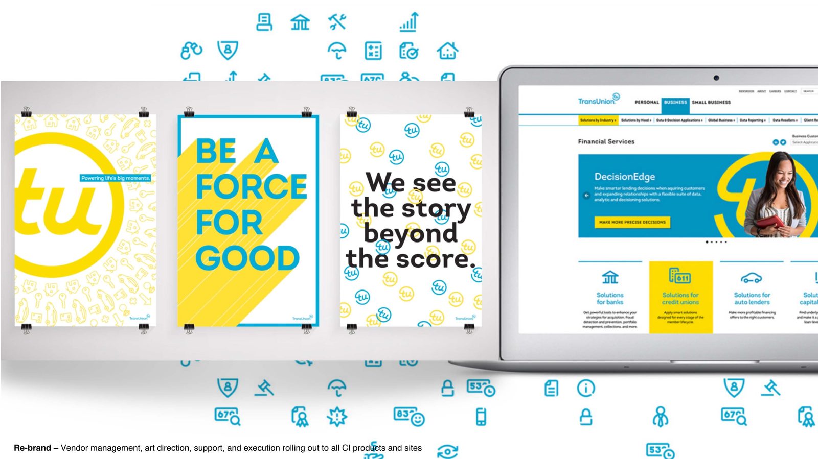
Symbols · Guide · Foundations
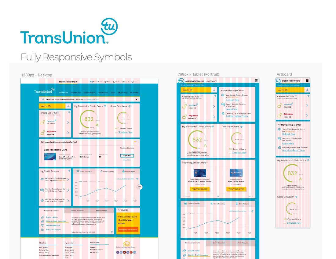
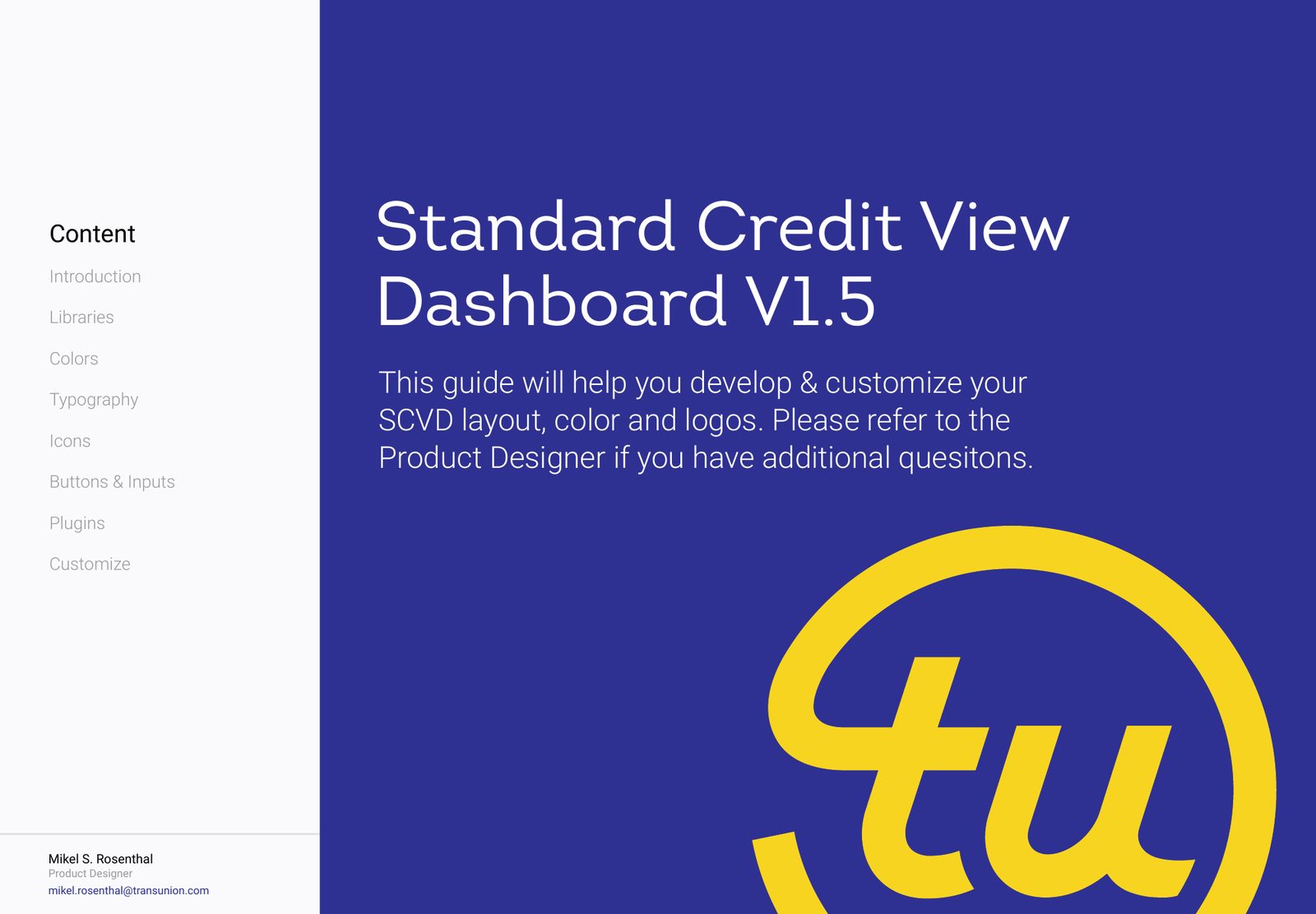
The system itself: fully responsive symbol libraries (years before Figma variants, this was disciplined Sketch architecture), a written guide covering color, type, and library workflow, and foundations tuned for data-dense credit dashboards.
Financial UI is trust UI. Hierarchy and plain numbers decide whether someone believes their own credit score. Every decision was made with that stakes in mind.
The system at work
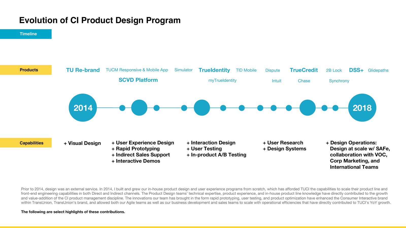
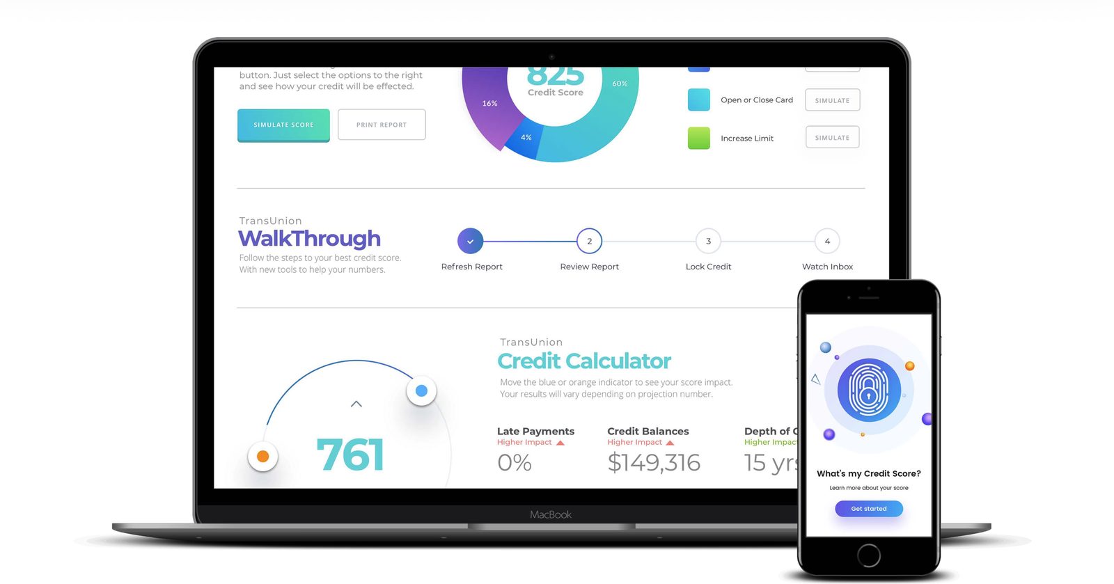
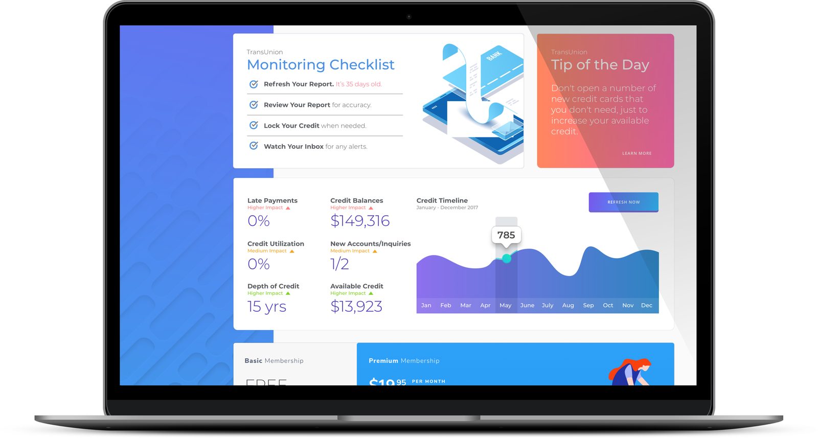
The consumer proof: TrueCredit — a rebrand and product design pass on TransUnion's consumer credit experience, built on TUCM foundations. Credit scores, calculators, and walkthroughs designed to make intimidating financial data feel navigable.

2018 – 2019
Design-to-code workflows got a shared vocabulary. The marketing library unified brand touchpoints. Credit data — some of the most anxiety-inducing content on the internet — got an interface language built for clarity.
TUCM is where I learned to make the audit itself persuasive. The pattern of audit → argument → architecture has carried into every system since. Financial UI is trust UI — hierarchy and plain numbers decide whether someone believes their own data.
Product imagery © TransUnion. Some details generalized per confidentiality.