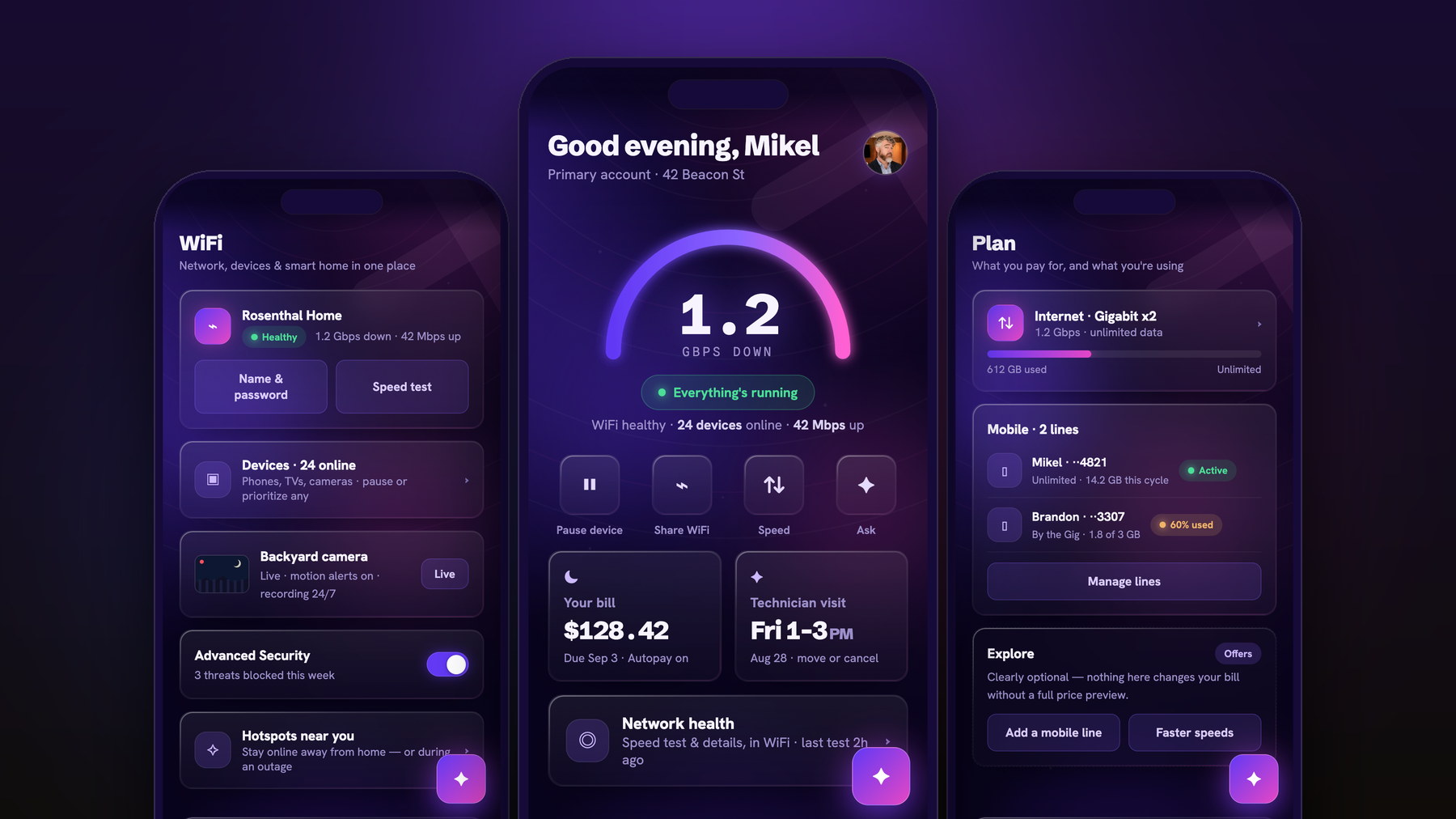
Mikel Rosenthal · Senior Product Designer · Visual Craft & Design Systems · Chicago
Complex software,made beautiful,built to scale.
Twenty-three years of product design, visual craft, and design systems — for Google, GE Healthcare, Blue Cross Blue Shield, Verizon, TransUnion, and Avant. AI-forward in how I work, hand-finished in what ships.
Scroll
GoogleGE HealthcareBlue Cross Blue ShieldTransUnionAvantWhirlpoolHerman MillerGartnerAflacDremelSurePeopleMaven WaveGoogleGE HealthcareBlue Cross Blue ShieldTransUnionAvantWhirlpoolHerman MillerGartnerAflacDremelSurePeopleMaven Wave
01The Premise
Every product I've shipped ran the same loop. AI just changed its economics.
Twenty-three years refined this into six steps. What used to take a sprint of static comps now takes an afternoon of working code — so more of the loop happens in the real thing, and the craft gets the hours back.
1.Frame the problem — the real goal, the user, the constraints. Before any pixels.
2.Map the flow — architecture, states, and the path a person actually takes.
3.Explore wide — AI multiplies the directions; taste decides. Teams pick from options, not opinions.
4.Design to the pixel — type, spacing, color, motion. Every state: loading, empty, error, edge.
5.Make it a system — components and rules a whole team can build from.
6.Build it for real — prototype to production front-end with Claude Code, shipped alongside engineering.
02The Systems · 2016 — 2026
Ten years on step five: make it a system.
Run at enterprise scale for Avant, BCBS, GE Healthcare, SurePeople, and TransUnion — architecture, governance, and a language whole organizations ship from. Some I founded. Some I inherited, and made stronger.
Avant — PathfinderProduct + Marketing System · 2021–2024 Case file →
Avant — Marketing LibraryDesign System · Marketing · 2024 Case file →
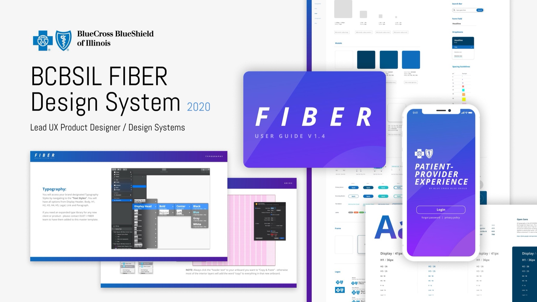
BCBS — FIBEREnterprise Design System · Healthcare · 2018–2019 Case file →
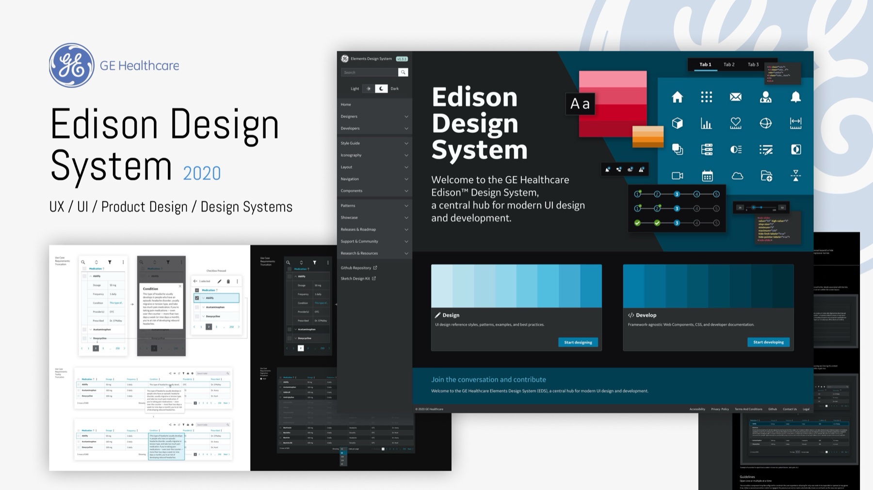
GE Healthcare — EdisonEnterprise Design System · Clinical · 2020–2021 Case file →
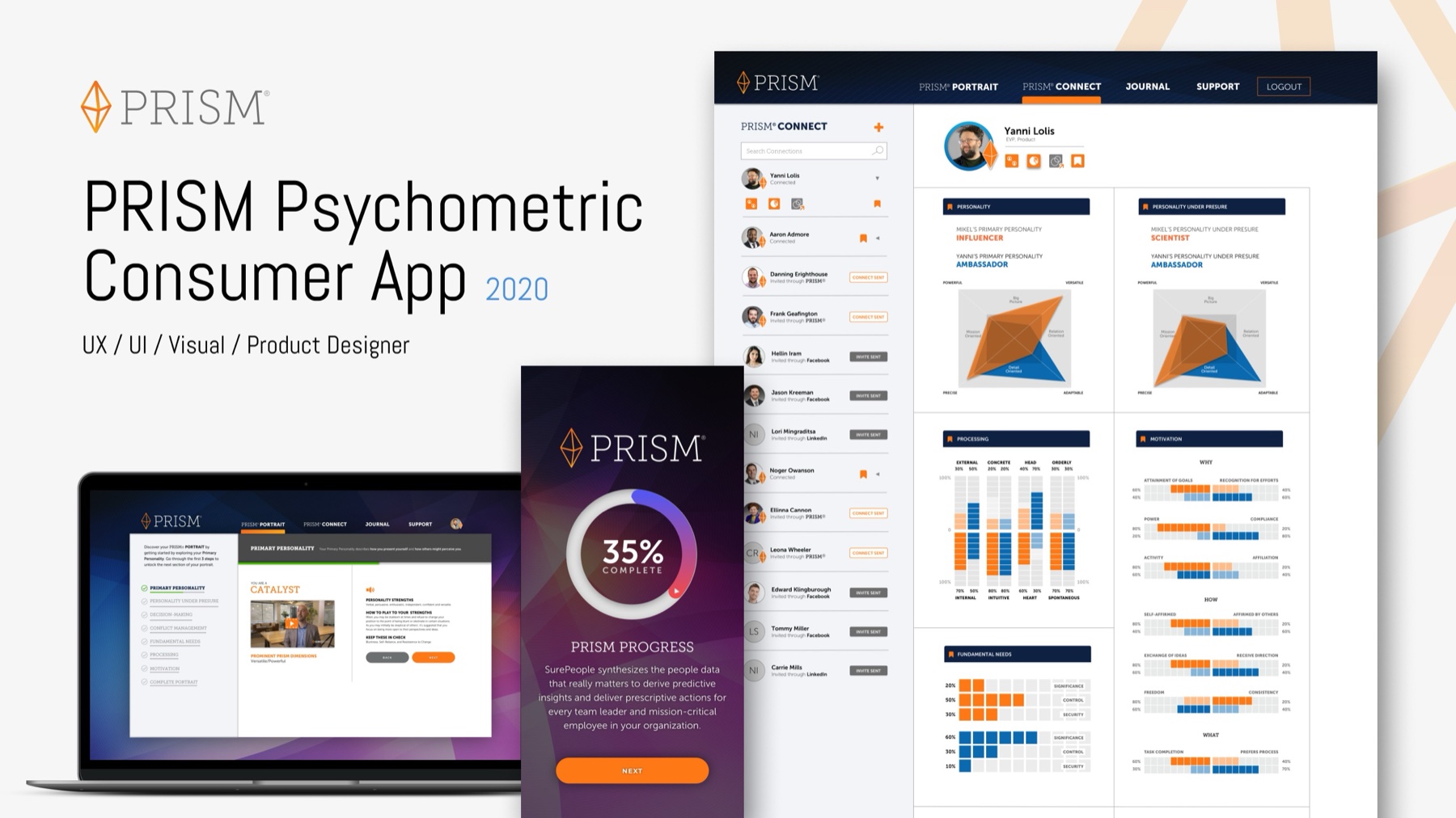
SurePeople — PRISMDesign System · HR Tech · 2020 Case file →
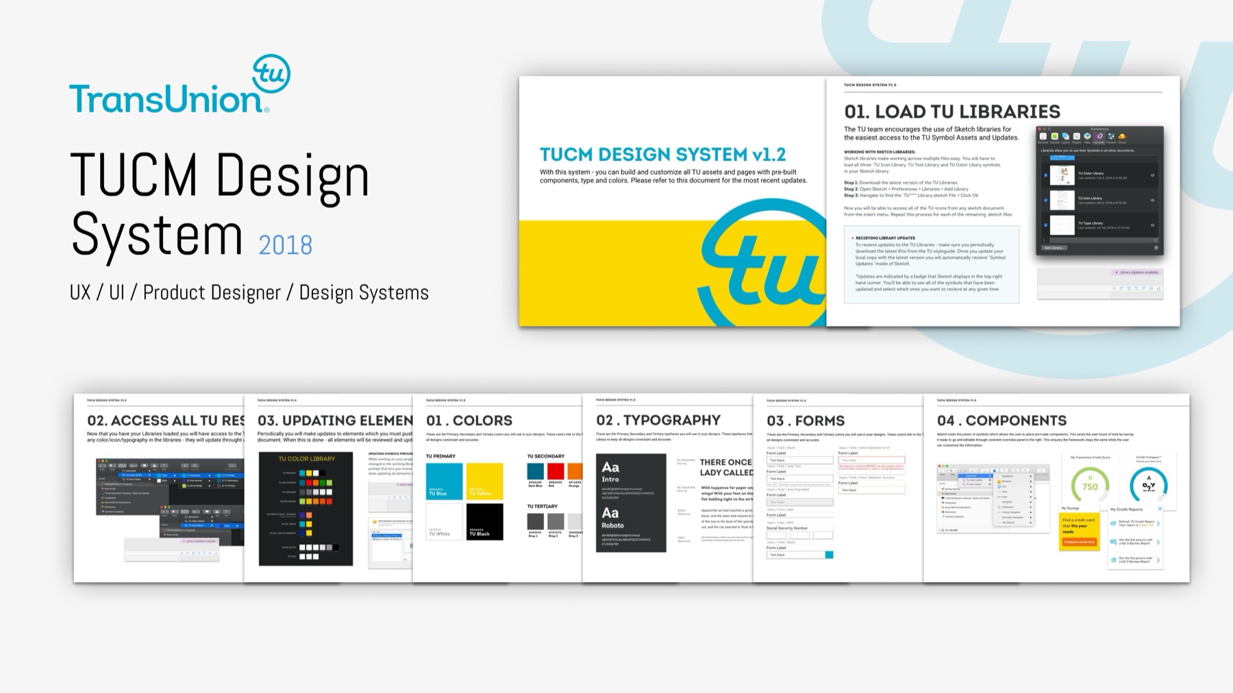
TransUnion — TUCMDesign System · Credit & Finance · 2018–2019 Case file →
03Selected Work · 2013 — 2026
01
Avant · Product Platform · 2021–2024
Pathfinder
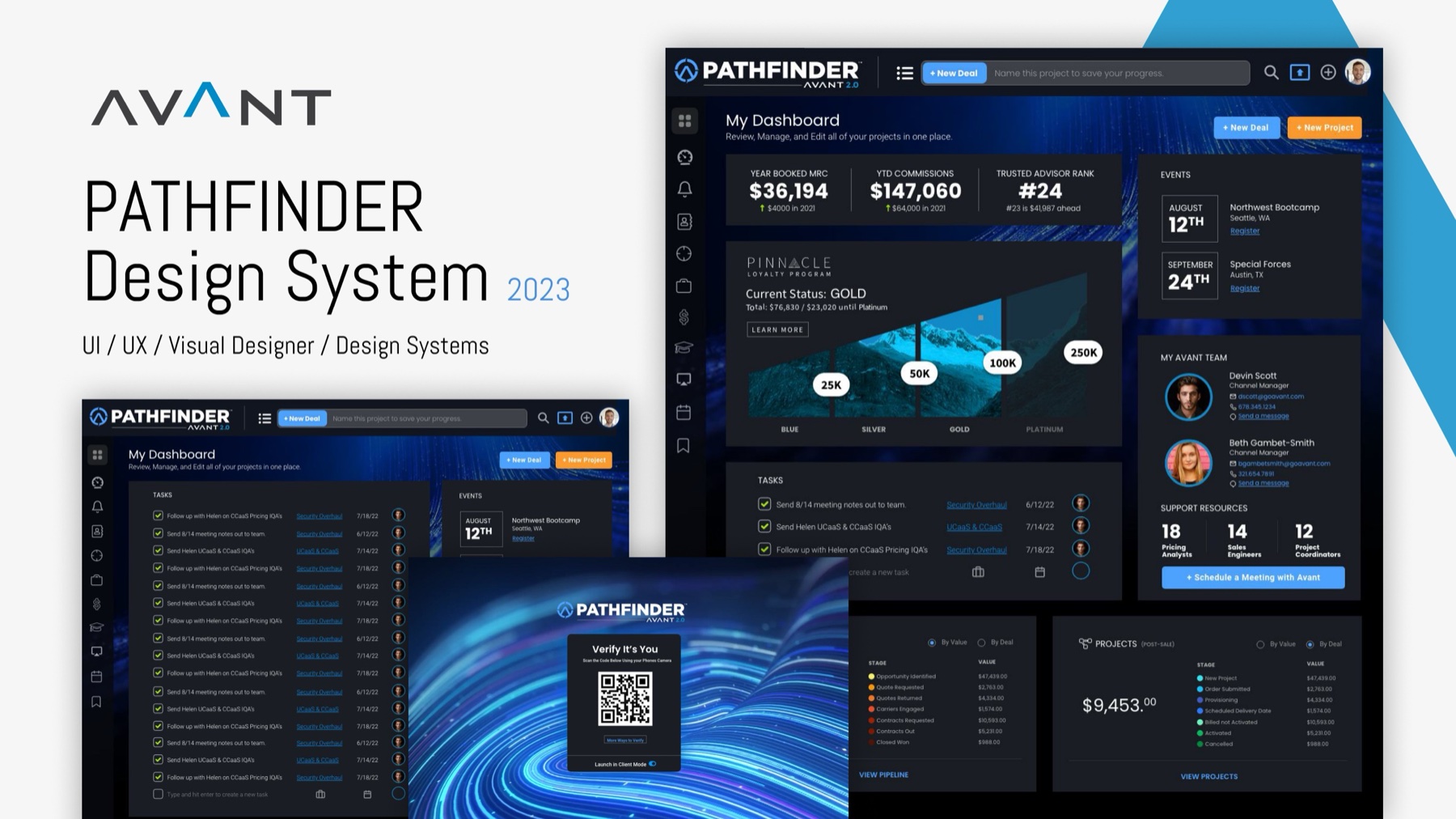
Design vision and system for a B2B telecom-intelligence platform — connectivity mapping, project dashboards, and configuration tools unified under one component framework used by 350+ trusted advisors.
Senior Product / Systems Designer · Product vision · Design system · Data viz
02
Spacelab · Brand & Packaging · 2021
Spacelab
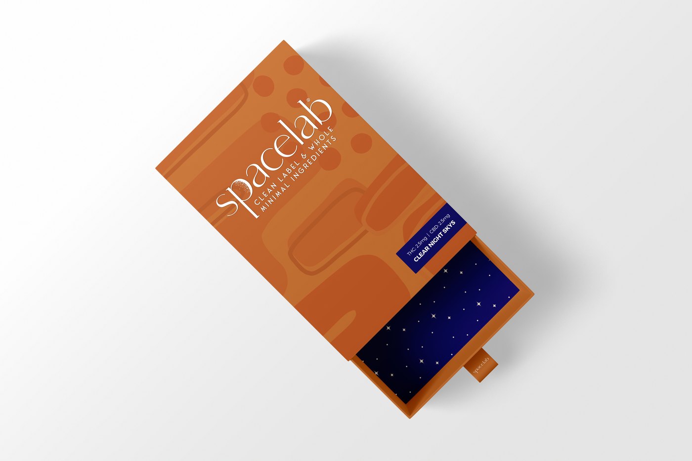
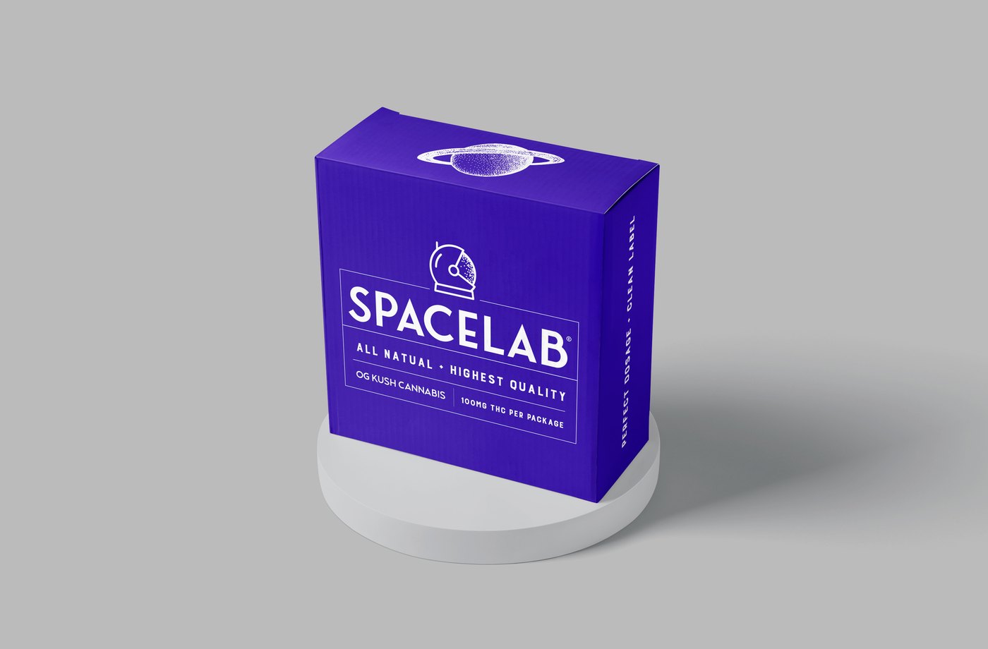
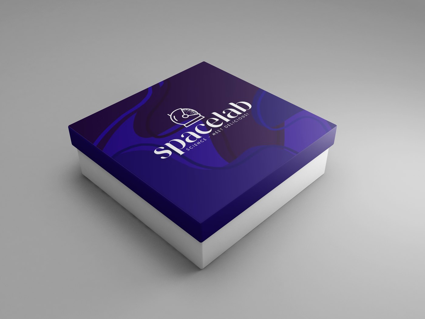
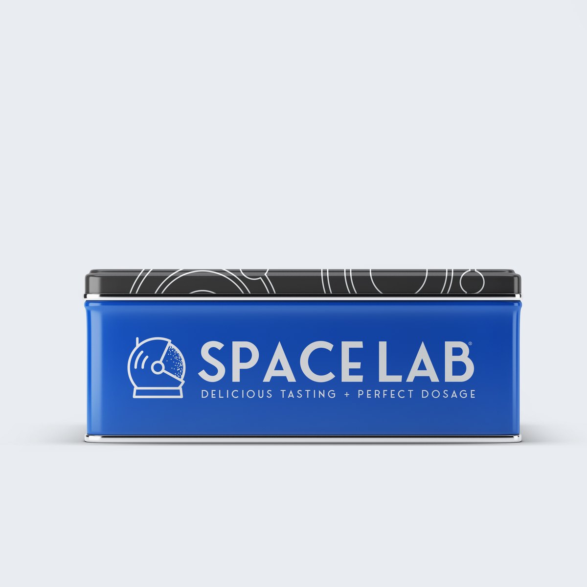
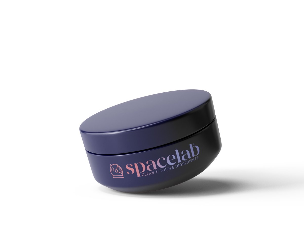
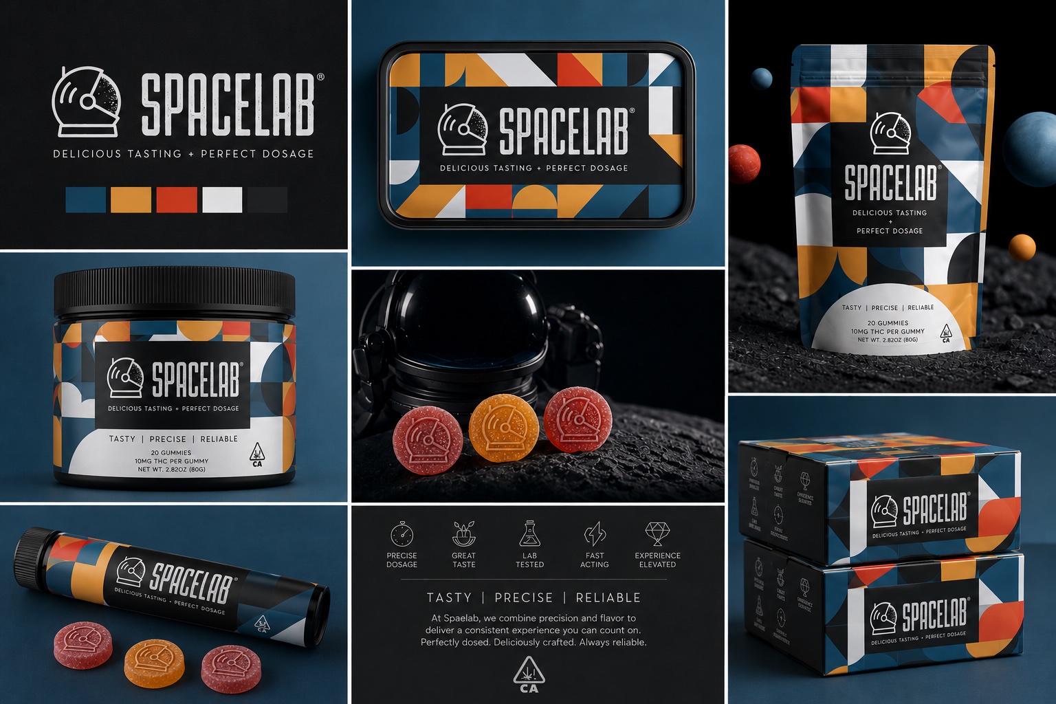
A full identity and packaging system for an artisan edibles brand — cosmic illustration language, midnight blues cut with burnt orange, carried across boxes, tins, foils, and jars.
Creative Direction · Identity · Packaging · Freelance
03
SurePeople · HR Tech · 2020
PRISM
Product design lead for a psychometric intelligence platform — translating dense personality data into humane, readable dashboards for coaches and teams.
Product Design Lead · Dashboards · Data visualization · Mobile UX
04
TransUnion · Fintech · 2018
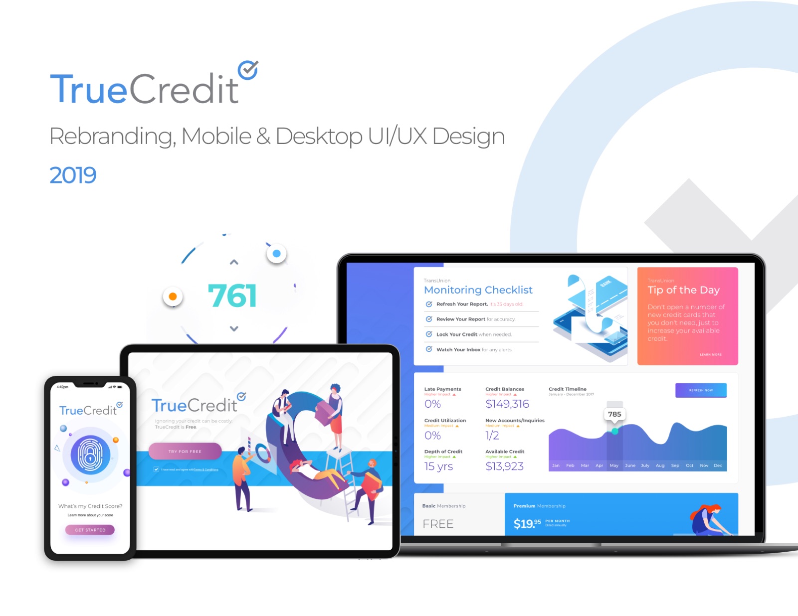
TrueCredit
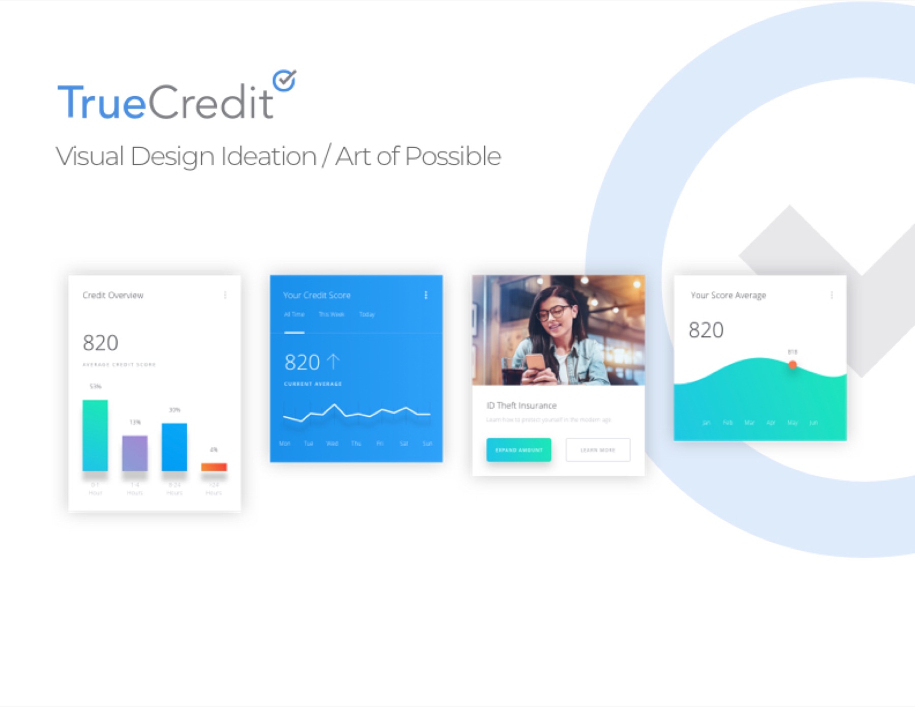
Rebrand and product ideation for a consumer credit platform — an "art of the possible" vision that reframed credit data as something people could actually feel good reading.
Design Systems Lead · Rebrand · Product vision · Enterprise system
05
Avant · Brand System · 2022–2024
Avant Marketing System
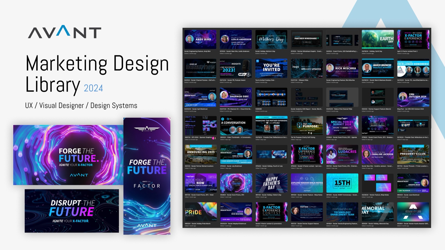
A Figma-first marketing design system — campaign templates, social kits, and brand components that let a lean team produce at agency volume without agency drift.
Brand Direction · Systems Design · Campaign kit · Figma library
01 / 05
03.5The Index · 2009 — 2024
Fifteen years of shipped products, one board at a time.
Case boards and client sites from the archive — fintech, healthcare, real estate, luxury retail. Most open a full case file.
International design excellence for GE Healthcare's clinical platform language.
✦ Fast Company
Innovation by Design
Recognized for design innovation in enterprise healthcare tooling.
✦ dmi : DVA
Interface Design
Design Management Institute award for interface design excellence.
05How the work gets made
i.
Vision
Find the unmistakable idea. Deep listening, brand and product audit, ambition-setting. Before a single pixel: what should this feel like, and why would anyone remember it?
ii.
Clarify
Name the real problem. Define success in measurable terms, cut the noise, and get every stakeholder pointed at the same north star — in writing.
iii.
Map
Architecture before decoration. Foundations, component inventories, user flows, narrative arcs — the skeleton that lets beauty scale without breaking.
iv.
Execute
Craft at full volume. Art direction, pixels, motion, sound — executed to production quality, not concept quality. AI compresses the mechanical passes; the judgment calls and the finish stay mine.
v.
Deliver
Systems teams actually use. Documentation, governance, Figma libraries, developer handoff — the unglamorous 20% that makes the other 80% survive contact with reality.
06The Practice · 2003 — 2026
One practice, every discipline — and a shared language for all of them.
The range most teams staff across three or four hires — product, systems, brand, art direction, motion, and sound — carried by one person. On a team, that means I plug in wherever the work needs me and speak every specialist’s language while I’m there. AI is in the workflow, not the credits: Claude Code for working prototypes and production front-end, Figma Make for taking a direction to a clickable prototype in an afternoon, and agent workflows for the multi-step passes — audits, variant production, documentation. It buys back the hours that go into finish. Over the past year that has matured into AI-assisted design engineering — I design and build in one pass, taking an idea to production-grade front-end rather than stopping at comps. This very site and my Morning Intel dashboard were built that way.
PBK StudioPrincipal DesignerIndependent multidisciplinary studio — composable design systems, product, brand identity, web, motion, voice performance, and original music. Governance, accessibility, and developer handoff built into every deliverable.May 2026 — Now
VerizonSenior Design System Designer II · ContractScoped contract on the post-rebrand enterprise system — designed and delivered the calendar component: full states and accessibility, built on the system's tokens and variables, handed off complete. A month of scope, shipped inside the first week.2025
The Bettering CompanyBrand Designer · FreelanceNew brand identity and a lightweight design system — company values translated into a cohesive visual language with shipping-ready guidelines.2024 — 25
AvantSenior Product · UI/UX & Design SystemsLed the Pathfinder™ Design System and a marketing design library spanning product and brand — themeable components and one consistent language for 350+ marketers.2021 — 24
GE HealthcareSenior UX/UI · Design Systems · ContractDesigned, built, and evangelized the award-winning Edison Design System™ — a single foundation unifying 40+ regulated enterprise products. Red Dot, Fast Company, and dmi:DVA honored.2020 — 21
SurePeopleLead UX/UI Visual Product Designer · ContractLed the PRISM™ psychometric platform — behavior analytics translated into a cohesive, scalable UI framework with modular kits.2020
Blue Cross Blue ShieldSenior Product / Design Systems · ContractCreated and maintained the FIBER™ Design System — a React-compatible framework that accelerated product-to-market timelines across web and mobile.2018 — 19
TransUnionSenior UX Designer · Design Systems · ContractDesigned the global TUCM Design System™ and visual identity for customer-facing and internal applications — integrated design-to-code workflows.2018 — 19
Maven WaveUX Team Senior Lead · Design SystemsDirected conceptual and visual direction across Fortune 500 engagements — Google, AT&T, Nike — establishing scalable workflows and early design-system patterns; mentored design teams.2005 — 18
Biersma CreativeSenior Designer & UX LeadVisual brand and UX direction across healthcare, retail, and entertainment — Aflac, AbbVie, Crate & Barrel, Disney, Herman Miller, Salesforce.2006 — 13
Firebelly DesignSenior Graphic DesignerConcept-to-execution brand and web design — print and digital for ComEd, Petco, Harris Bank, and Scholastic.2003 — 05
a.Figma
I build systems that scale and visuals that behave.
b.AI
Fast iteration, smart automation, and future-proofing by design.
c.CX
I find the friction, the confusion, and the quiet reasons customers leave — then fix them.
d.Brand
Turning identity into interface rhythm, interaction, and cohesion — concept to system, in one continuous arc.
e.Platforms
Slack, Jira, Confluence, GitHub, Notion, Miro — whatever your team uses.
f.Fluxus
Video, motion, animation, music and sound, spatial concepts, projection mapping — first take, always.
g.Body
Dancer. Operatic voice. Precision whistler. Ambidextrous. The instrument is the instrument.
h.Sound
Phonetic mimic — human, animal, mechanical. Absorbs accents, dialects, and textures after a single exposure.
Missouri State University BFA, Summa Cum Laude — Electronic Arts & Design · Minor in Mass Media & Communications
A focused engagement: design audit, creative direction, and a north-star concept your team can rally around. Strategy with pictures — not a deck that dies in a drive.
I join your team as design systems lead or art director — the same seat I've held at GE Healthcare, BCBS, TransUnion, and Avant. Vision through governance, inside your stack, alongside your people.
The whole visual world: identity → design system → website → motion → sound. One coherent voice from logo to interface to the music in the launch film.
If your team has reached the point where design needs to do more — anchor a system, define a brand, or hold a complex product experience together — that's the work I do best. Available for focused engagements and open to the right full- or part-time role.
Email first · Replies within 2–3 business days · Remote or Chicago-area hybrid
Avant Communications · B2B Technology · 2021 — 2024
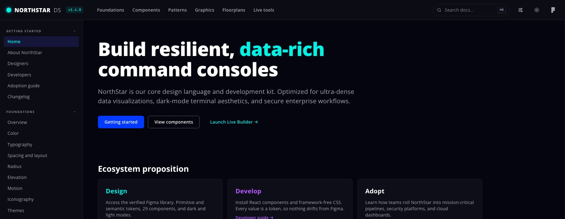
Pathfinder Design System
Avant's first unified design system — dual-themed, built from zero, and owned end to end for three years.
The six-step loop on the front page isn't a diagram — it's how this was built. Pathfinder is the long version.
RoleSenior Design Systems Lead — end to endScopeResearch · Foundations · Components · Theming · A11y · GovernanceStackFigma Variables · React handoff · Dev Mode
350+
Contributors enabled
3yr
Owned end to end · v1 → 3.0
2×
Systems from one foundation
5→1
Primary blues to one language
01Frame the Problem
Pathfinder is where technology advisors research, quote, and close enterprise deals — and it had grown faster than its design language. Three years of separate teams had layered five primary blues, three button shapes, and mixed type stacks into production, while marketing shipped at high volume with no shared foundations.
I didn't start with components. I started with the audit — every production surface, inventoried. The mess became countable, and countable meant fundable: the system had a business case before a single component existed. In a tool where advisors make six-figure recommendations in front of clients, inconsistency reads as unreliability. The problem was trust, not tidiness.
02Map the Flow
Before pixels, the terrain. The system had to serve a dark analytical product where advisors compare providers and close deals, a light high-volume marketing operation, and a live data layer — charts of real revenue — shared by both. Mapping those flows set the architecture early: two themes resolving from one source, and components proven against the platform's densest screens, not its simplest.
The spine that came out of it: one tracked project, five states. Advisors were running six-figure deals out of inboxes and spreadsheets. Mapping the work end to end gave the product a shape — every screen answering for one state of one project, and every state a different problem:
Project Information — where the advisor lives between deals. It has to answer "what needs me today?" in five seconds without becoming a wall of numbers. Configuration — the screen the client sees. It turns a market of dozens of providers into a defensible shortlist, one dense comparison row each.
Discovery — the longest state and the likeliest to stall, where assessments sit with engineers for days; waiting had to read as legible, not anxious. Registration — the irreversible step, which is exactly why the register control lives inside Configuration, next to the reasoning that justifies it. Contract — the state that has to survive: a signed deal becomes a deployment, then a billing relationship, then a renewal handled by someone who was never in the room.
03Explore Wide
Direction got decided in the open. Style tiles put real directions side by side — palette, type, data density, both themes — so the team chose from options, not opinions. The tiles that lost still earned their keep: every rejection sharpened the rationale for what won.
The model went to advisors before it went to build. The five states shipped first as a clickable prototype. The concept held — advisors described the states back in their own words, unprompted, and stopped asking "where's the assessment I ran?", the question that had defined the old process.
The details didn't hold, which is the point of testing. The first Configuration table gave the fit score and the provider logo equal weight, so advisors scanned past the evidence and made a brand-recognition decision — precisely what the screen existed to prevent. I rebuilt the row hierarchy until the score and the differentiator outweighed the logo. Registration moved for the same reason: I'd treated it as a light confirmation, advisors treated it as a commitment, so it went where the reasoning lives.
04Design to the Pixel
Designed or it isn't done. Every component shipped with loading, empty, error, and disabled states — in a platform full of in-progress assessments, the in-between states are the product.
The chart library carried the credibility layer: line, bar, area, stream, radar, and hex — themeable, consistent, and legible with live revenue data on the screen in front of a client.
05Make It a System
Three tiers of tokens: primitives → semantic → component. Engineers consume intent, never hex codes. Dark product and light marketing resolve from one semantic layer — re-theme at the primitive layer and nothing downstream changes.
Governance built for adoption, not enforcement. Federated contribution. Docs written for the person shipping at 4pm on a Friday. Weekly office hours that caught edge cases before they became forks. Semantic releases with migration notes, so an upgrade never surprised anyone.
06Build It for Real
Systems prove themselves in shipped product. Components went to engineering as a React-ready library through Dev Mode — named, specced, and versioned so design intent survived the handoff. Clickable prototypes went in front of advisors before build; when something didn't hold, it got rebuilt before it shipped.
Adoption was the metric that mattered — the library became the default path, not a mandate.
→The Outcome
Brand reviews shifted from policing basics to discussing ideas. New surfaces shipped visually consistent on day one. Accessibility findings stopped recurring, because the fixes lived at the foundation level. And the architecture held: 2.0 to 3.0 on the same foundations, no rebuild — 3.0 is in development now, a deeper dark theme and denser data visualization resolving from the same layer that shipped 2.0.
When the same feedback keeps arriving, the fix is upstream in the system — not in the individual deliverables.
The Pathfinder system's foundations, extended into a self-serve marketing library — 350+ managers producing on-brand work without a designer in the loop.
RoleSenior Design Systems Lead — library ownerScopeCampaign systems · Report templates · Social kits · EnablementFoundationSame foundations as the product system — one visual language
350+
Marketers trained & shipping
174+
Campaign variants, one template logic
1
One foundation shared with product
↓
Revision cycles on routine assets
01The Problem
After the product system unified Pathfinder, marketing was the next bottleneck: high asset volume, no shared foundations, every campaign re-litigating the basics. The design problem wasn't creating a new system — it was adapting one for non-designers, who need harder rails and warmer documentation.
02What I Built
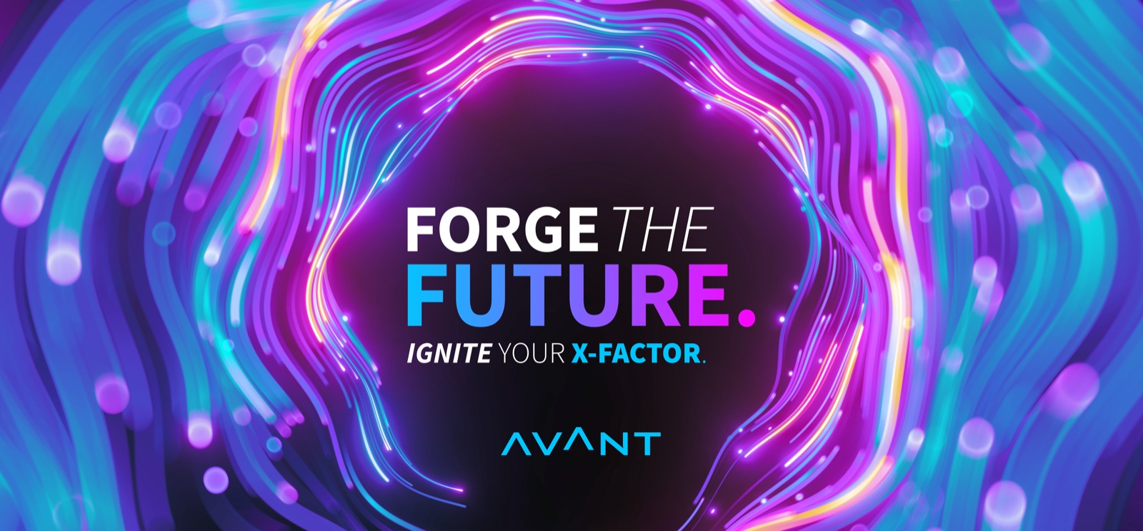
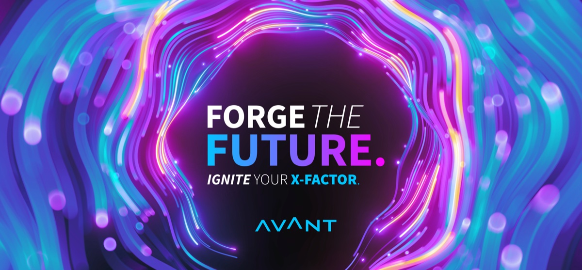
One template, infinite expression. "Forge the Future" set the model: a locked typographic and brand structure with expressive visual fields, so campaign variants multiply without drift — dozens of banner and social formats from one template logic.
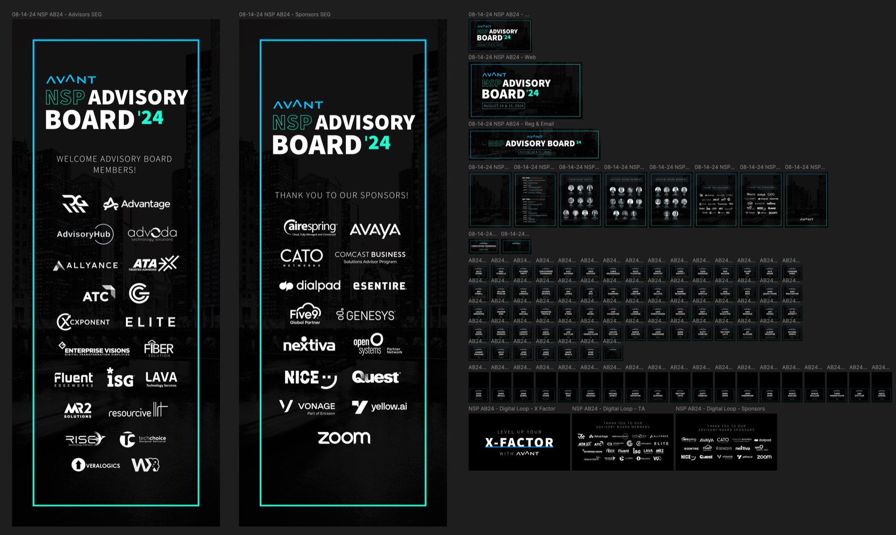
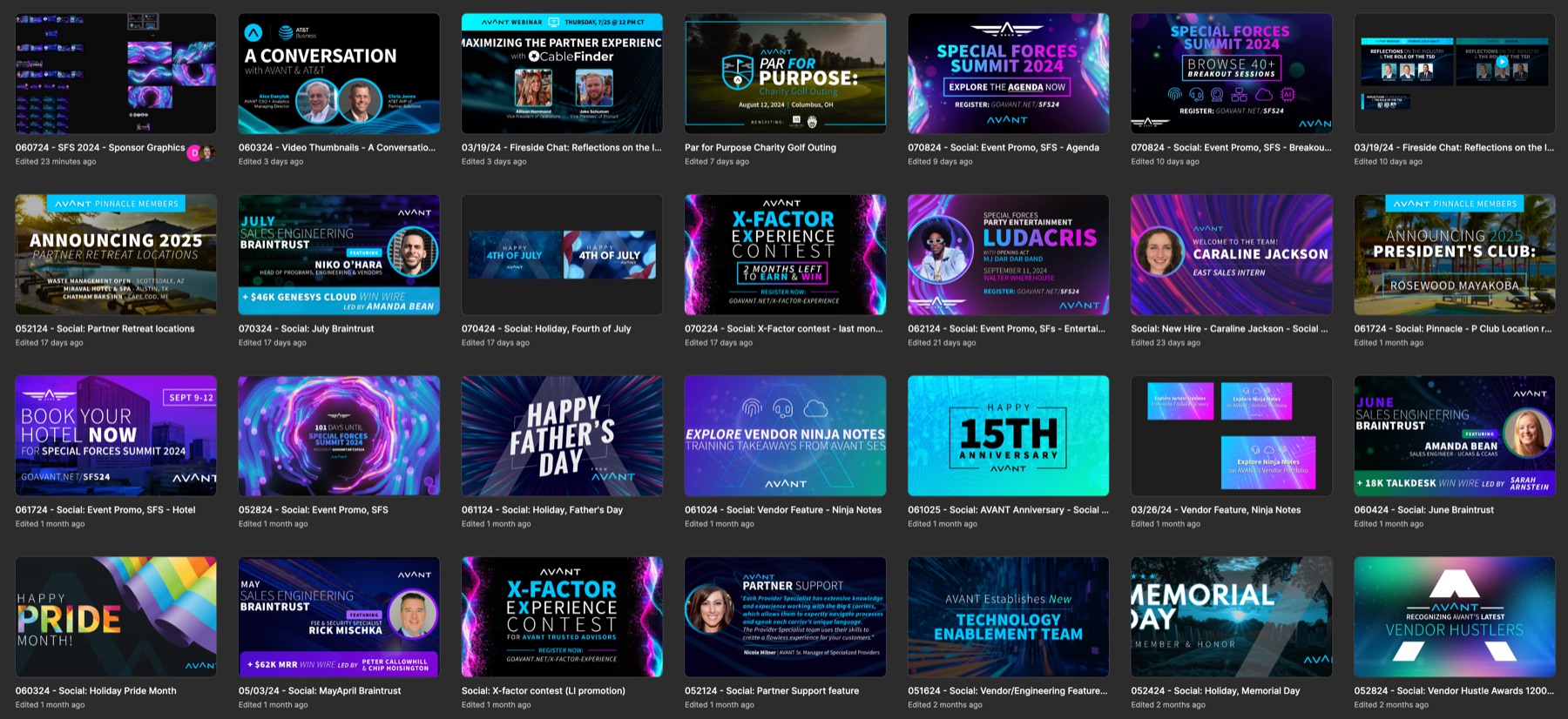
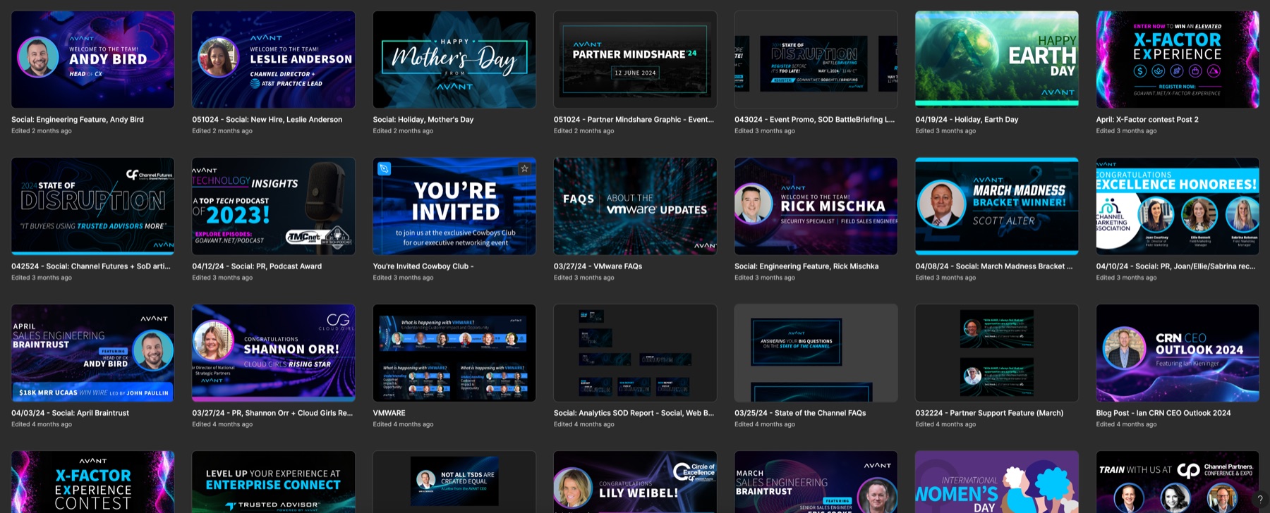
From campaign to calendar. The same template logic carried event creative and the social calendar — the NSP Advisory Board '24 package ran from stage screens to badges to email from one Figma system, and holiday socials shipped on-brand without a designer bottleneck.
Beyond banners. The library covered the unglamorous, high-volume work: 40-page industry reports, partner enablement, and event material — templates carrying the brand's editorial layer so a report and a LinkedIn banner read as one company. The pattern throughout: I created the materials first — covers, reports, campaign assets — then refined each into the library as templates the team could ship from.
Enablement over enforcement. Adoption ran through training sessions and self-serve guides written for non-designers. The training did more for scale than any template.
03The Flagship Report
A worked example. The 2024 Colo & Cloud Report became the library's proof case for editorial work — a 40-page industry report designed on the same rails as the campaign and social kits.
Exploration inside the rails. Dozens of cover concepts, all drawn from the same brand palette — geometric, gradient, and fluid-wave directions — before the final was selected. The system constrained the exploration without flattening it.
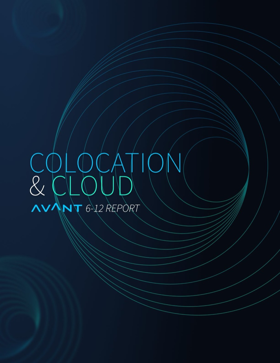
Built to travel. The final cover shipped production-ready and co-branded for partner distribution, with interior templates carrying the brand's editorial voice across every page — so the report and a LinkedIn banner read as one company.
Refined back in. As with the campaign work, the finished report was distilled into library templates, so the next report started at eighty percent instead of zero.
04The Outcome
The library became the default path because it was faster than the old way. Marketing stopped rebuilding basics, revision cycles on routine assets collapsed, and brand consistency stopped depending on any one person's vigilance — including mine.
Marketing libraries are design systems with a different user — the architecture is the same, the empathy is different.
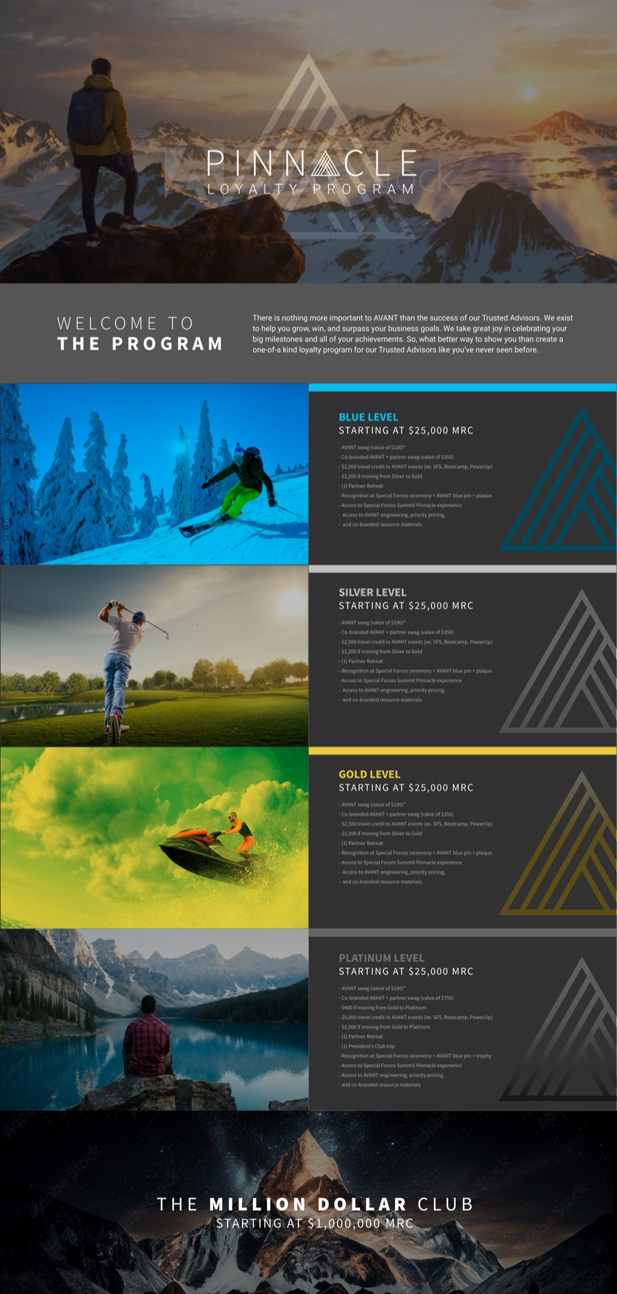
Pinnacle. The loyalty program microsite — tiered rewards told through altitude, from base level to summit, built entirely inside the library's template logic.
Blue Cross Blue Shield · Healthcare & Insurance · 2018 — 2019
FIBER Design System
BCBS's first unified design system — React-compatible foundations spanning consumer enrollment, member tools, and marketing.
RoleDesign System Founder / Lead — contractScopeFoundations · Components · System guide · Web + Mobile · EnrollmentStackSketch libraries · React-compatible coded components
1st
Unified system at BCBS
2×
Platforms — web + mobile, one foundation
40+
Screens unified across enrollment
→Dev
Design to development, no re-drawing
01The Problem
BCBS member and enrollment experiences were built by many hands across many vendors — and it showed. Components were disjointed, specifications lived nowhere, and every new flow reconstructed the basics. For a healthcare brand whose entire promise is trust, the seams were the problem.
02What I Built
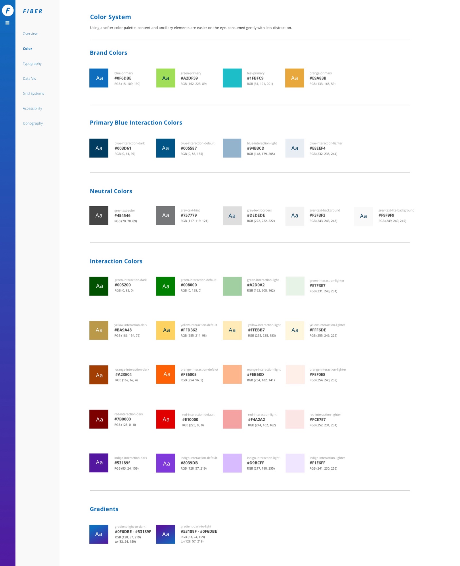
Foundations first. A color system with interaction and accessibility tiers, a typographic scale built for dense insurance content, an icon library, and grids that worked from marketing pages to enrollment forms.
Accessibility as architecture. In healthcare, accessibility decides whether the product works at all. Contrast, focus, and plain language were baked into the foundation layer, not added after.
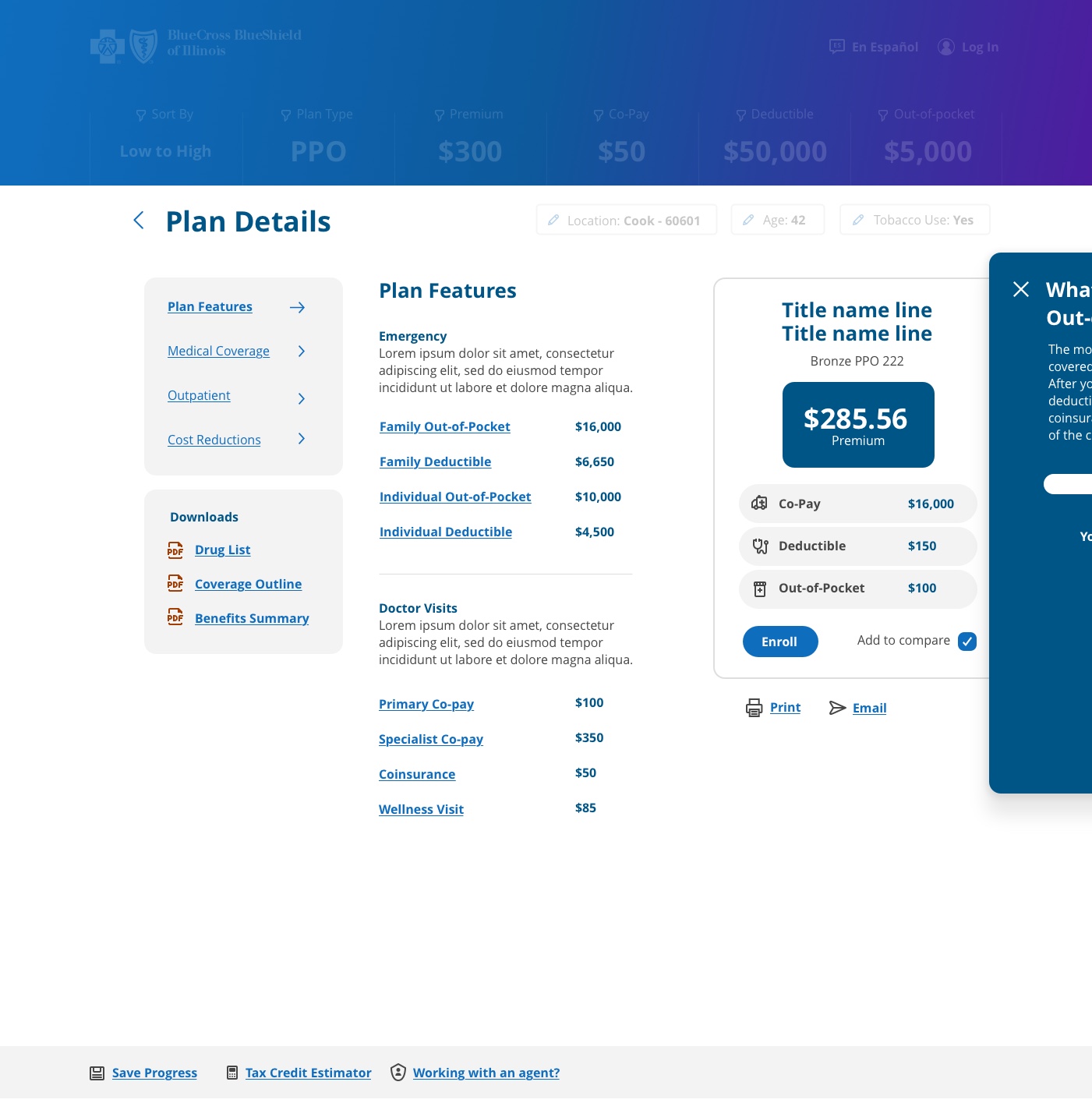
Proven on the highest stakes. Plan selection and enrollment — forms, payment, and confirmation patterns shipped as coded components with theming hooks, with the same foundations carrying the marketing surfaces.
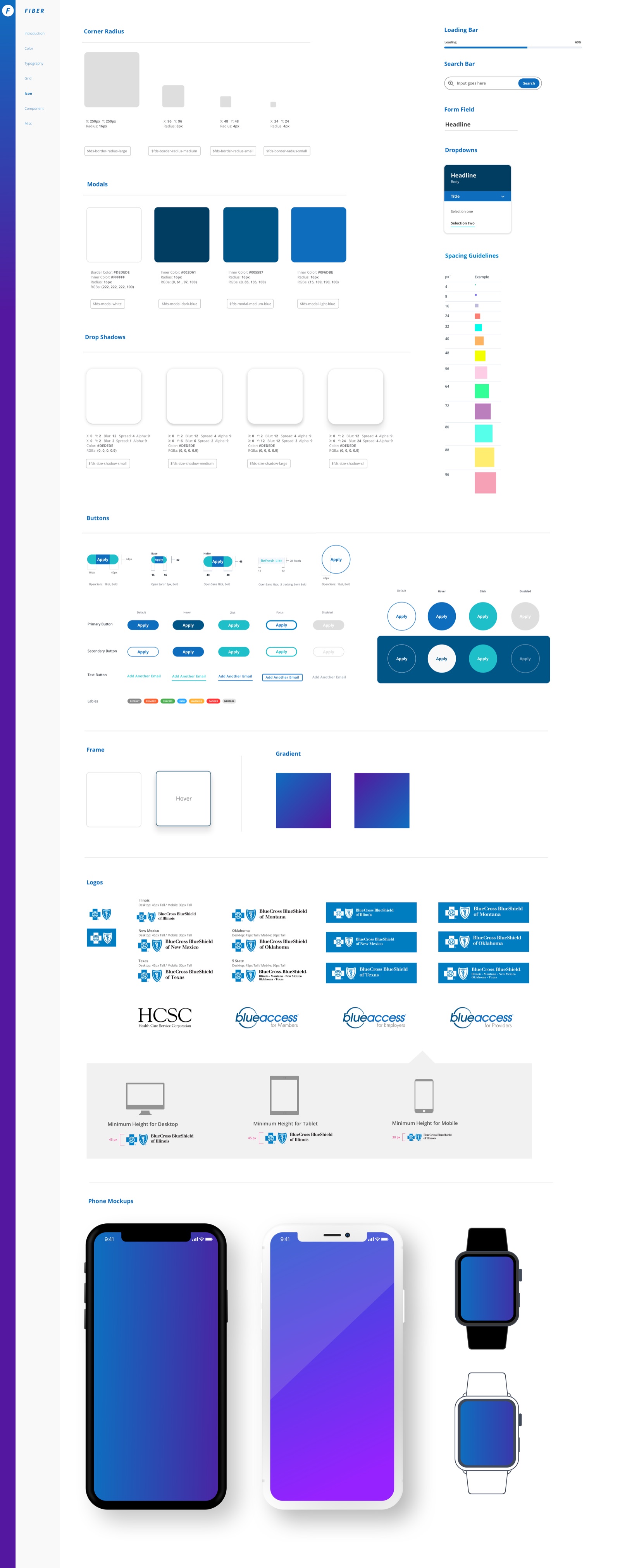
Documented like a product. Corner radii, modals, shadows, buttons and states, form fields, spacing steps, the multi-plan logo matrix, and responsive minimums — one sheet a vendor could build from without a meeting.
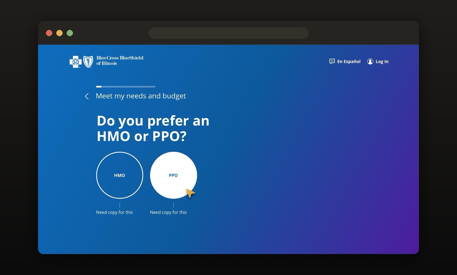
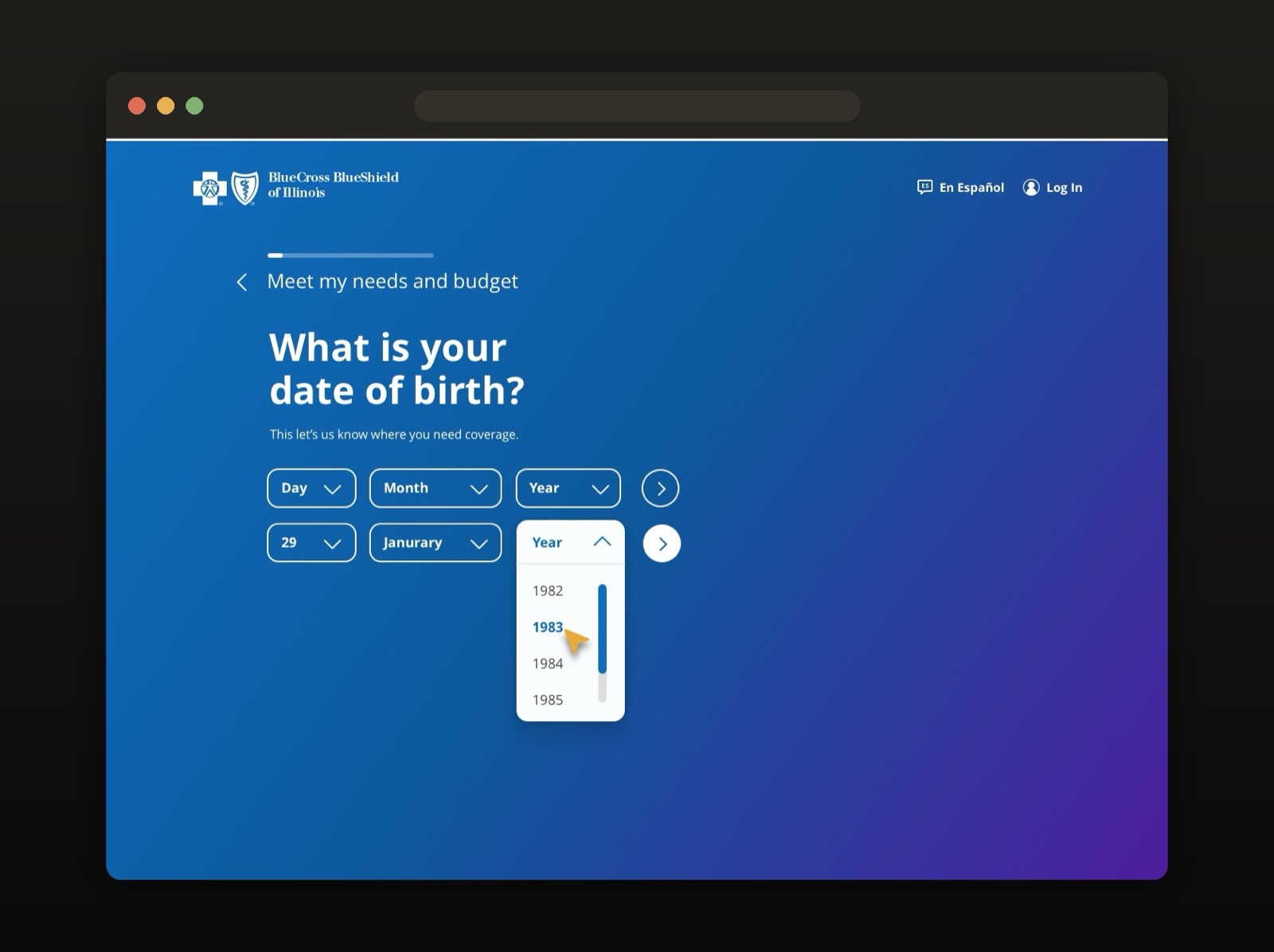
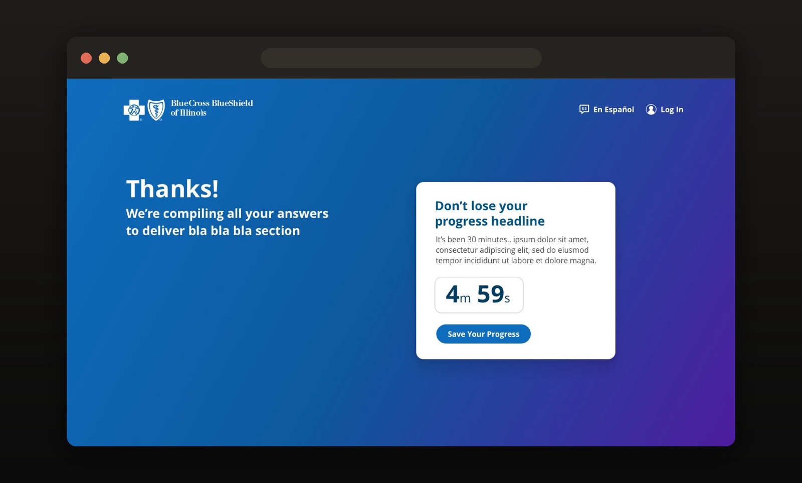
The system in production. The under-65 shopping experience rebuilt as a conversation — one question per screen, plain language, progress you can leave and return to. Every screen below is assembled from FIBER foundations.
03Making It Stick
A system is only as good as its adoption. FIBER shipped with a guide I authored and presented myself — not a spec dump, but an argument: here is the problem, here is the vocabulary, here is exactly how to build with it.
The brief, in the system's own words — "disjointed components with no real visible path to constructing the design to developers' specifications." The fix was a single source of elements and code that let any team produce mockups, prototypes, or production sites without error or question.
Shared vocabulary, communicated often. Designers, developers, and vendors named things the same way and pulled from the same sources. When a question came up, the guide answered it — and the meeting never happened.
Beyond enrollment. The same foundations carried BCBS's outward-facing marketing surfaces — homepage through plan selection to payment — so the brand read as one product, not a federation of vendors.
04The Outcome
Teams stopped reconstructing the basics. Enrollment flows shipped visually consistent. The guide gave designers and developers one vocabulary — and the system accelerated concept-to-completion across BCBS's multi-product ecosystem.
Healthcare taught me accessibility discipline — a standard I've carried into every system since.
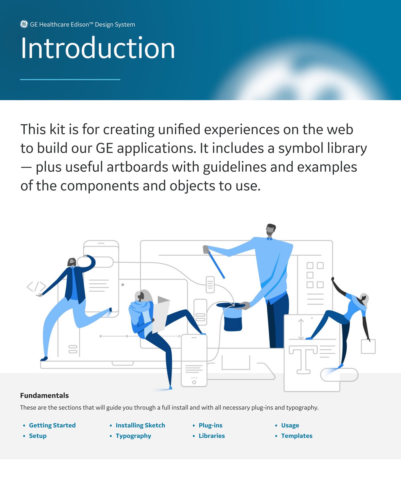
GE Healthcare's products span imaging, monitoring, and clinical workflow — software used in life-and-death contexts, built by teams across the globe. Edison unifies them: modular, accessible UI patterns rigorous enough for regulated environments, flexible enough for everything from radiology workstations to touch-screen devices.
Edison was a team effort that predated and outlasted my engagement. My focus: scalable component libraries, theming, and documentation that let diverse product teams adopt the system without translation loss.
02What I Contributed
Four themes from one semantic layer. Clinical software runs in radiology reading rooms at 2am and on bright surgical floors — light and dark themes across desktop and touch targets, resolved from shared foundations so components never fork.
Components for regulated review. Notification patterns, steppers and progress, form controls, and the icon library — each with full state coverage and accessibility behavior documented for regulated review. When WCAG compliance is a legal requirement, accessibility stops being a checklist and becomes architecture.
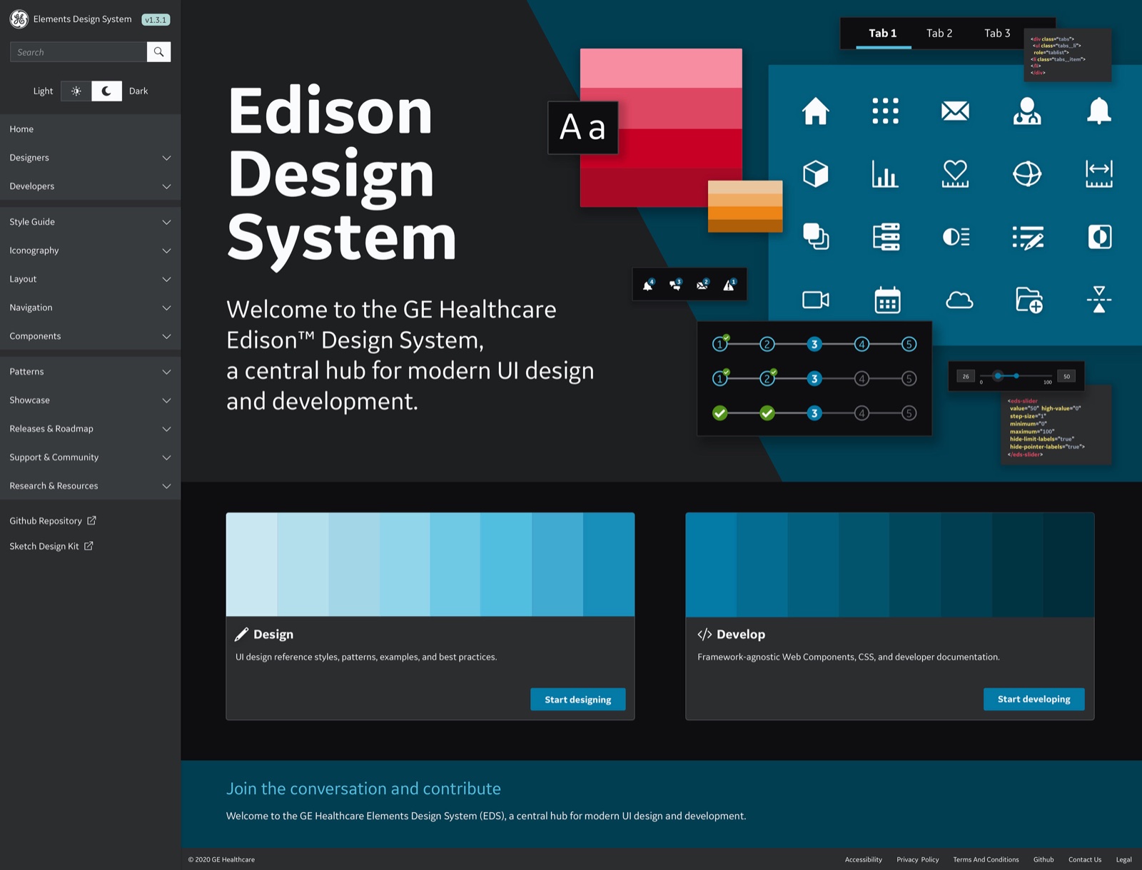
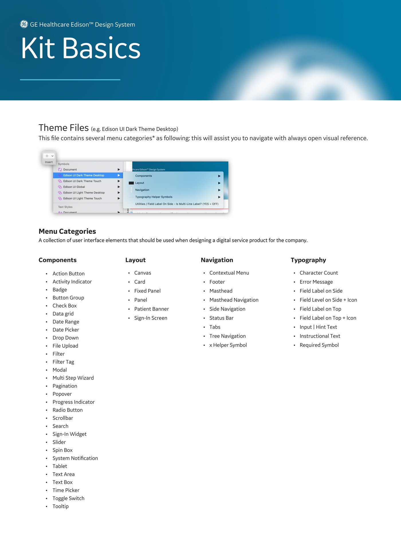
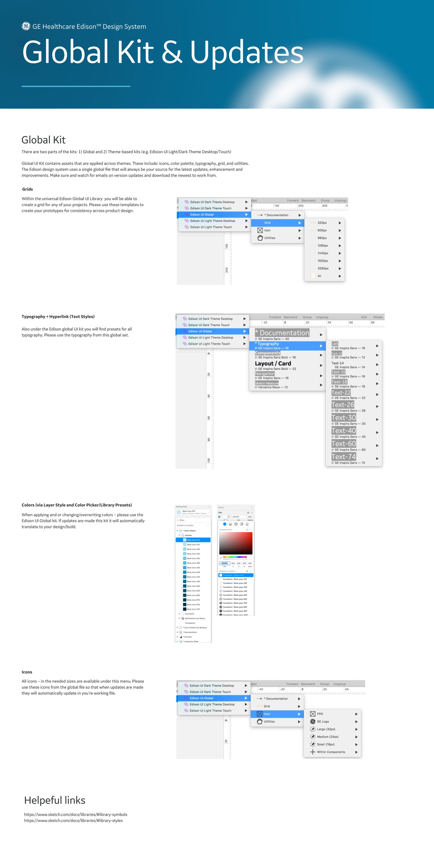
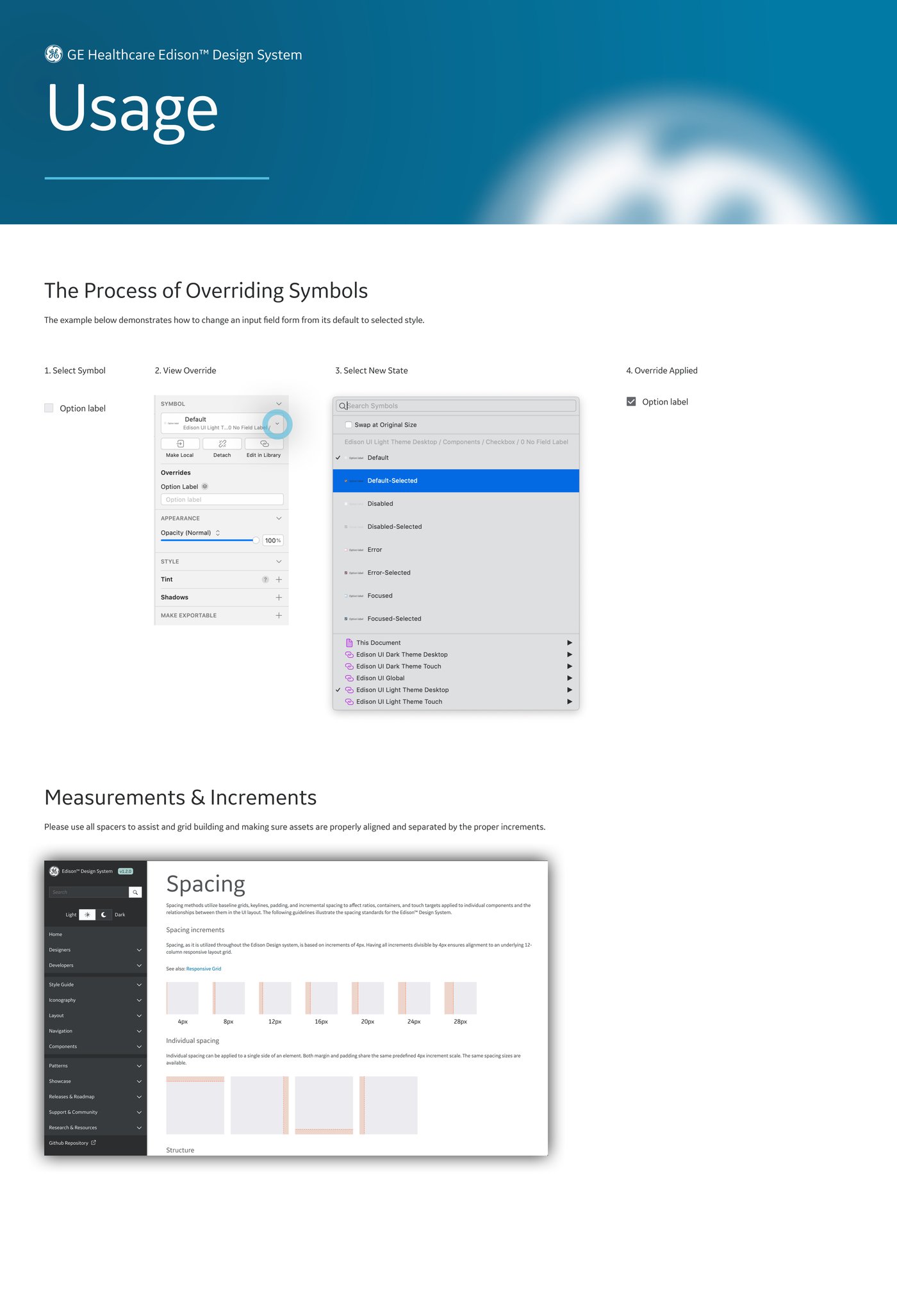
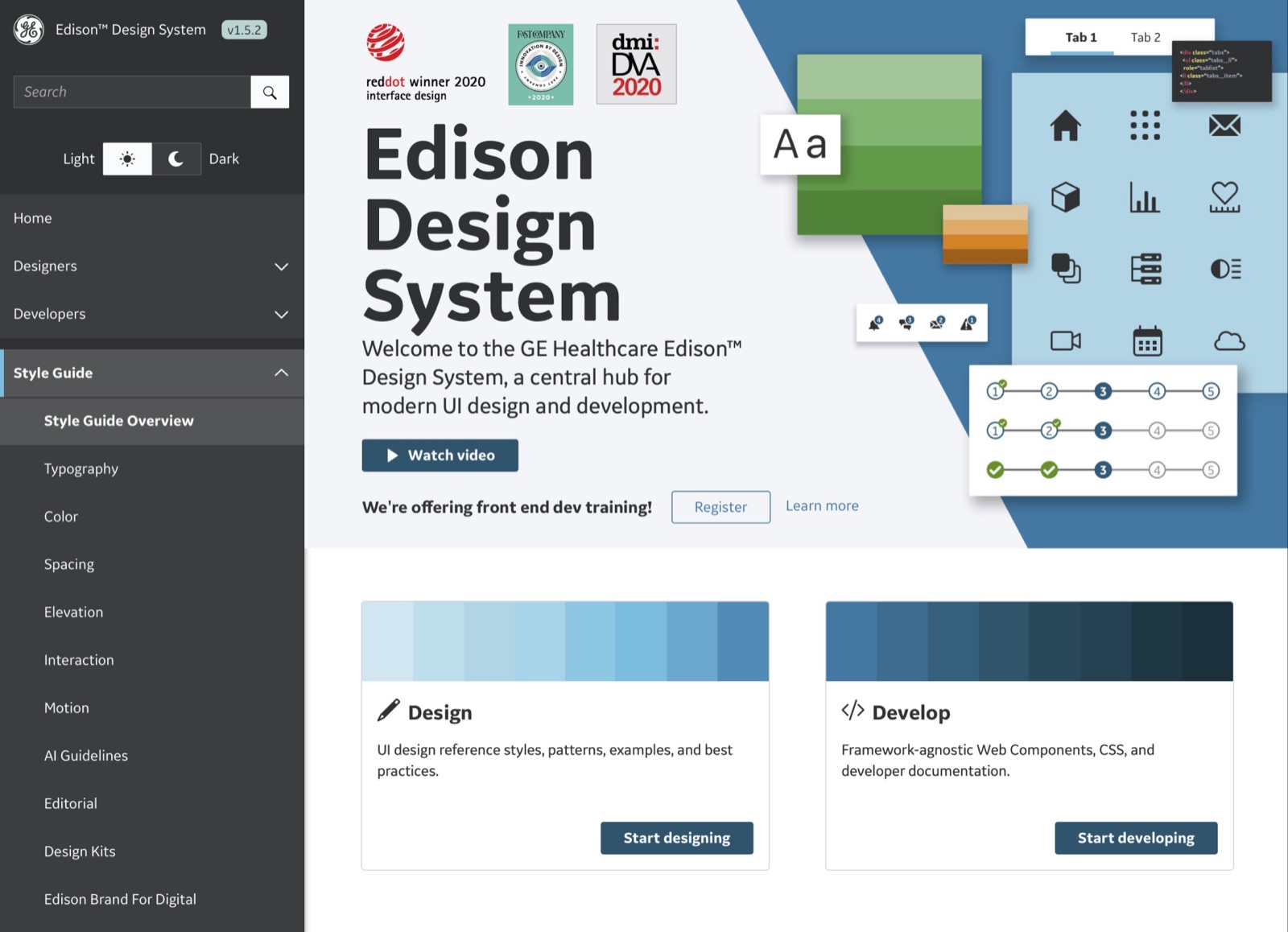
Shipped as a kit. Edison went to teams as an installable system — GE typeface, Sketch libraries, theme files, and a written guide walking designers from setup through overriding symbols. The component menu alone reads like a product catalog.
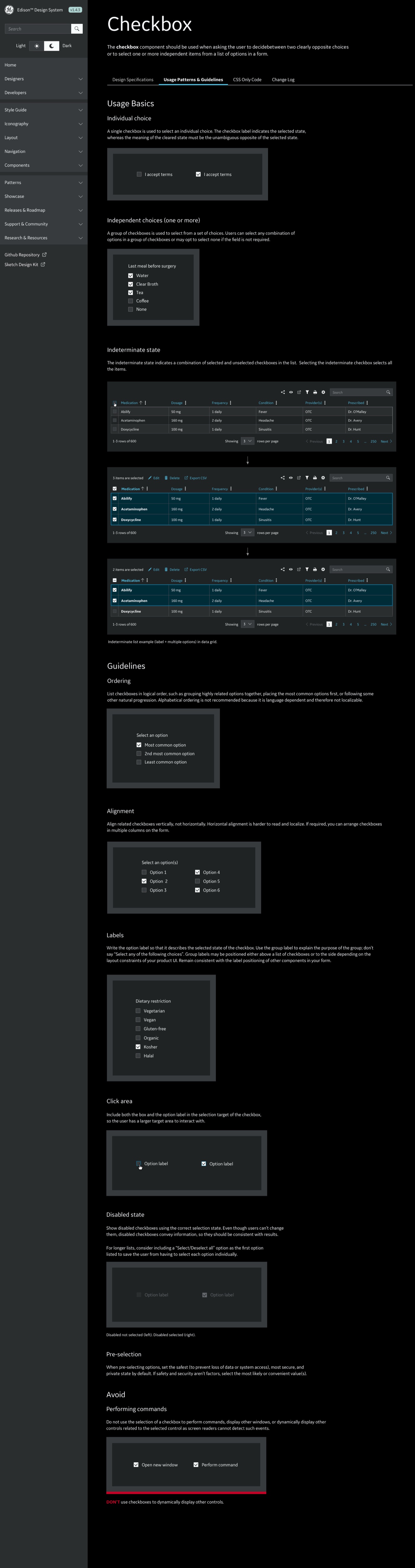
Specified to the pixel. Every control shipped with full guidance — anatomy, states, spacing, do-and-don't — written so clinical product teams could build without interpretation. The checkbox guideline alone, lights-off theme:
03Adoption at Scale
The kit was half the job — adoption was the product. Forty-plus teams across the globe don't align because a system exists; they align when the path of least resistance runs through it. Edison's documentation hub became the single source of truth — one site serving designers and developers alike, from UI patterns and best practices to framework-agnostic Web Components ready to drop into any product stack.
Libraries that keep themselves honest. Sketch libraries installed by theme and device tier — dark, global, light — meant every designer's local file stayed in sync with the source, updates flowing downstream without manual chasing. Version drift, the quiet killer of design systems, never got a foothold.
Documentation written for adoption, not posterity. Every page answered a working question — what is this, when do I use it, how do I override it — rather than archiving decisions. That's the difference between a system teams comply with and one they reach for.
04The Outcome
The team's work earned the 2020 Red Dot Award for Interface Design, alongside Fast Company Innovation by Design and the dmi:DVA — I played a central role in the system work behind that recognition, alongside designers, engineers, and accessibility specialists across GE Healthcare.
Big systems are social systems. The hardest problems weren't visual — they were alignment across dozens of teams.
End-to-end design of a psychometric platform — complex behavioral analytics translated into dashboards, mobile experiences, and a modular UI framework people actually act on.
PRISM measures how people think, work, and relate — psychometric data that's genuinely complex and personally sensitive. The design problem: visualize it so a manager can act on it in thirty seconds, without flattening the nuance or making anyone feel reduced to a chart.
02What I Built
Visualization as vocabulary. Relationship maps, trait spectrums, and team composites — each a reusable pattern with defined anatomy, not a one-off chart. The same components scale from an individual profile to a team view.
Desktop depth, mobile moments. Desktop carries the analytical depth; mobile carries onboarding, check-ins, and quick reads before a meeting. One modular kit, shared foundations, hierarchy re-tuned per context.
Warm by design. Psychometrics border on the personal — typography, color, and language did as much emotional work as the data itself.
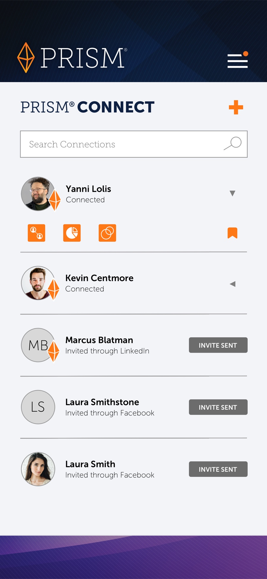
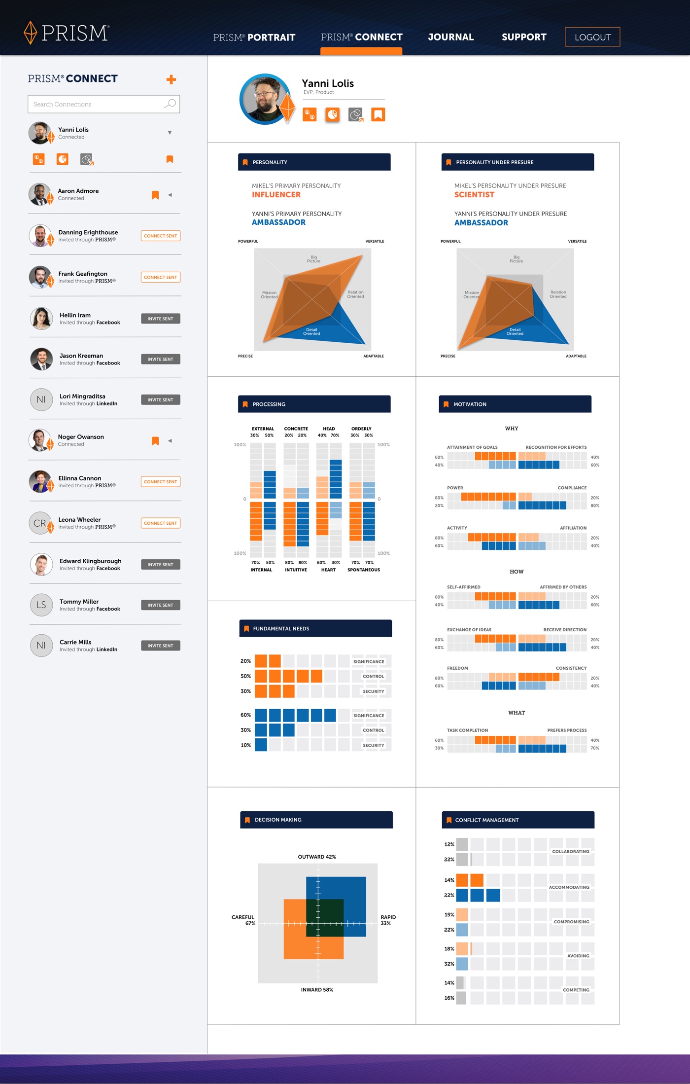
PRISM Connect. The social layer — compare personalities, processing styles, motivation, and conflict management across your network, on any device.
03The Data Language
Chart anatomy, treated like component anatomy. Every visualization got the same spec a button would — defined states, sizes, and usage rules. That's the difference between a dashboard that reads as a designed language and one that reads as chart soup.
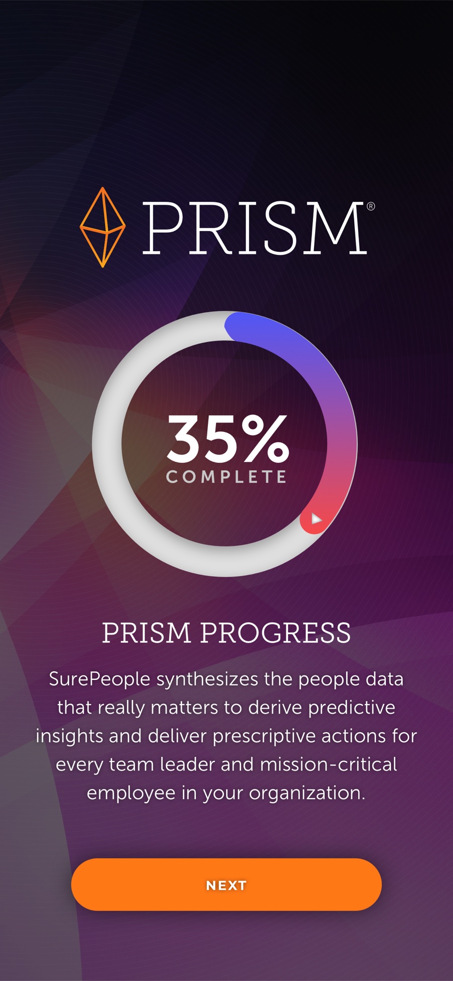
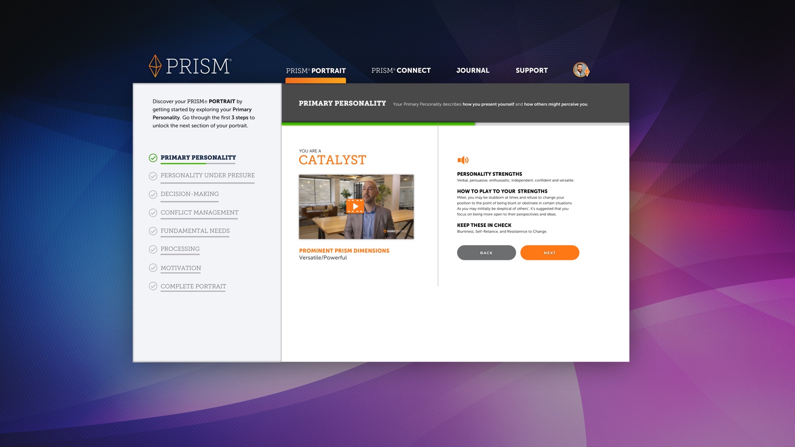
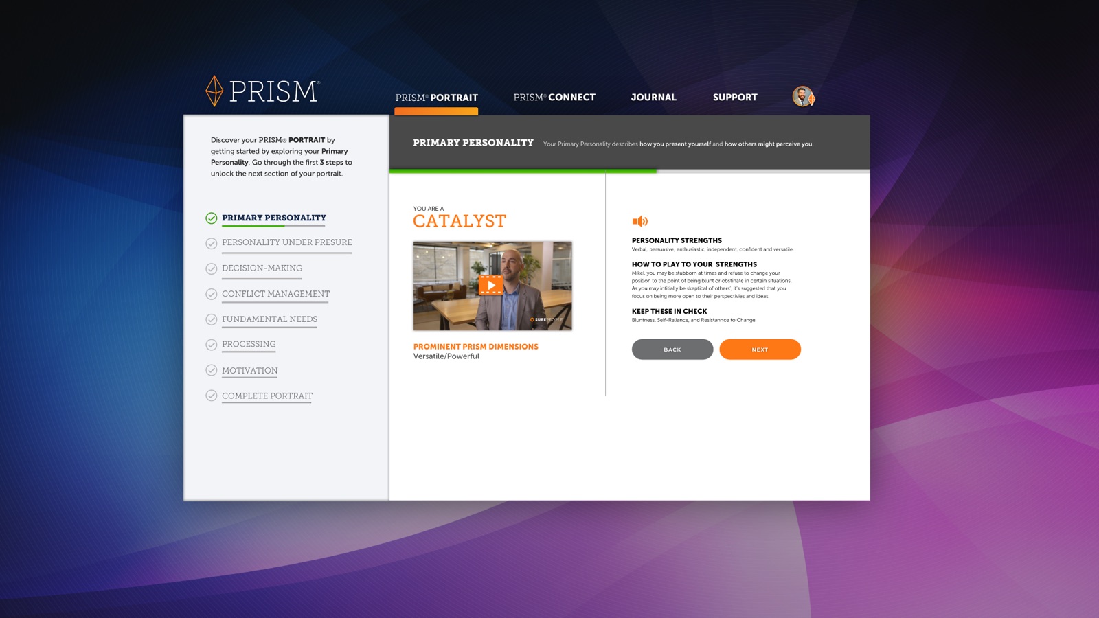
Approachable by design. The Portrait onboards users one step at a time — a guided reveal from Primary Personality through Decision-Making and Conflict Management, each with plain-language strengths and a short video — so dense psychometric data never reads like a test.
Relationship Advisor — data becomes guidance. The system's payoff: side-by-side psychometrics translated into concrete advice for working with a specific colleague. Not "here's your score" — here's what to do in your next conversation.
Navigable, not overwhelming. Anatomy, states, and hierarchy designed as a system are what keep genuinely dense behavioral data legible at a glance — the thirty-second read the platform promised.
04The Outcome
A cohesive UI framework across the full platform, with interaction models and information architecture defined for complex data visualization — and modular kits the team could keep building on after my engagement.
Data visualization is a component problem. Define the grammar, and the data speaks for itself.
TransUnion's global design system, built from audit to adoption: responsive symbol libraries, a written guide, and the white-label SCVD guide that let any partner brand re-skin credit dashboards.
RoleSenior UX Designer, Design Systems — contractScopeAudit · Grid & symbols · System guide · Marketing library · TrueCredit rebrand
1st
Global system for credit-view products
100%
Responsive symbol coverage
2
Systems — product + marketing library
+Brand
TrueCredit rebrand on system foundations
01Audit First
TUCM started the way every honest system does: with an audit. I mapped every component, color, and pattern in production into a single research artifact that made the fragmentation undeniable — and gave the system its priorities. The audit doubled as the business case: once the fragmentation was countable, the system was fundable.
02What I Built
The system. Fully responsive symbol libraries — years before Figma variants, this was disciplined Sketch architecture — with foundations tuned for data-dense credit dashboards.
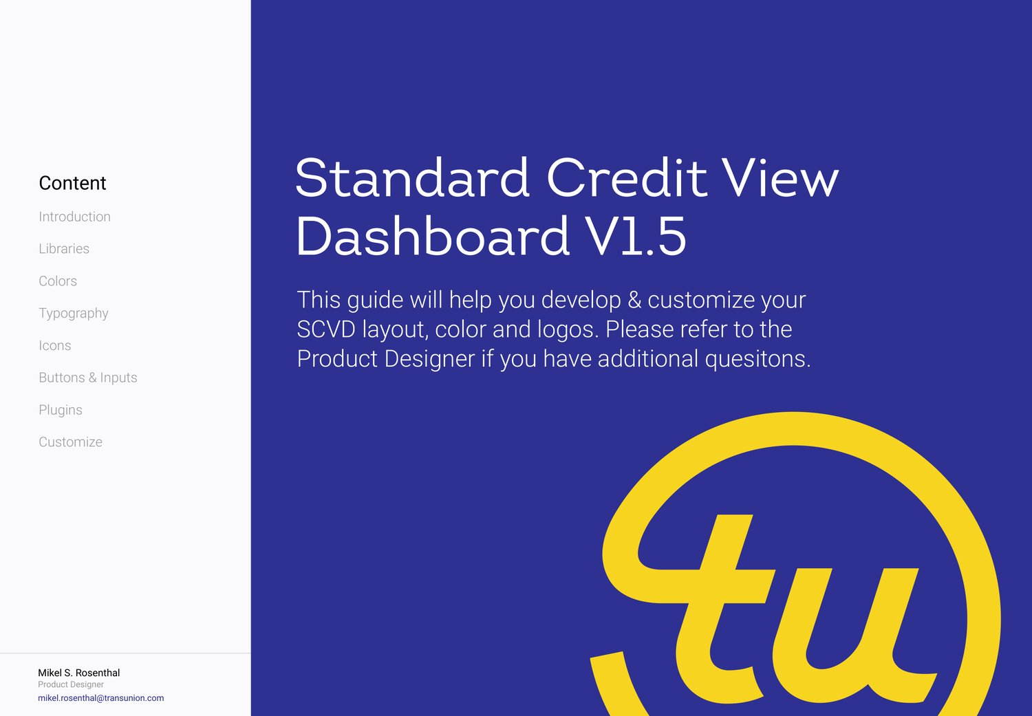
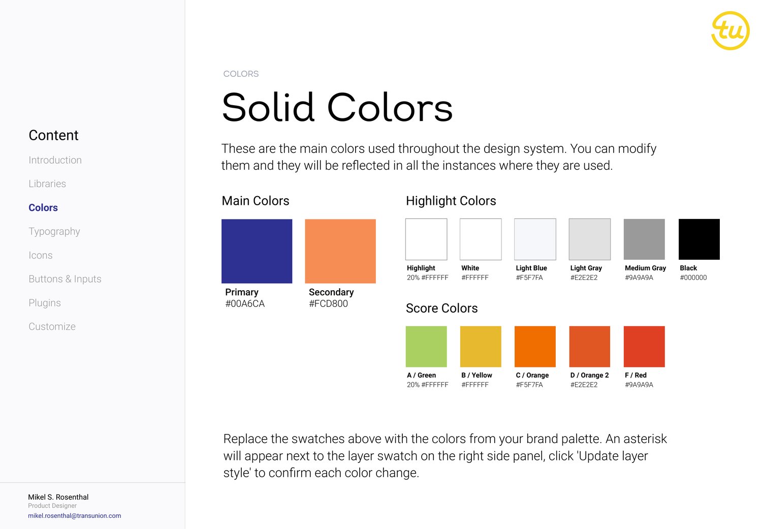
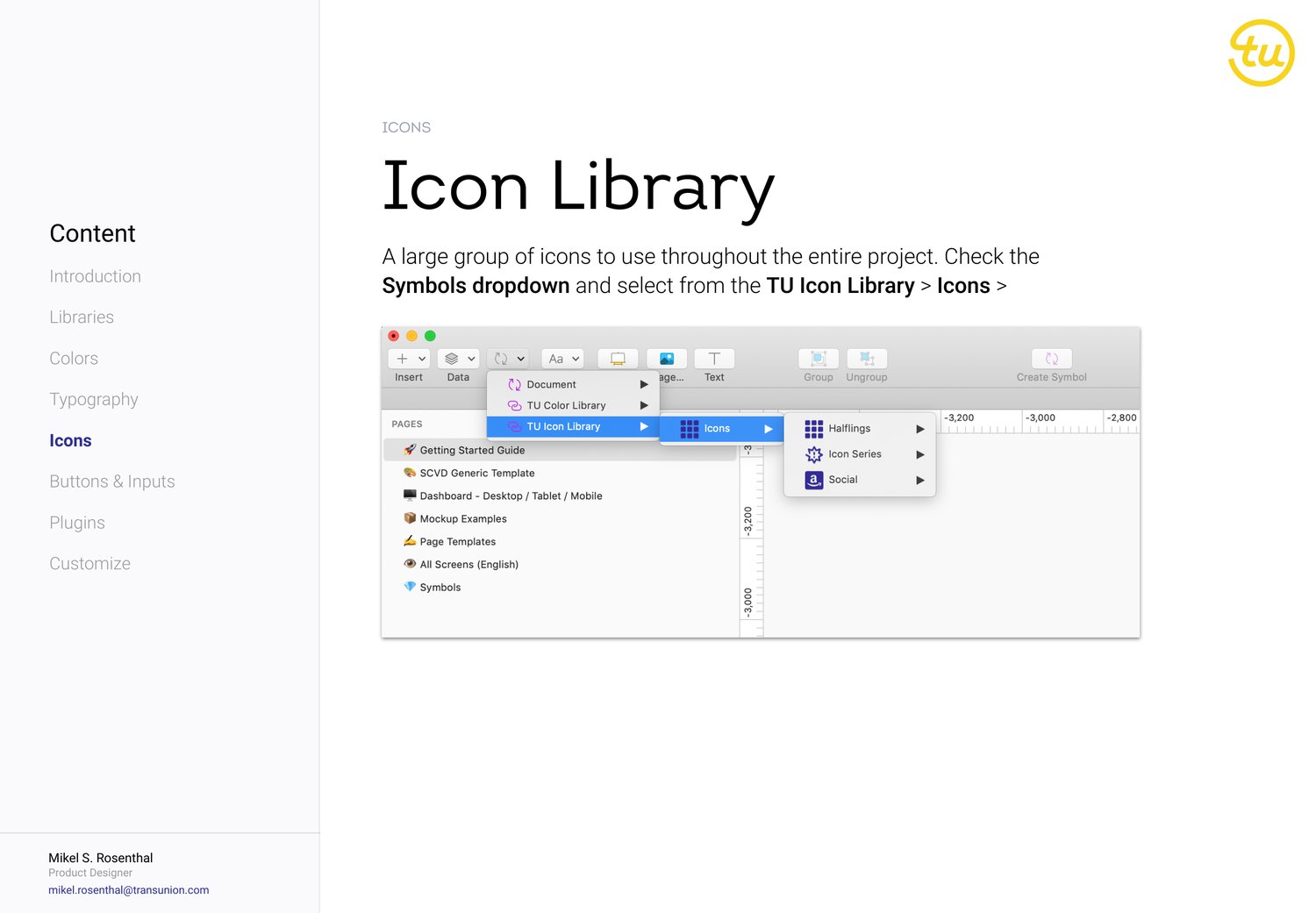
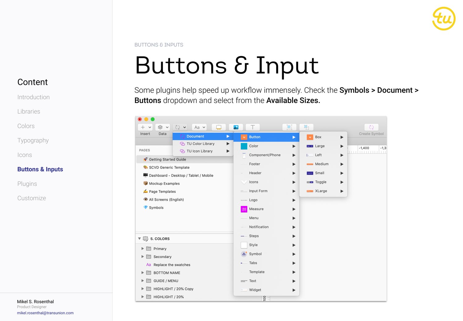
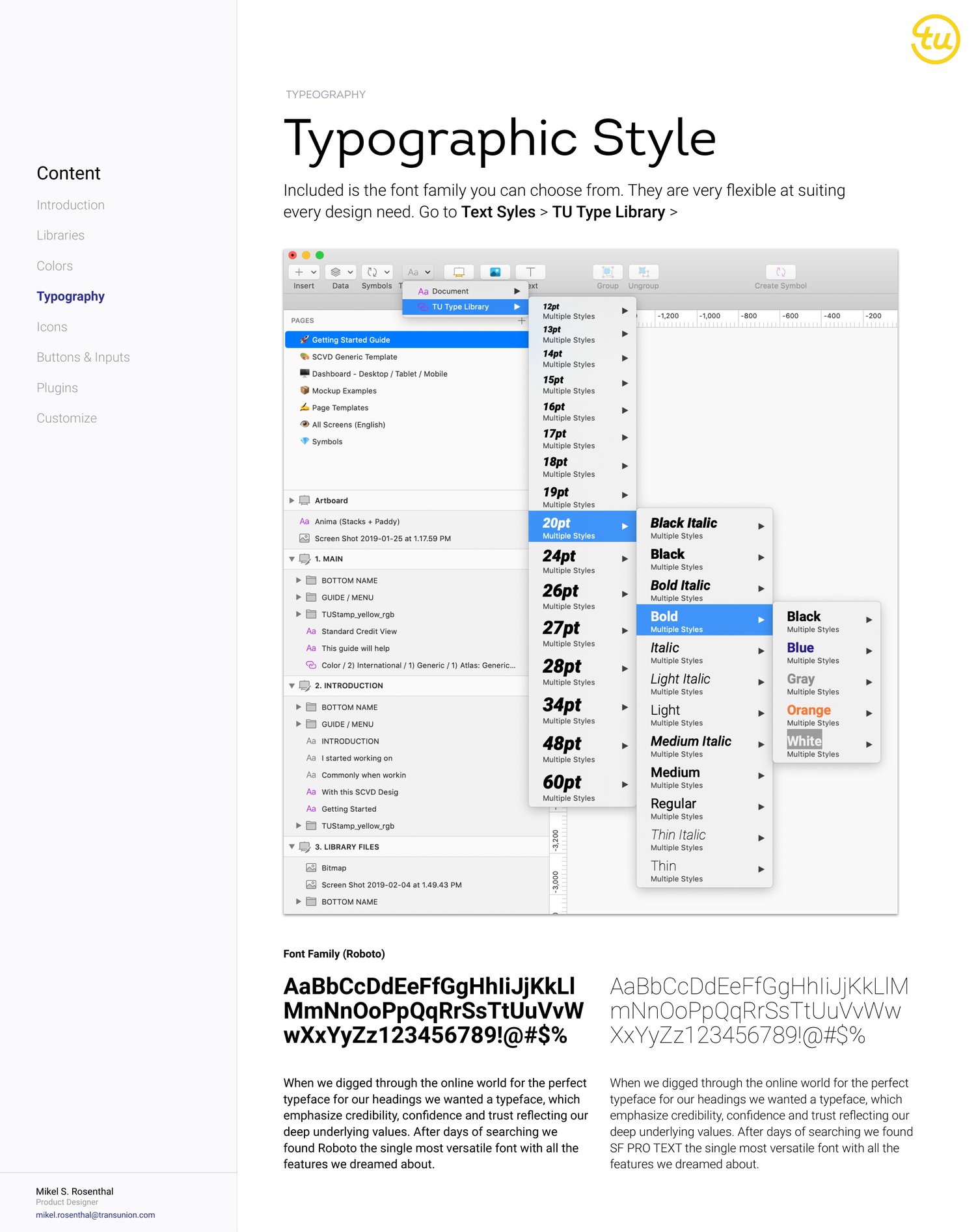
Documented as a product: the SCVD guide. The Standard Credit View Dashboard shipped with its own written system guide — libraries, color, typography, icons, buttons and inputs, plugins — built so a partner team could take it and run.
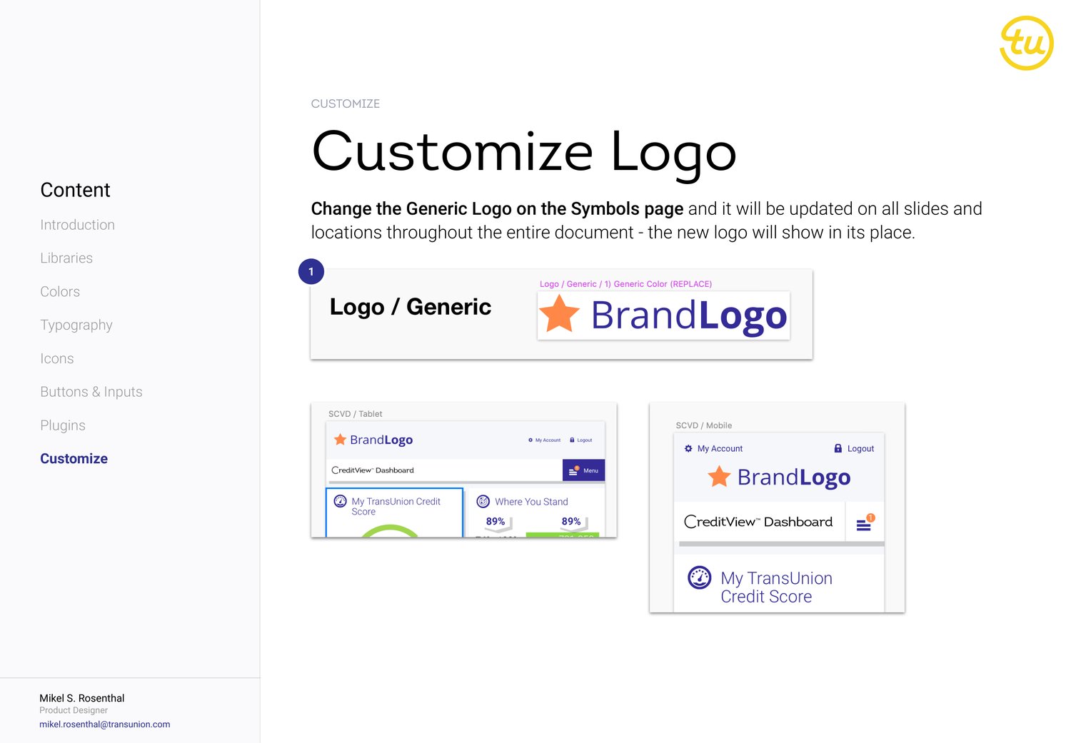
White-label by design. Change the generic logo once on the symbols page and it updates through every screen in the document — colors and type re-theme the same way. One system, any partner brand.
03The System at Work
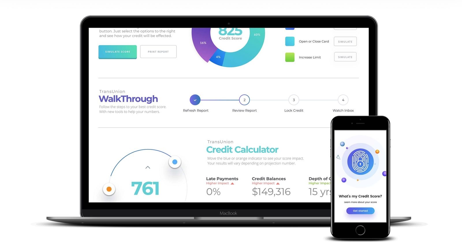
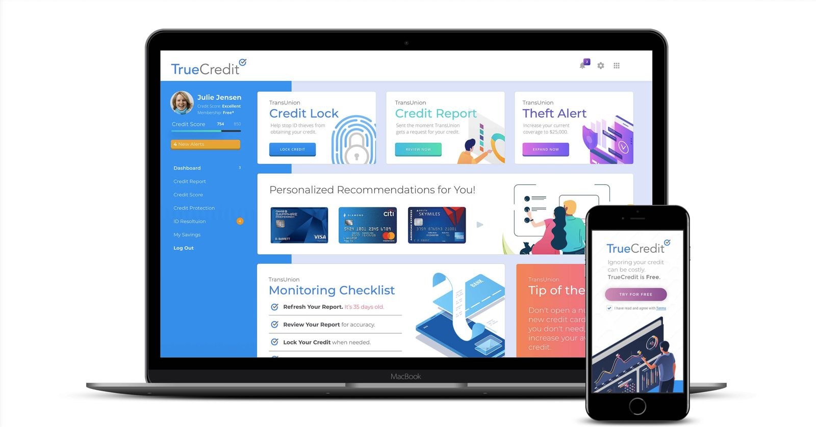
A system is only proven when it ships a product. TUCM's proof was TrueCredit — a full rebrand and design pass on TransUnion's consumer credit experience, built entirely on system foundations. Credit scores, calculators, and monitoring walkthroughs, assembled from the same symbols and libraries the guide documented.
One system, every screen size. Because the symbols were responsive from day one, the TrueCredit family — dashboard, calculator, pricing — moved from desktop to mobile without a redesign pass. The breakpoints were already in the components.
Financial UI is trust UI. Hierarchy and plain numbers decide whether someone believes their own credit score. Building the consumer product on the system made that discipline structural, not a per-screen style choice.
04The Outcome
Design-to-code workflows got a shared vocabulary. The marketing library unified brand touchpoints. Credit data — some of the most anxiety-inducing content on the internet — got an interface language built for clarity. The pattern of audit → argument → architecture has carried into every system since.
People flinch at credit data. Clear hierarchy and plain numbers are what let them believe it.
TransUnion’s consumer credit experience, rebranded and redesigned: credit scores, calculators, and monitoring made to feel navigable instead of intimidating.
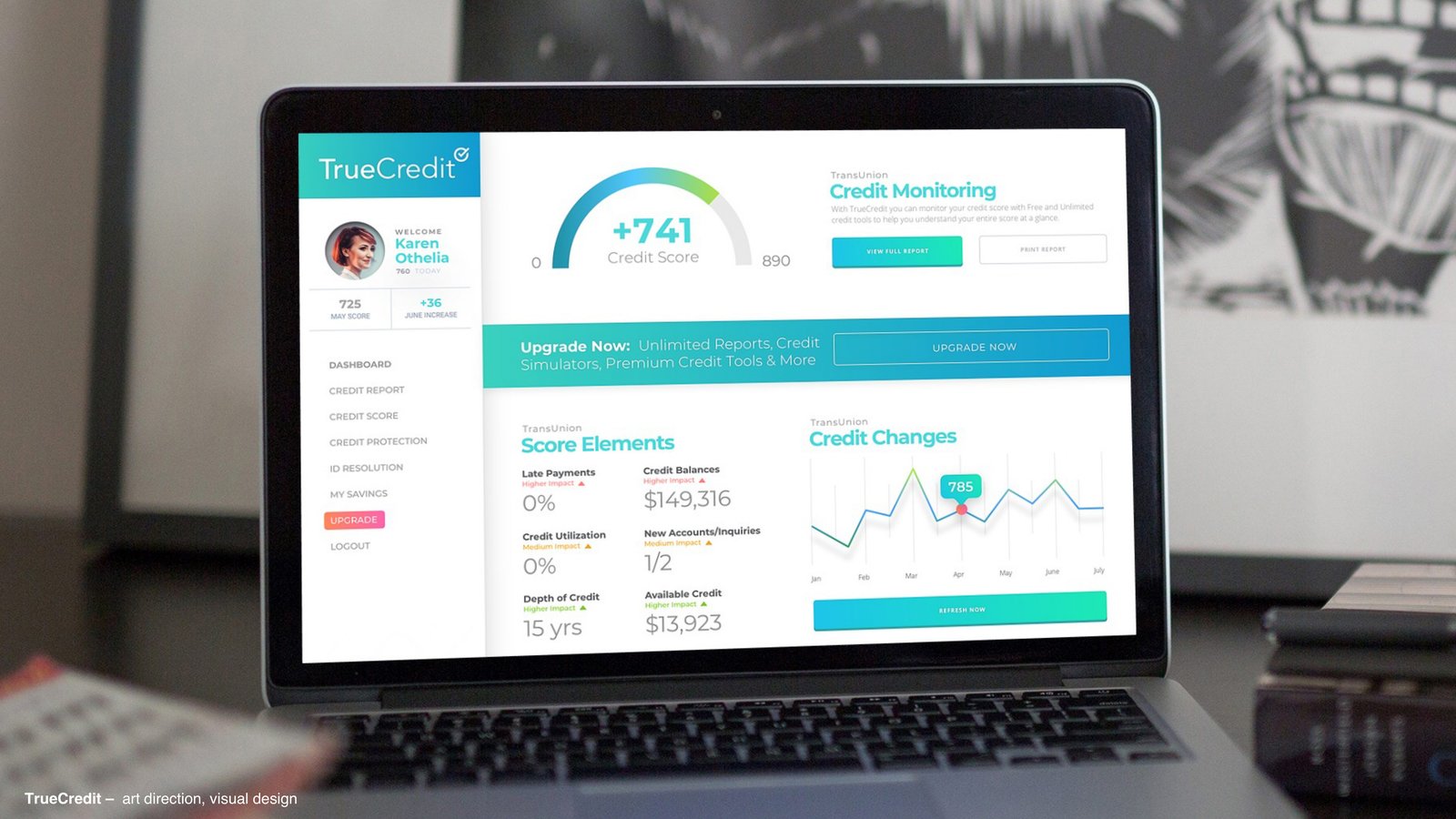
Credit data is some of the most anxiety-inducing content on the internet. TrueCredit needed a brand and product language that made a score feel like information, not judgment — friendly enough for a first-time user, precise enough to be trusted with $149,316 of credit balances.
02The Art of Possible
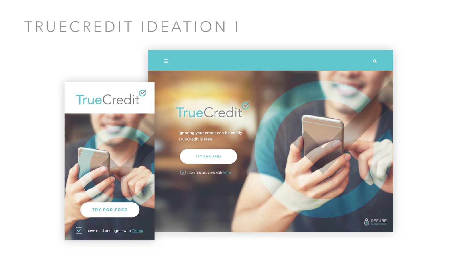
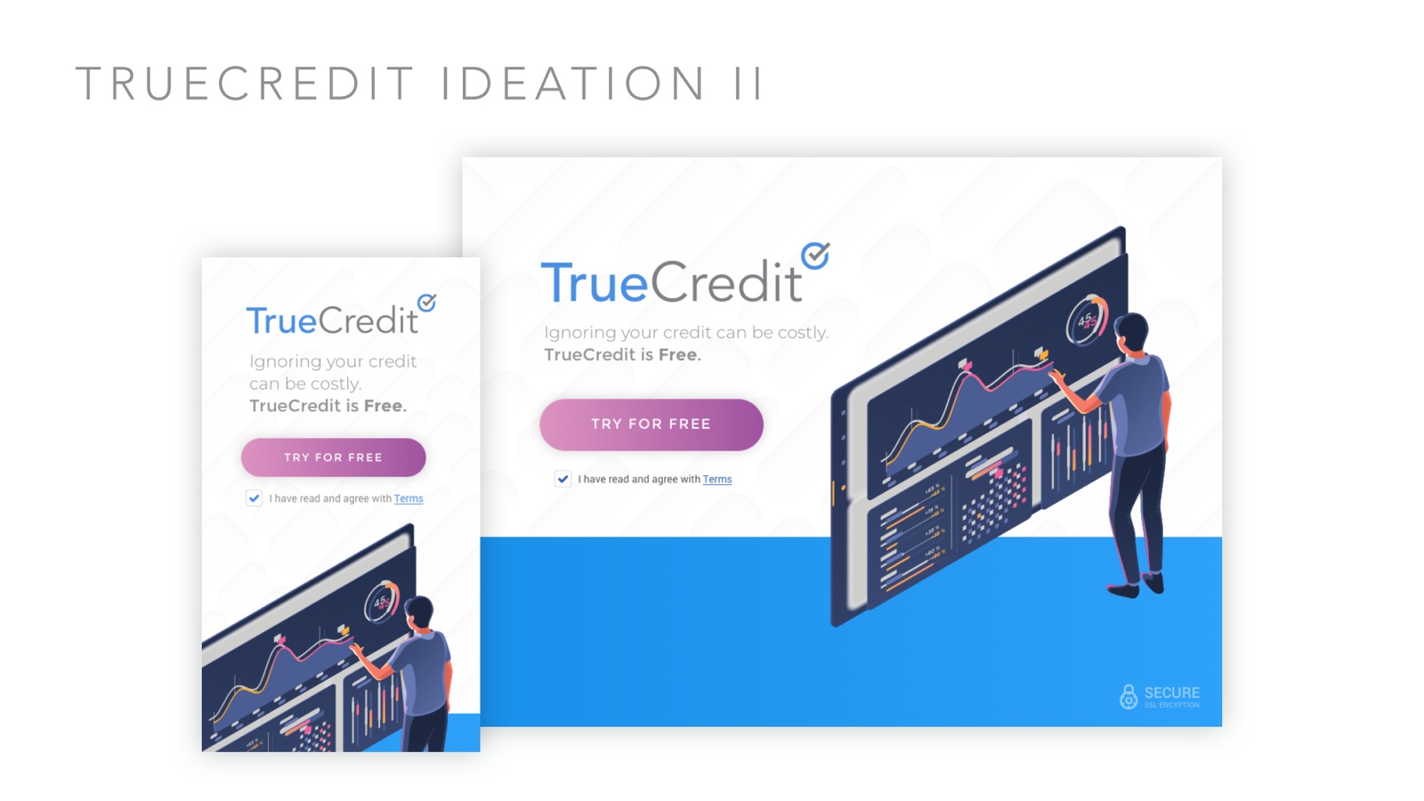
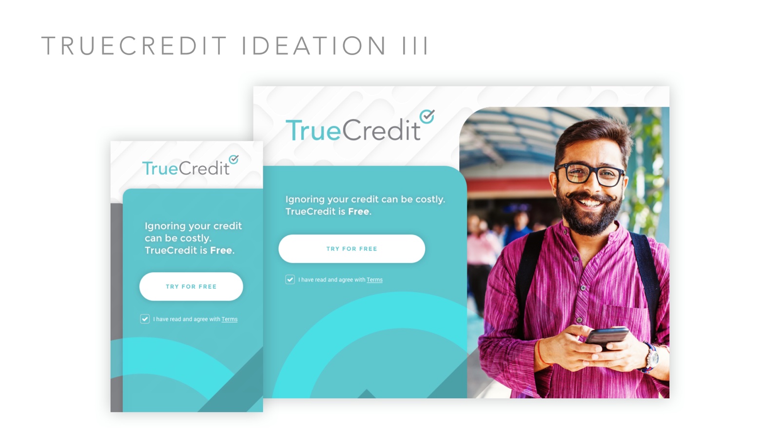
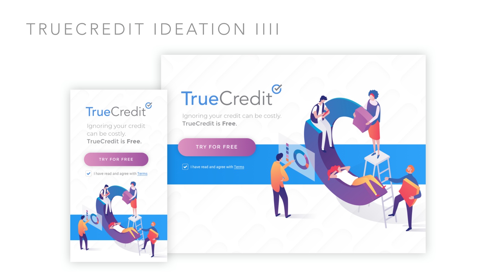
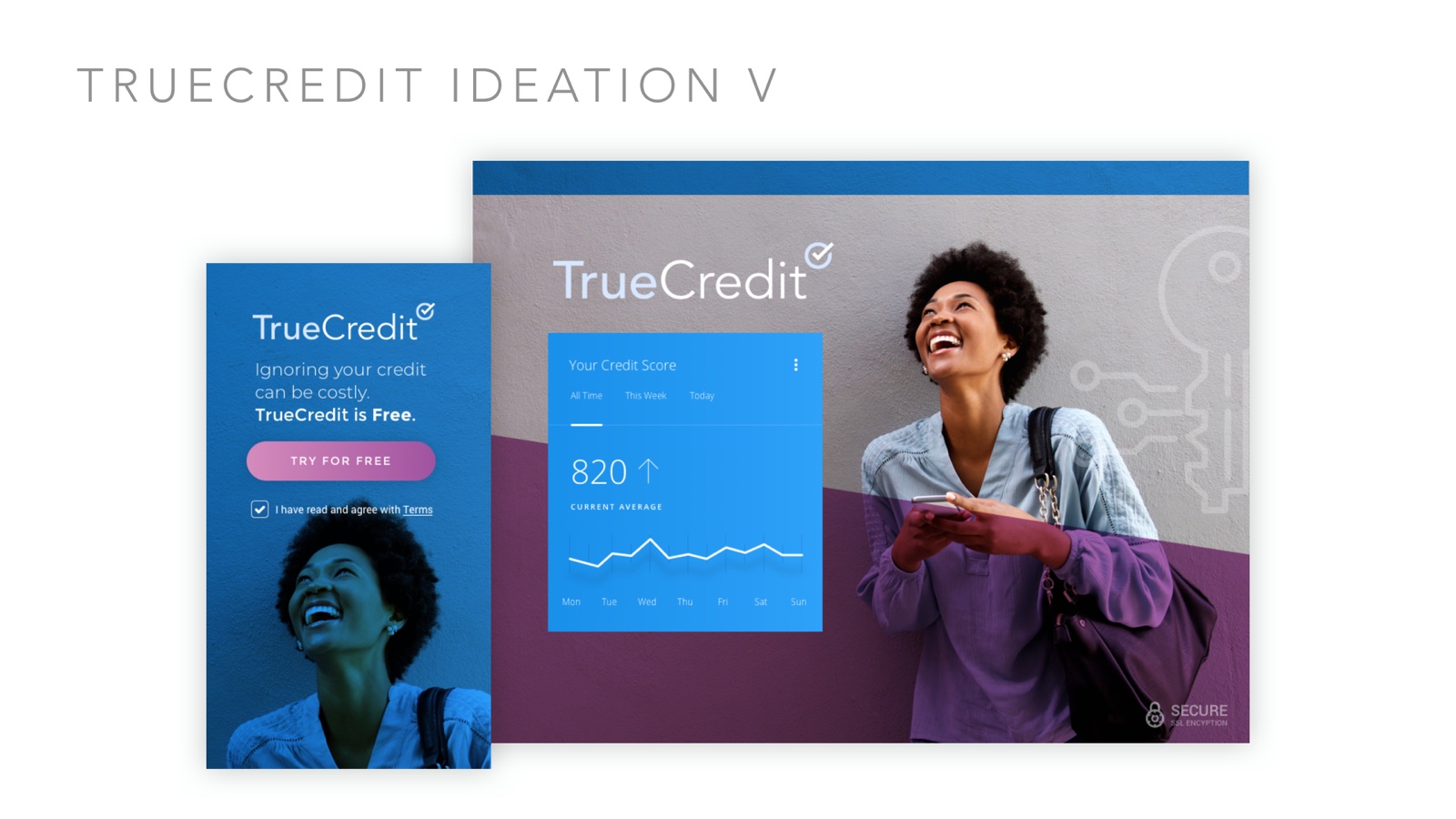
Five visual directions pushed the rebrand from safe to decisive — photography under brand marks, isometric illustration, saturated color fields — each carried across desktop and mobile before one was chosen.
03The Product
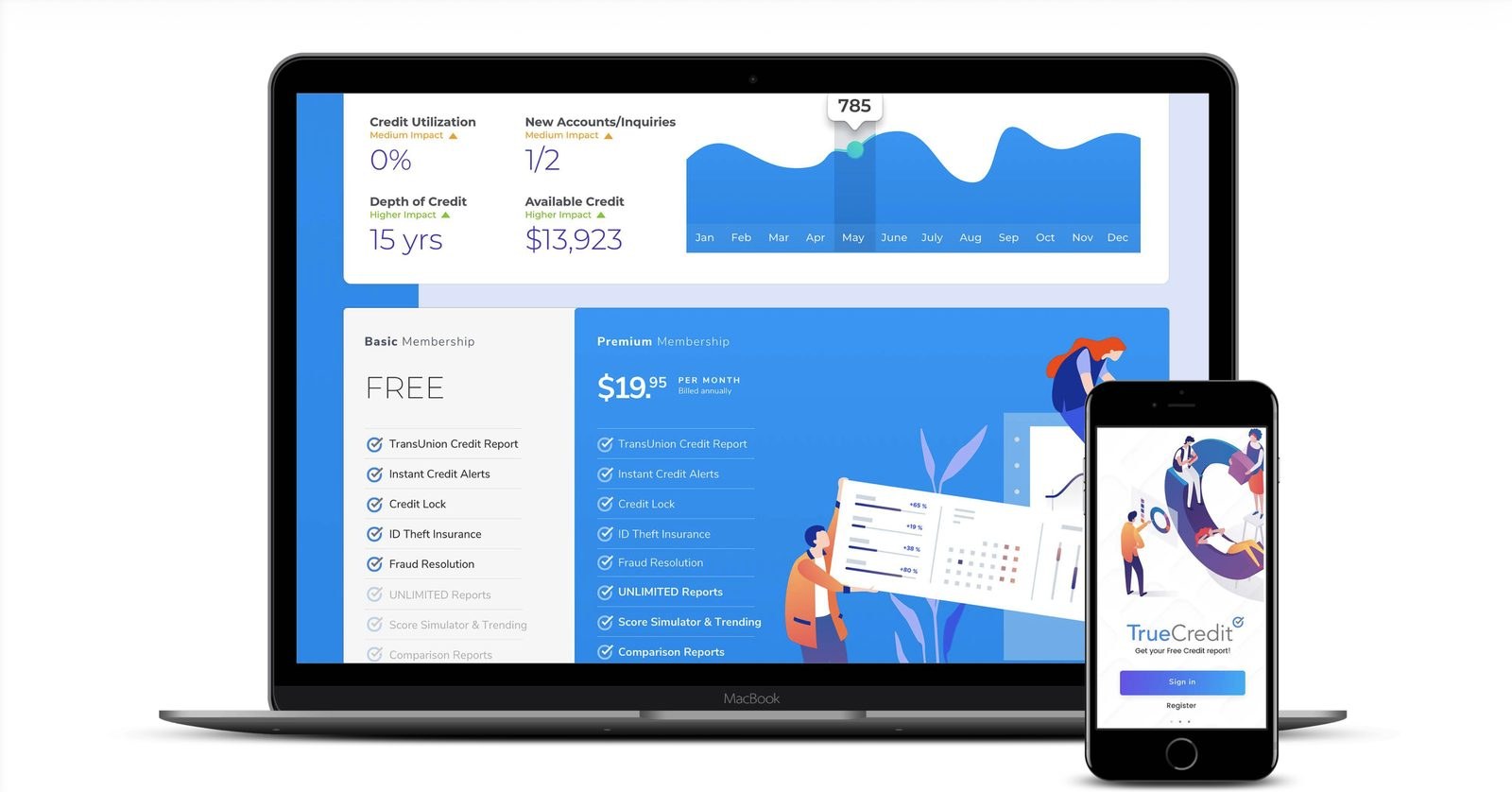
The chosen direction carried into the full product — walkthroughs and a credit calculator for first-time users, credit lock, reports, and theft alerts for daily monitoring, and a free-to-premium pricing path — every screen paired desktop and mobile from day one.
04The Outcome
A consumer credit product with a face people didn’t flinch at. Built on TUCM foundations, so the rebrand proved the system while the system carried the rebrand.
People flinch at credit data. Clear hierarchy and plain numbers are what let them believe it.
Typefaces cast to match — Rotis, Flux, Cosmos, Barmeno
31
Page presentation, strategy through mockup
1
Identity a growing firm could scale into
01The Brief
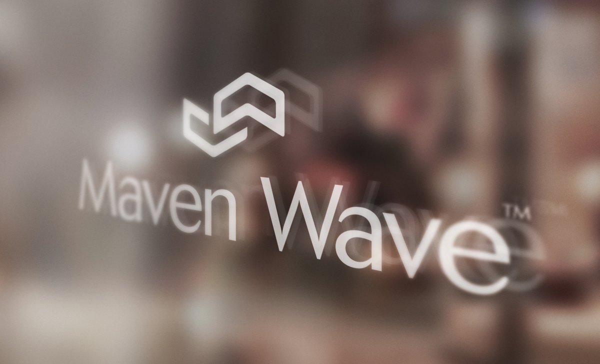
Maven Wave needed a visual brand that could hold a hard middle ground: professional, high-quality, innovative, likable, and smart — a traditional consulting firm on one side, a cloud brokerage and technology firm on the other. The identity had to represent real capability and leave room to grow.
The presentation opened by teaching the client how to judge a logo — Paul Rand, the Citi case study, and the rule that a mark earns meaning by association: simple, memorable, timeless, versatile, appropriate.
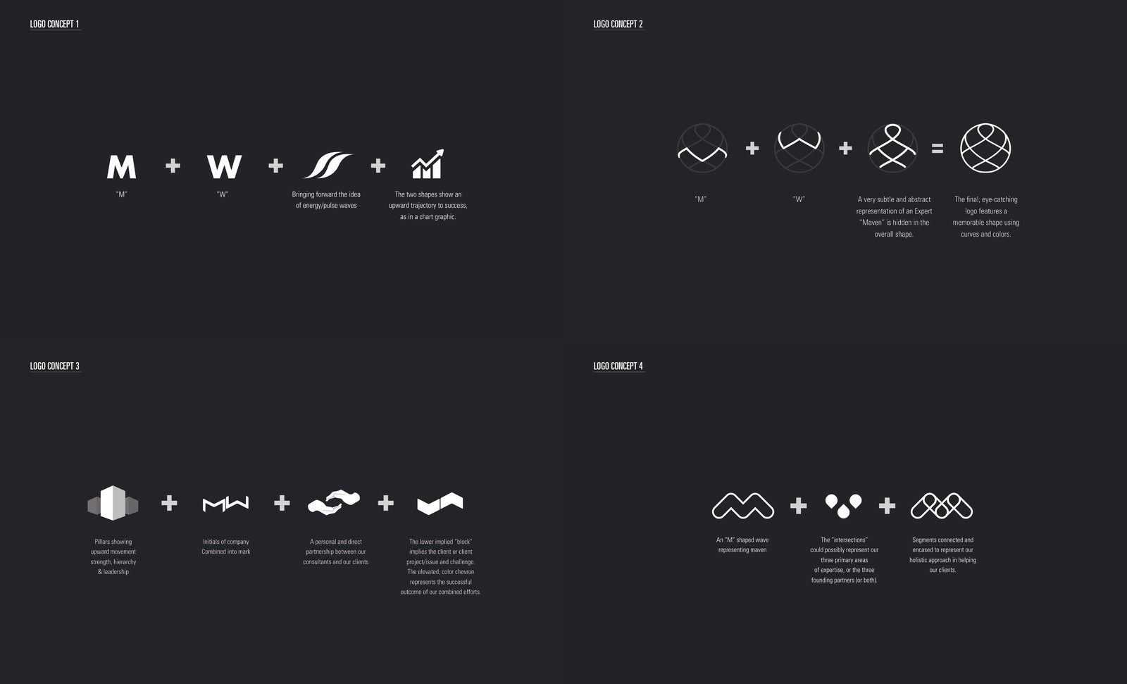
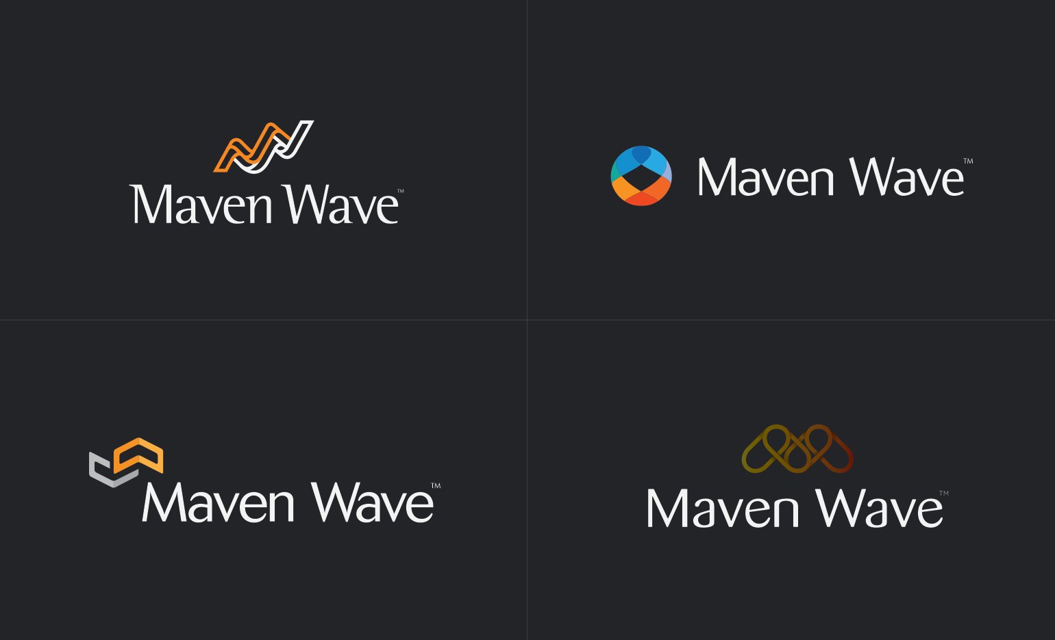
02Four Directions
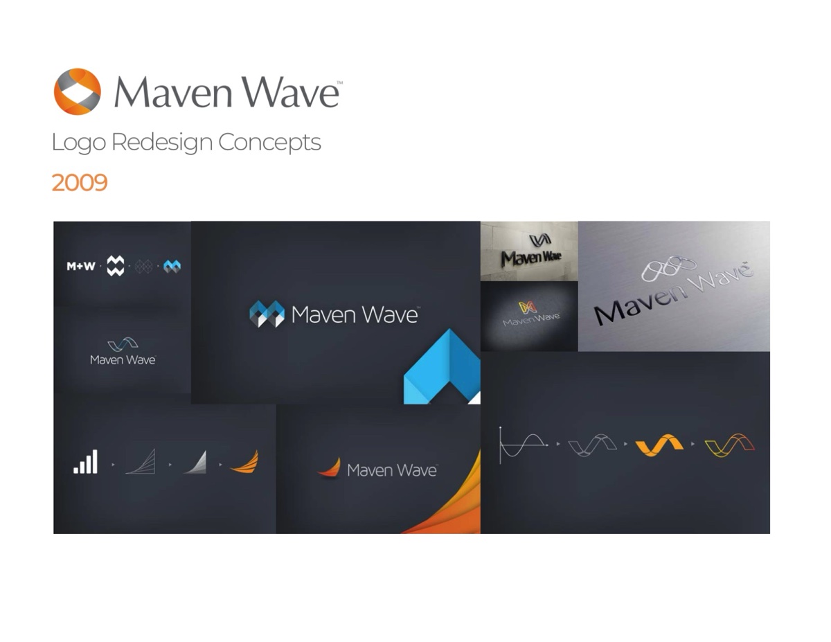
Each concept was built as a complete system, not a sketch — construction logic, mark, lockups on light and dark, a typeface cast to match the personality, and a physical mockup to make it real.
The ribbon wave — M and W woven into a rising pulse, set in Rotis Semi Serif. The flux sphere — motion and orbit, with its own modern grotesque. The chevron cube — an expert’s M built from dimensional planes, set in Cosmos. The loops — interconnection between consultants and clients, set in Barmeno.
03The Outcome
Four directions, presented as one argument about what a brand is for. The lineup gave Maven Wave a real decision to make — mark, voice, and material presence together — and the firm carried its identity into becoming one of Google Cloud’s premier partners, later acquired by Atos.
A logo derives its meaning from the quality of what it symbolizes — the deck taught the principle, then proved it four ways.
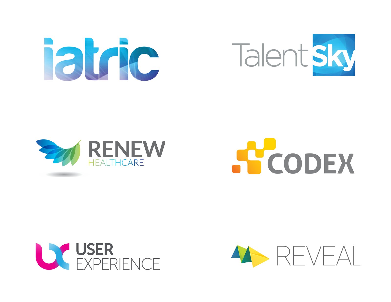
Two decades of identity work in one place: software, healthcare, finance, staffing, manufacturing, and print, each mark built to survive a business card and a billboard alike.
RoleIdentity Designer — concept through final artScopeMarks · Wordmarks · Naming support · Vector finals
20
Marks shipped, shown as delivered
9
Industries, one discipline
17yr
Span of the collection
1×
Rule — legible at 16 pixels
01The Discipline
A logo derives its meaning from what it symbolizes — the job is a mark that is simple, memorable, timeless, versatile, and appropriate, then getting out of its way. These twenty are shown as delivered: no mockup theatre, just the marks.
02The Marks
All marks designed by Mikel Rosenthal for their respective clients. Trademarks belong to their owners.
Freelance · Artisan Edibles · 2021
Spacelab Brand & Packaging
A confections brand built from a blank page: naming, identity, and a packaging system that held one language across boxes, tins, and jars.
RoleCreative Direction · Identity · Packaging — FreelanceScopeNaming · Logo exploration · Brand system · Packaging lineStackIllustrator · Photoshop · dielines & mockups
20+
Names explored, lockups drawn for each
38
Page brand exploration deck
1
Name that said it all — Spacelab
4
Package formats, one visual language
01Naming — The Wide Net
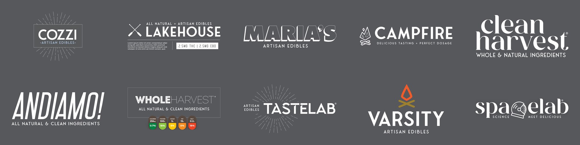
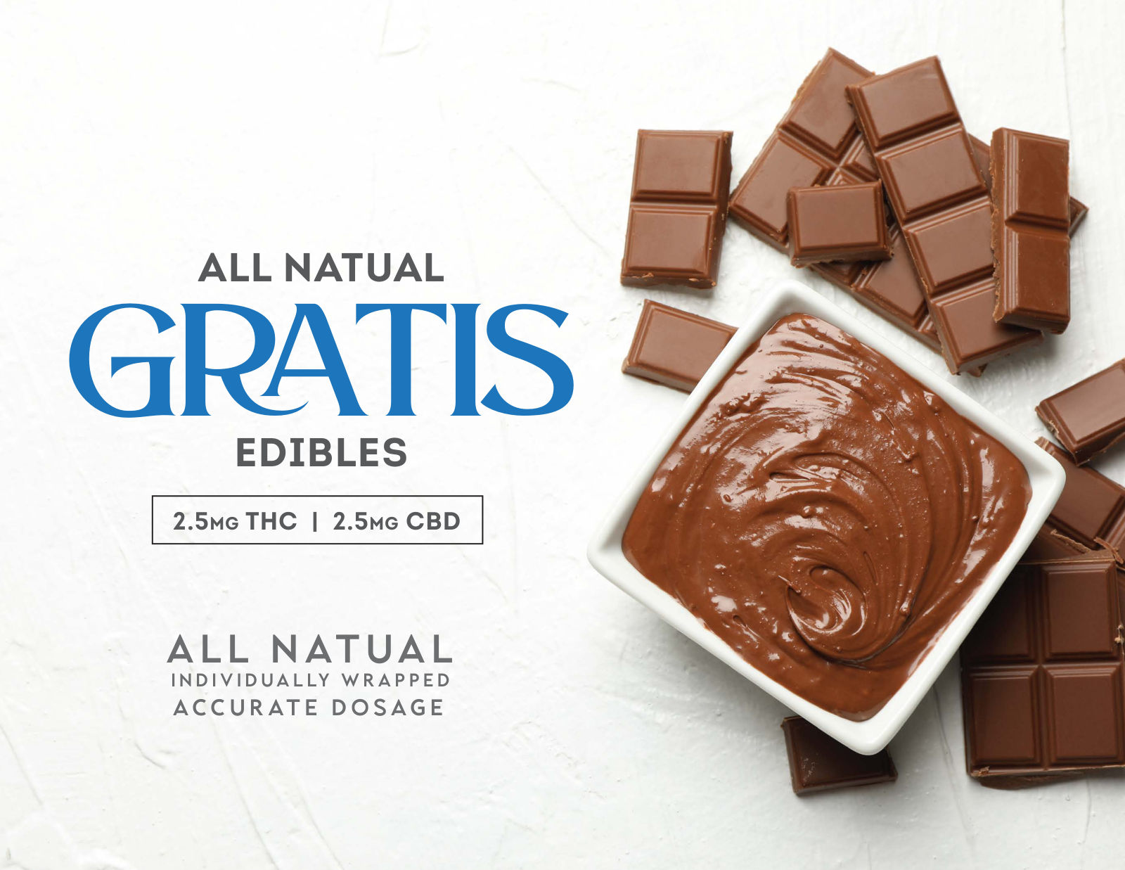
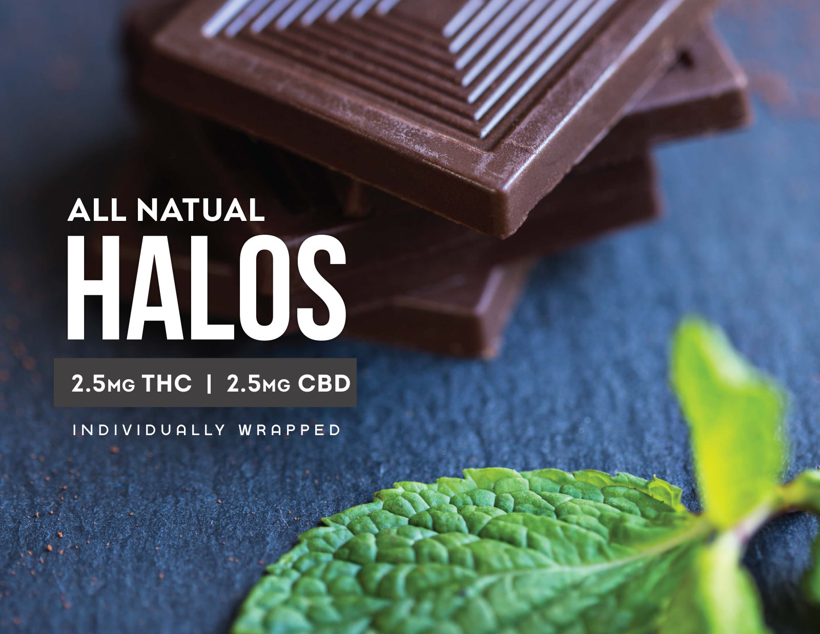
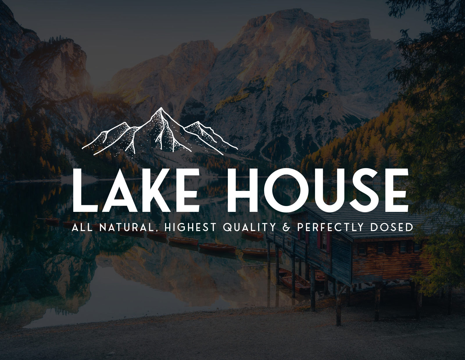
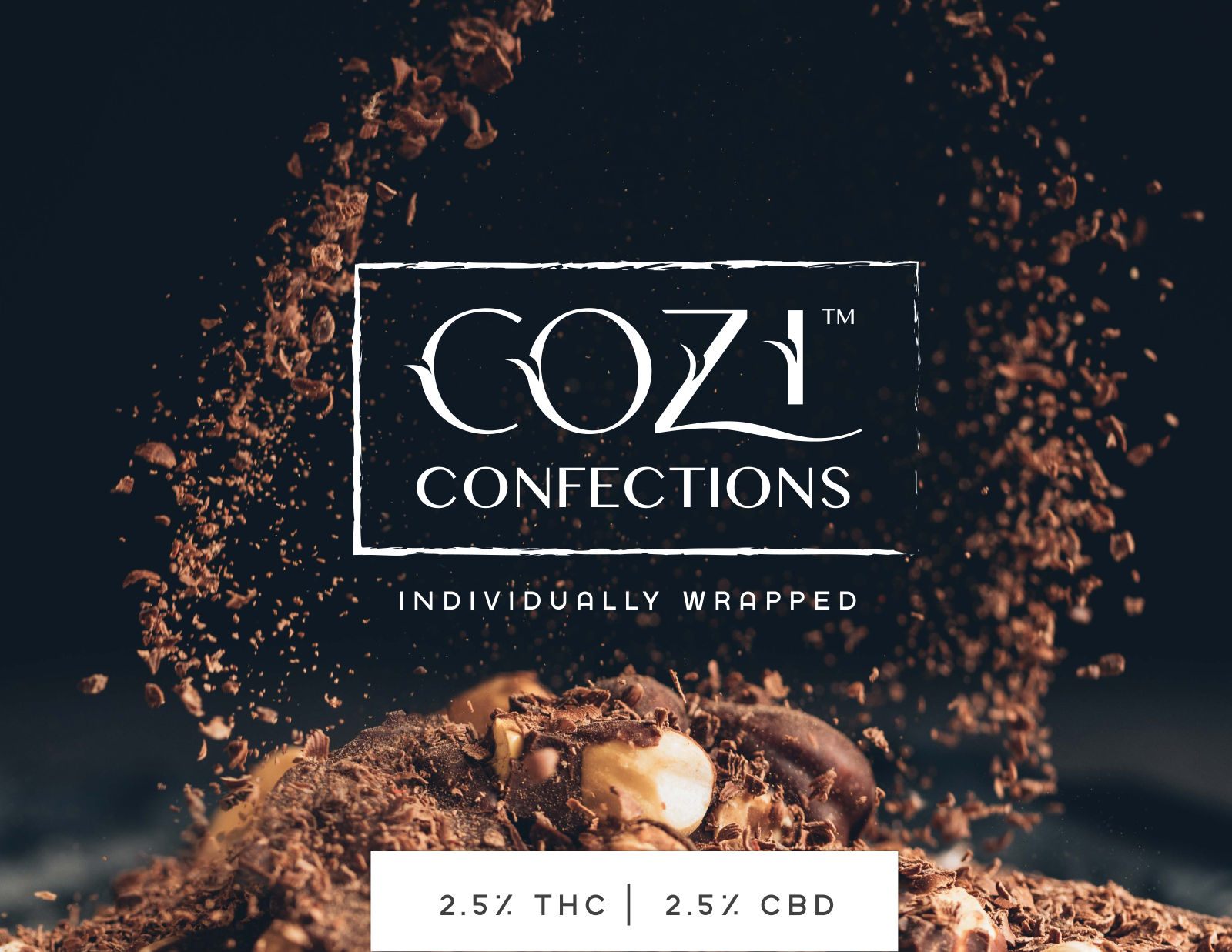
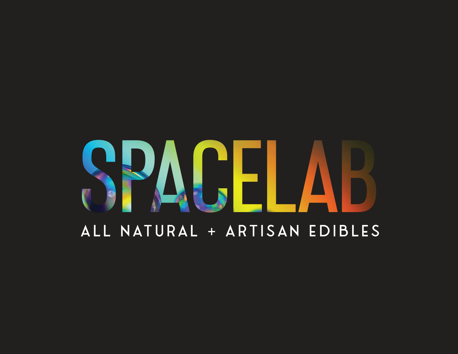
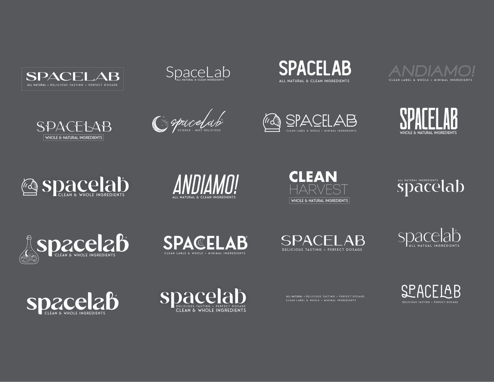
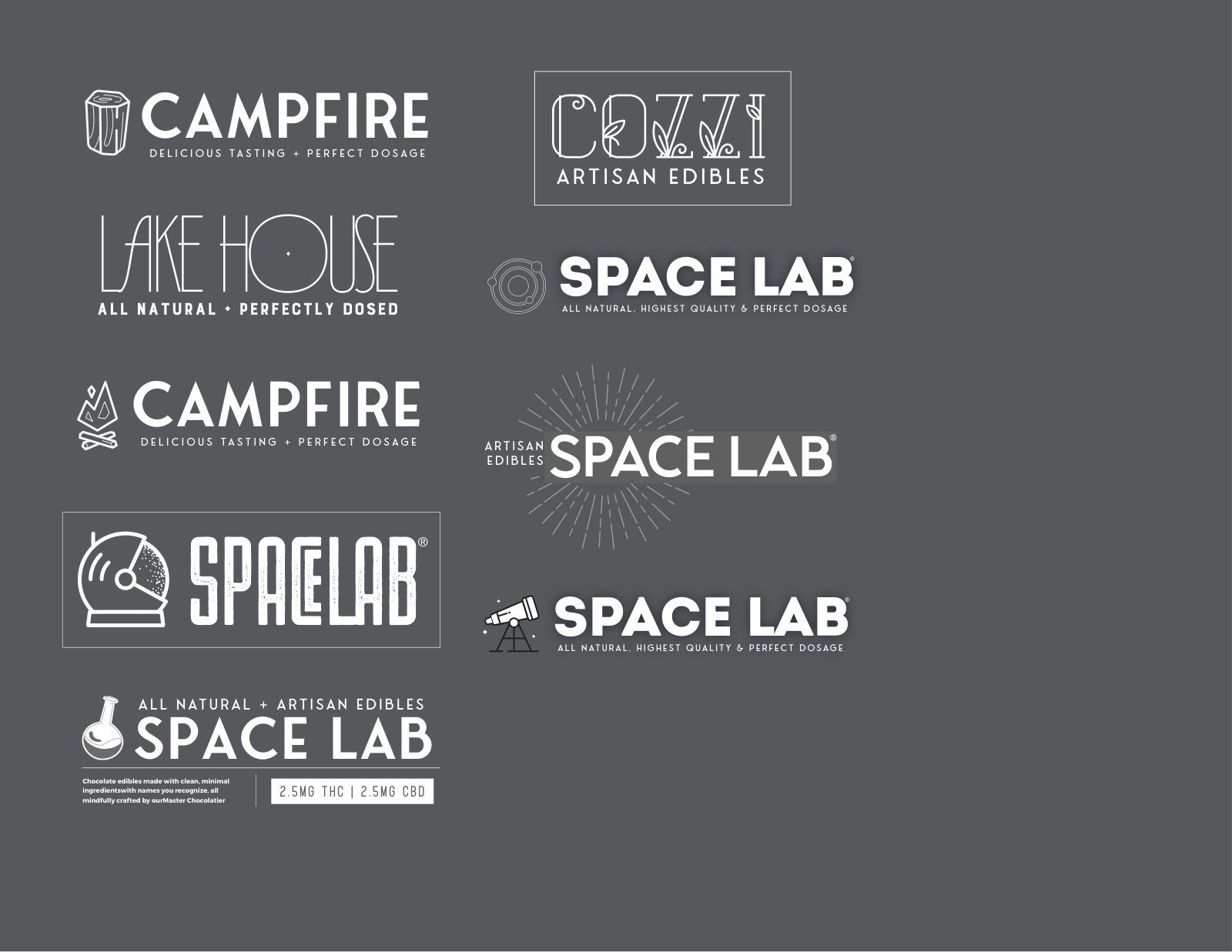
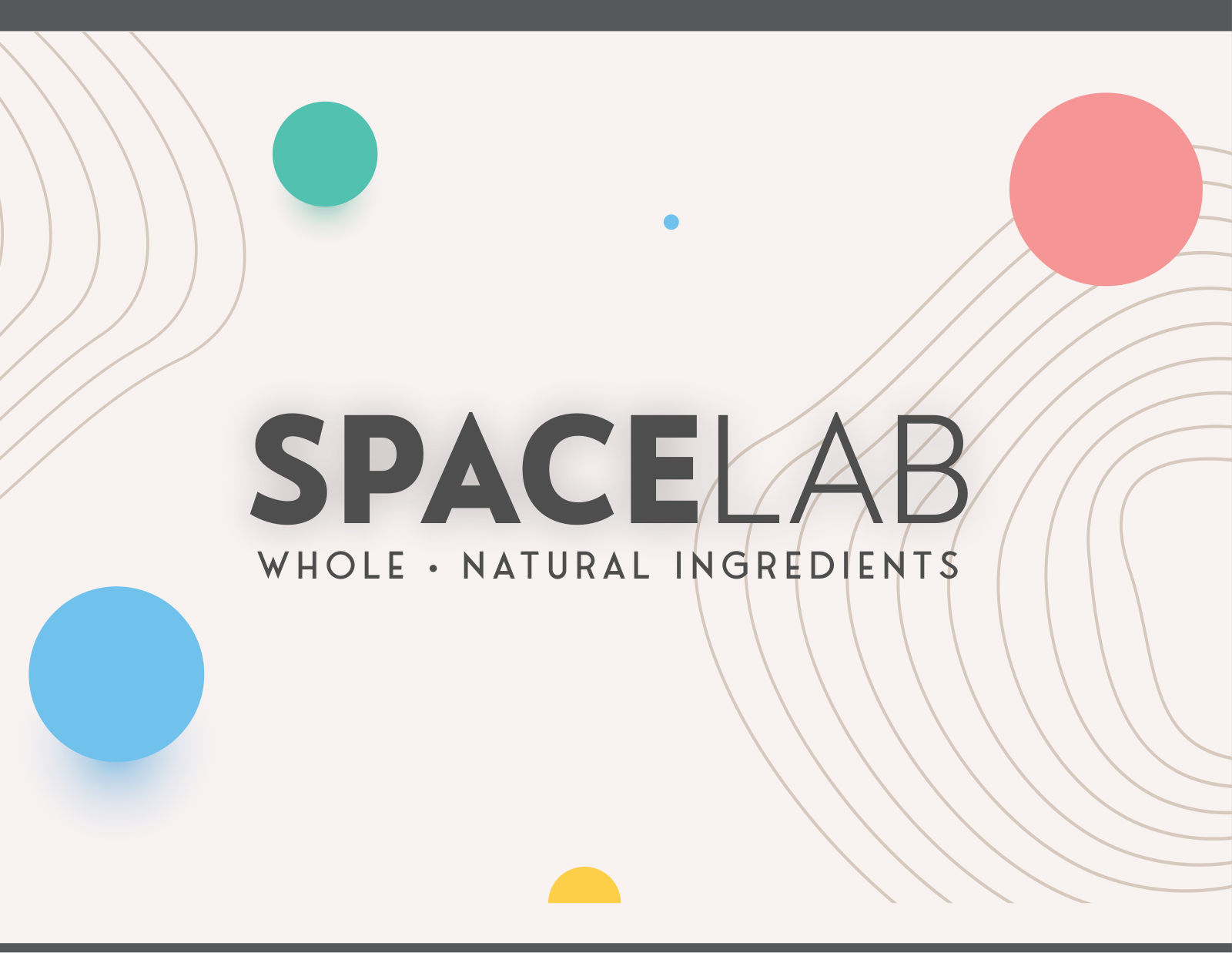
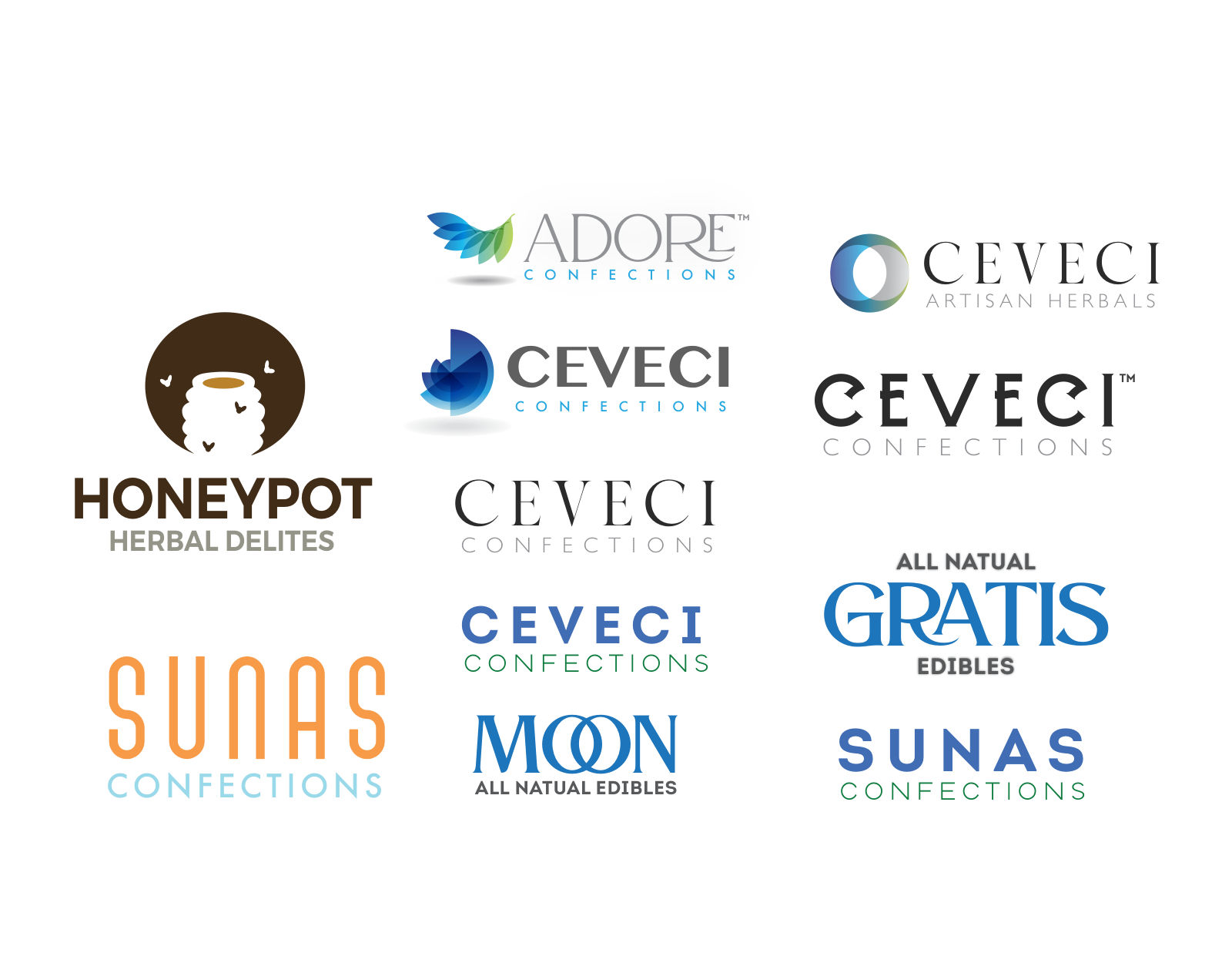
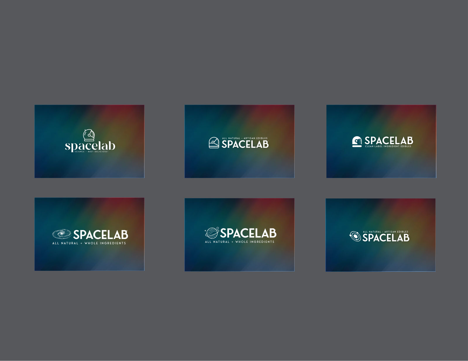
Before a mark, a name. The exploration ran wide on purpose — Cozzi, Adore, Halos, Lake House, Campfire, Clean Harvest, Tastelab, Varsity and a dozen more — each drawn as a real lockup and staged in context, because a name can only be judged wearing its typography.
Ten of the twenty names, each drawn as a finished lockup
02The Mark
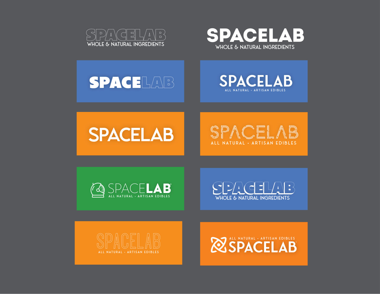
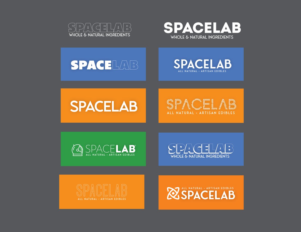
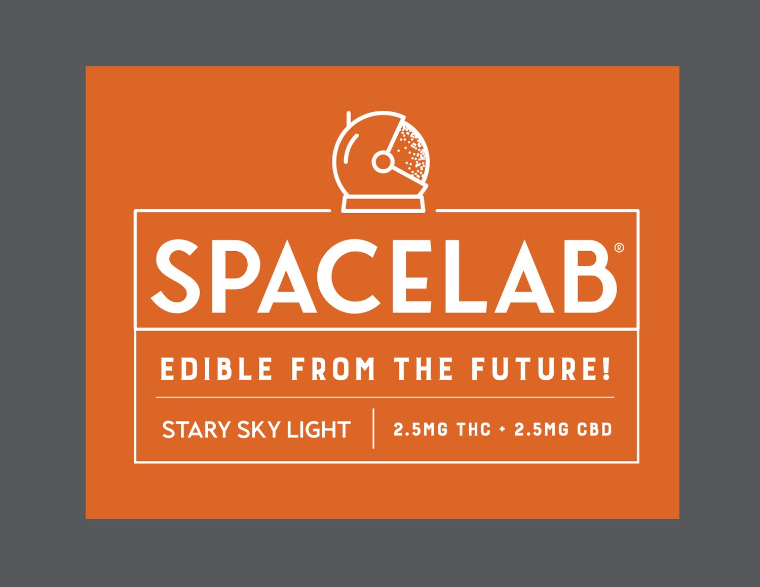
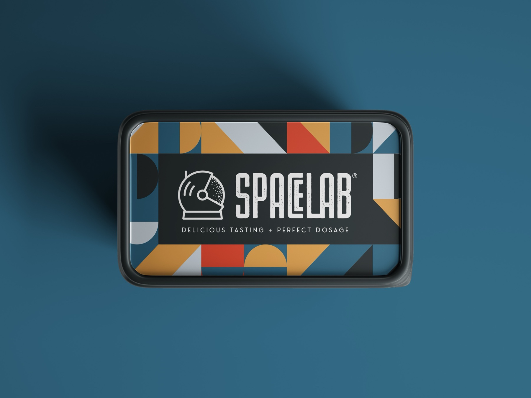
Spacelab won because it carried the promise: science meets delicious — precise dosage, playful spirit. The astronaut-helmet mark and stencil-cut wordmark held up from a foil stamp to a storefront, and the system flexed from lab-clean white to deep-space color.
03The Packaging System
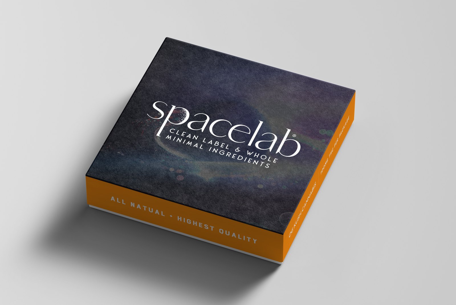
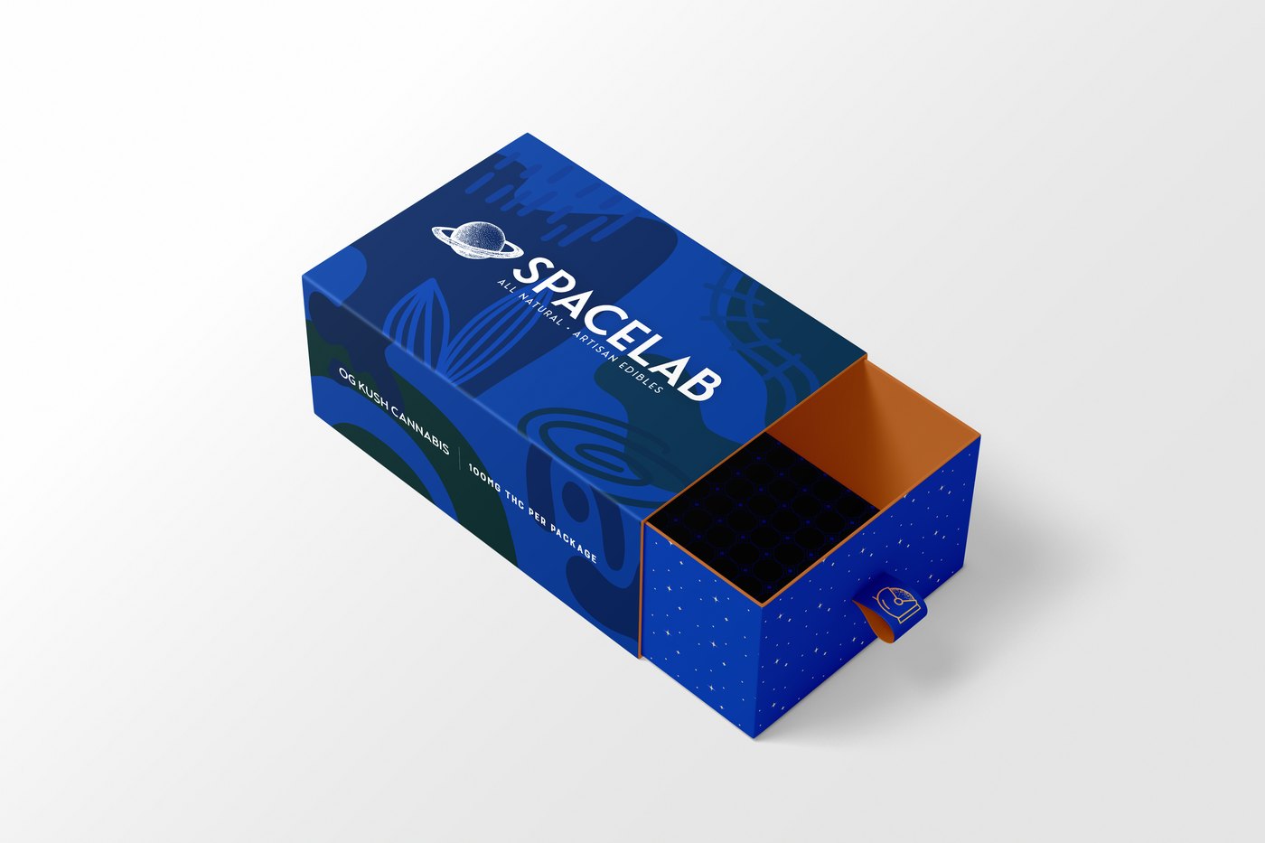
The mark had to survive every format the line would ship in. One celestial artwork language — star fields, orbital arcs, the helmet — carried across drawer boxes, square boxes, tins, and jars, with the wordmark and its clean-label line holding the same position on every face.
One structure, many colorways. The same drawer box, re-skinned: midnight blue for the core line, burnt orange for the seasonal. Structure, type, and lockup never move — only the field behind them.
Down to the small formats. Tins and jars get the same treatment at a fraction of the surface — the test any identity has to pass.
And a second artwork direction. Running alongside the star fields: flat geometry — half-circles, wedges, and triangles in ochre, slate, and red. Same helmet, same black label bar, same rules. It became the face of the line.
04The Outcome
A complete shelf presence from nothing — name, mark, system, and packaging line speaking one language. The exploration deck did its job twice: it sold the direction, and it documented every road not taken.
A name can only be judged wearing its typography — so every candidate got dressed before the vote.
Independent freelance engagement. Client details generalized per confidentiality.
Self-Initiated · Information Design · 2016
Google Information Dashboard
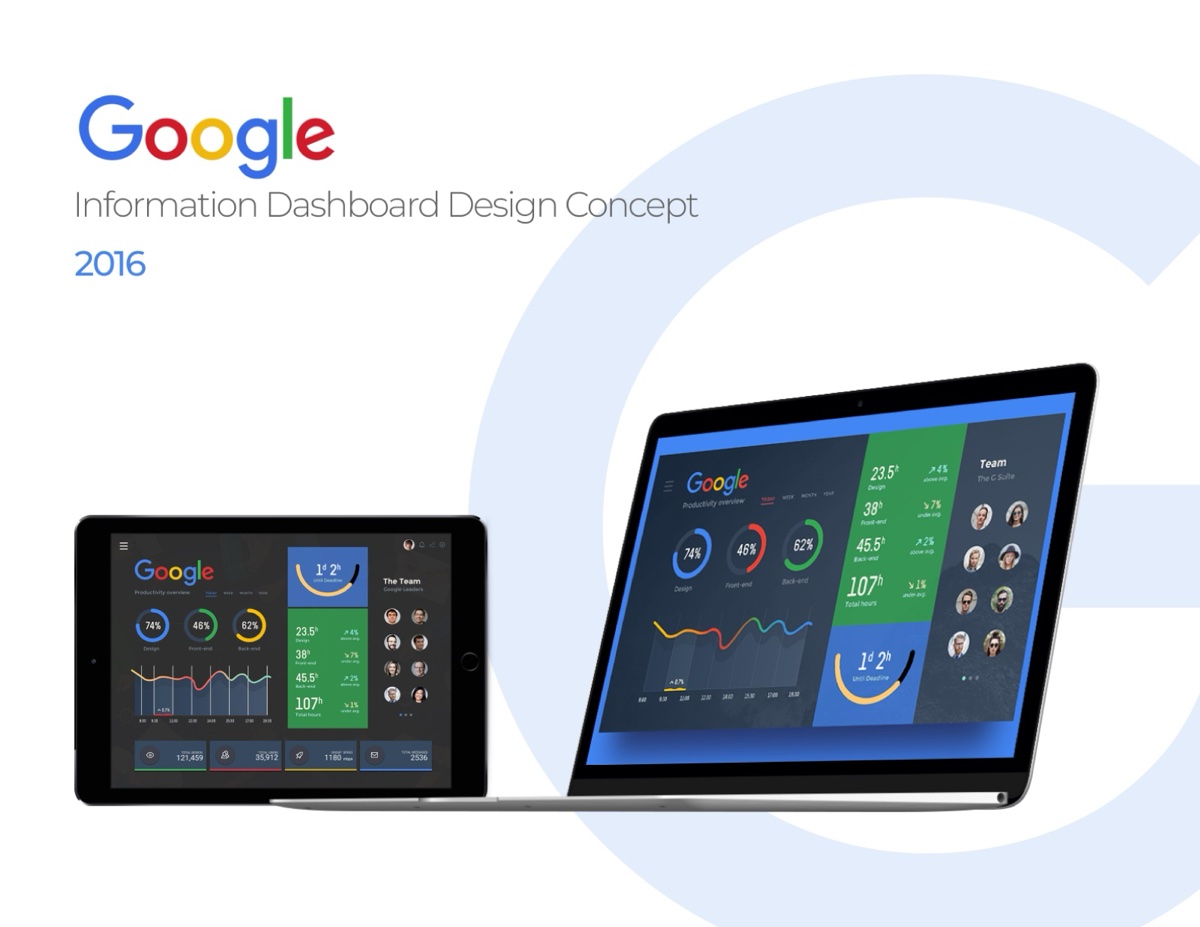
A self-initiated study in taming information density — one dashboard surfacing search, analytics, and account signals in a single calm view.
The brief was self-set: what would a Google-grade information dashboard look like if density were treated as a design material instead of a problem? The design works in cards and charts with strict hierarchy: green-to-blue status language, generous counters, and data visualization that reads at a glance on desktop and tablet.
02The Takeaway
Nobody asked for this one. It still shapes how I draw charts today.
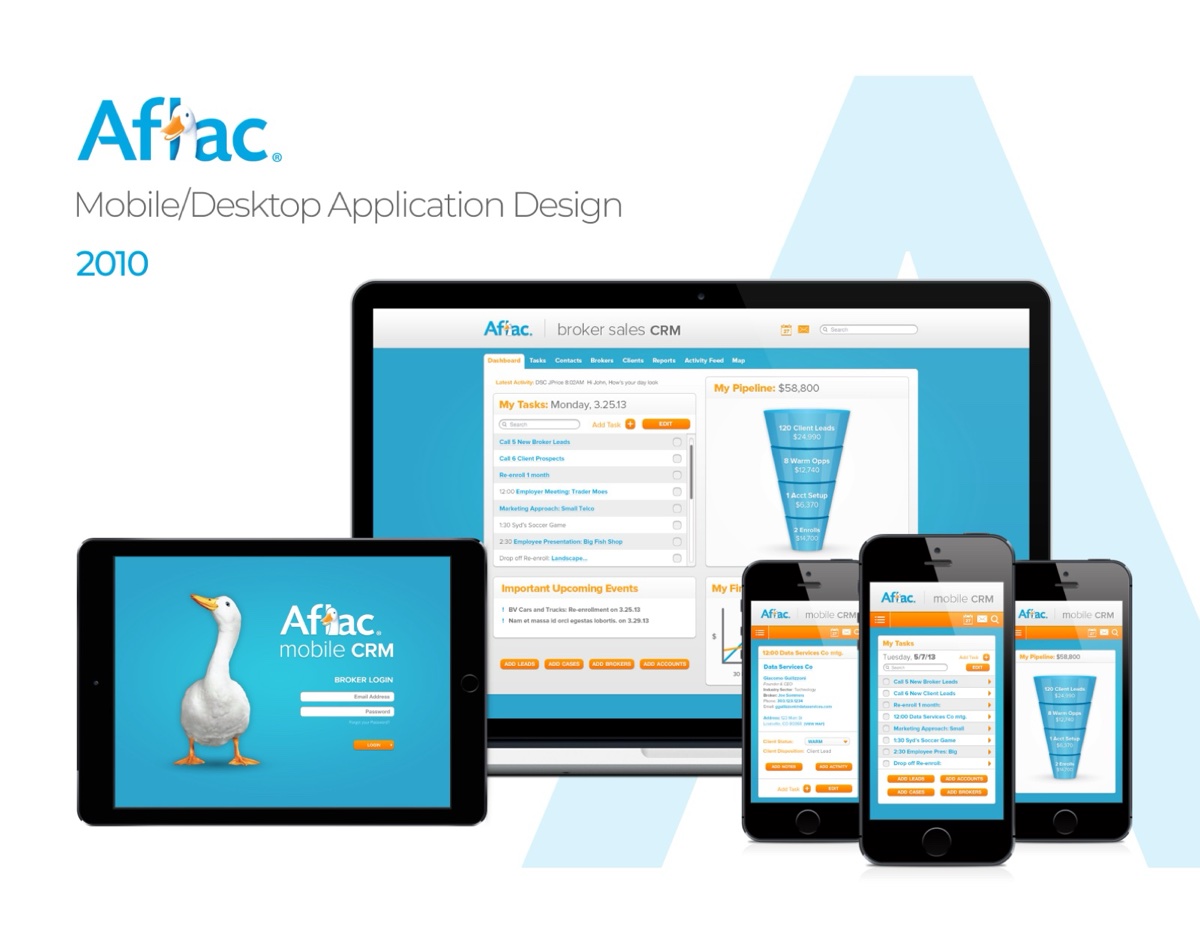
In 2010, putting a full client-relationship tool in an agent’s pocket was the frontier. The design paired a desktop workspace with a companion mobile app: policy lookups, claim status, and client management in a visual language matched to one of America’s most recognizable brands.
02The Takeaway
Early proof of a habit that stuck: understand the workflow first, then pick the device.
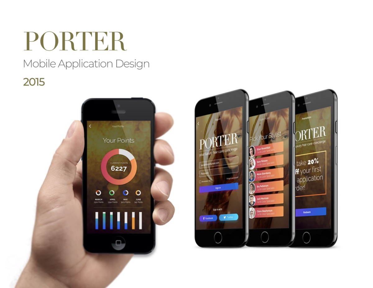
Porter treated hair care as a luxury service, and the app had to feel like the lobby: warm photography, disciplined type, and a booking flow with zero friction. The interface put stylists and products a tap away while keeping the brand’s premium hush intact.
02The Takeaway
The screens stay quiet on purpose. The service is the luxury; the interface just holds the door.
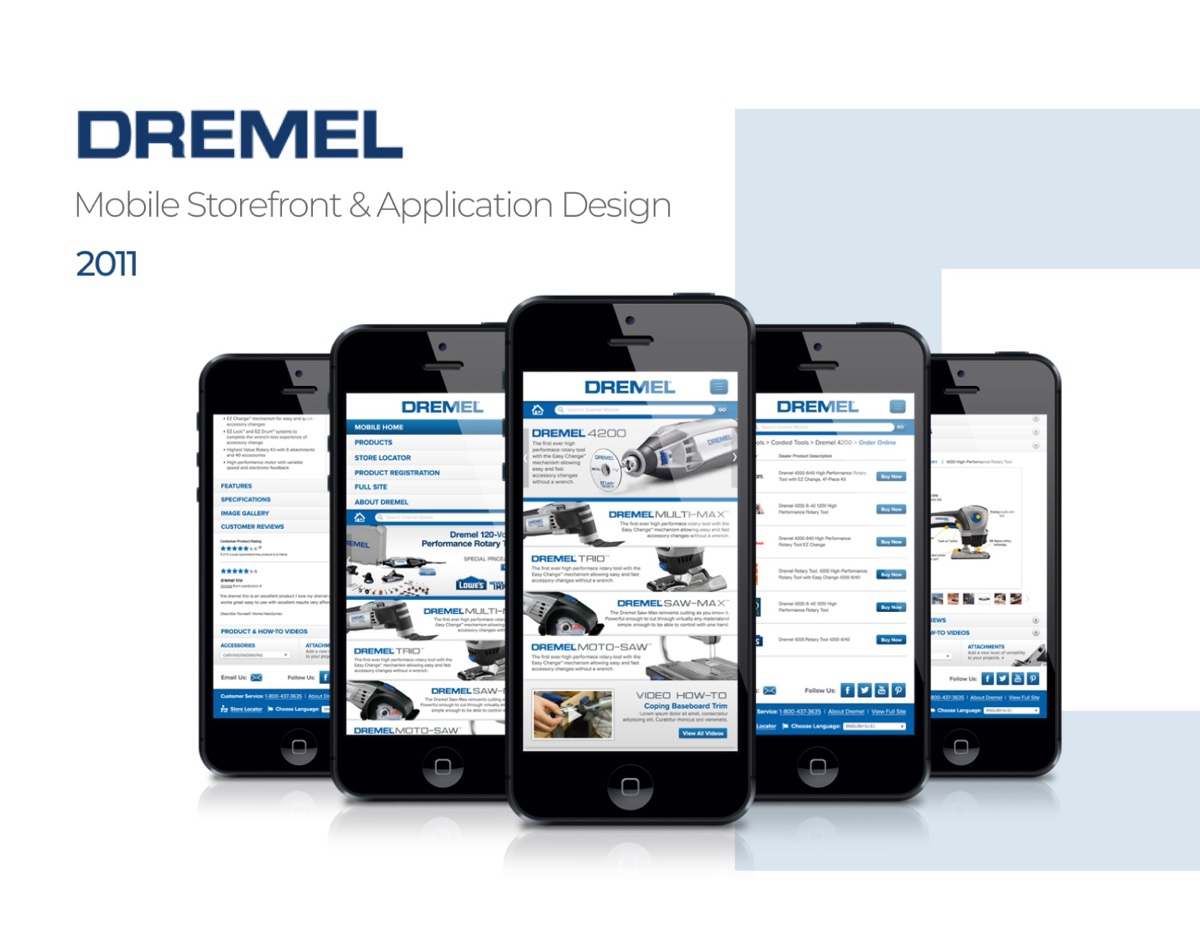
Years before responsive frameworks made it routine, this storefront put Dremel’s full tool and accessory catalog on the phone — browsing by project as much as by product; makers start with the thing they want to build.
02The Takeaway
Letting people shop by project instead of spec turned out to matter well beyond tools.
Identity and interface shipped as one system: a sharpened mark, a site rebuilt around it, and product screens that inherited the same geometry and palette — so the brand didn’t stop at the marketing page.
02The Takeaway
Plenty of rebrands stop at the marketing page. This one carried through to the login screen.
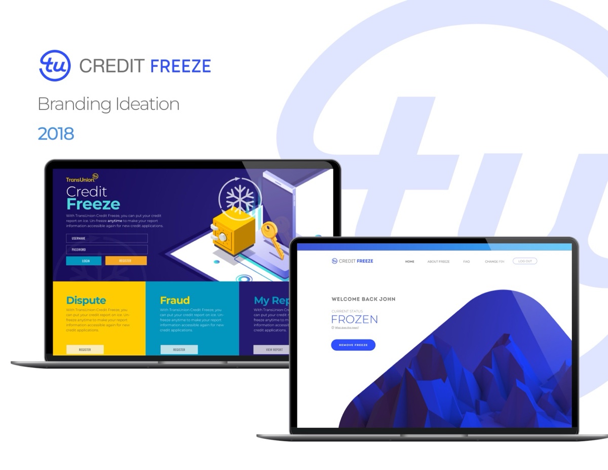
After 2017’s breach era, freezing your credit went from an obscure safeguard to a mainstream act. This ideation explored how a freeze product could look approachable instead of bureaucratic — friendly geometry, clear states, and a visual temperature that says protected, not punished.
02The Takeaway
Security products need to feel calm. The ideation aimed the whole brand at reassurance.
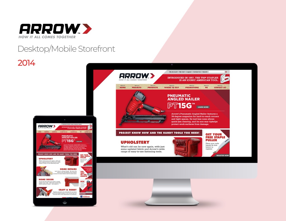
Desktop and mobile storefront for an American workshop staple — bold, red, and built to sell fasteners without fuss.
RoleUX / UI DesignerScopeE-commerce · Desktop + mobile storefront
01The Work
Arrow’s brand is industrial confidence, and the storefront leaned into it — big product photography, unmissable red, and a catalog structure that gets a contractor from need to checkout in as few taps as the hardware aisle has steps.
02The Takeaway
Contractors don’t browse. The design gets them from need to checkout and back to work.
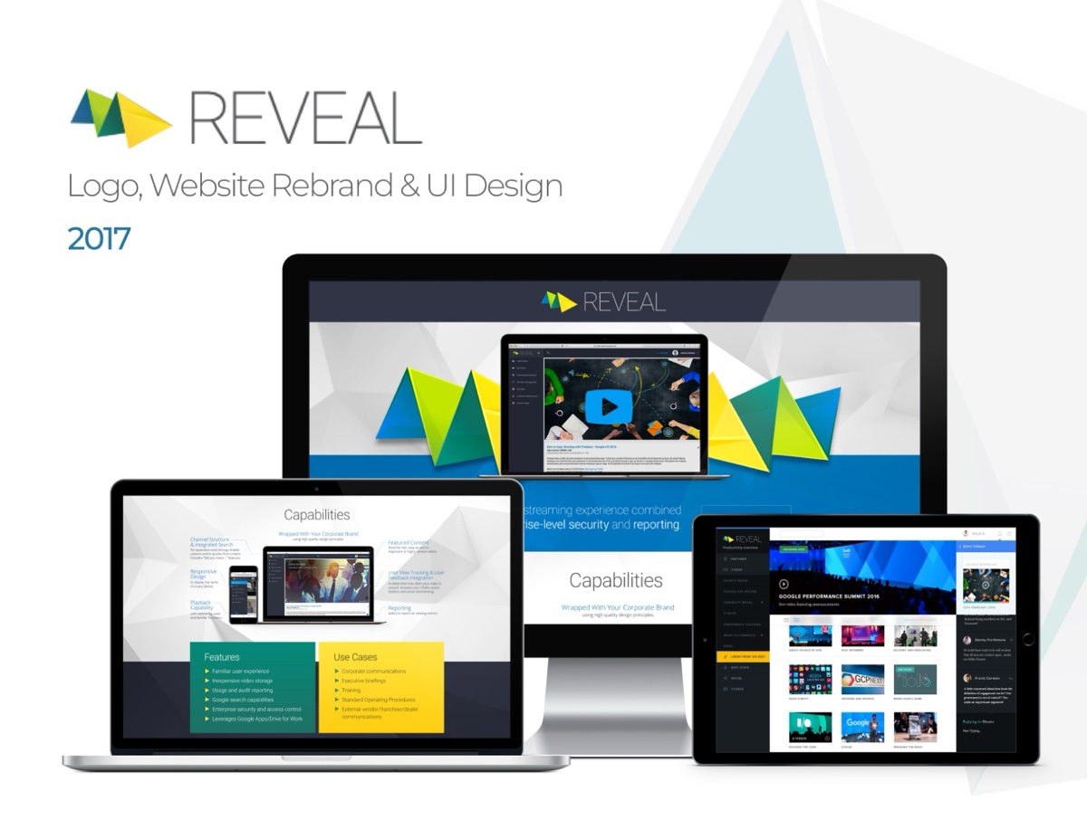
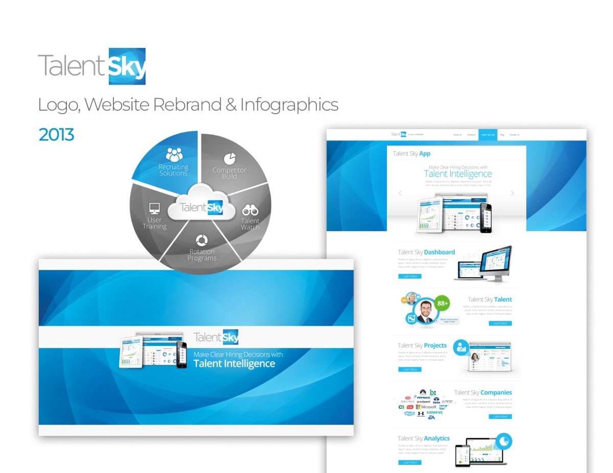
A startup selling a new idea needs its story drawn as much as written. The rebrand paired a fresh mark and site with a system of infographics that explained the skills network visually, charts and diagrams doing the elevator pitch’s heavy lifting.
02The Takeaway
When the product is a new idea, the infographic is the demo.
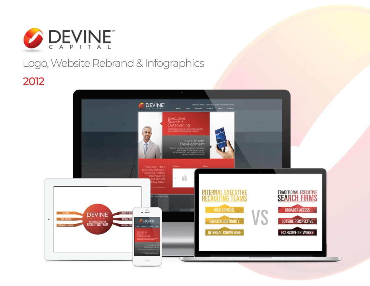
Financial services live or die on perceived competence. The rebrand gave Devine a composed mark, a site with unhurried typography, and comparison infographics that made complex offerings scannable.
02The Takeaway
In finance, restraint is the brand, so the design spent its energy on being believed.
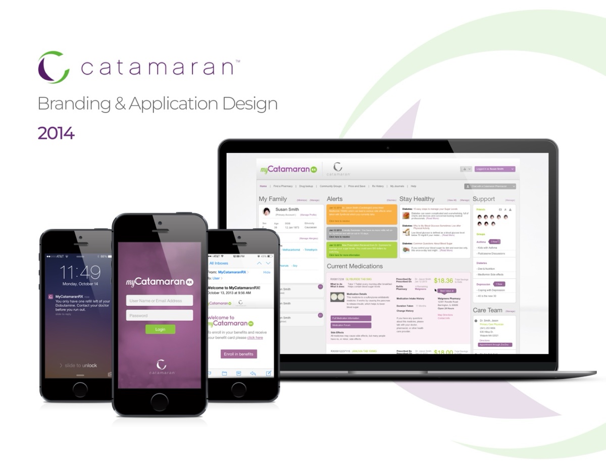
Branding and application design for a pharmacy-benefits member experience — prescriptions, pricing, and coverage without the insurance-speak.
RoleDesigner — brand & applicationScopeBranding · Mobile application · Health UX
01The Work
Pharmacy benefits are where healthcare complexity hits the wallet. My Catamaran translated it: refills, coverage, and cost transparency in an app with a friendly identity and screens a member could parse in a waiting room.
02The Takeaway
An early rehearsal for the healthcare systems that followed: plain language as a design requirement.
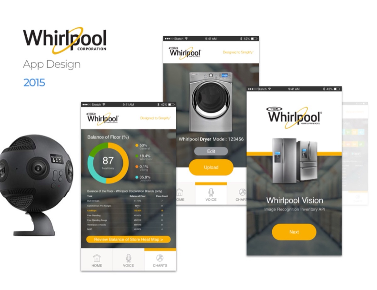
Before the smart home settled into platforms, Vision imagined the appliance as a teammate: cycle status, efficiency scores, and camera views in a companion app with Whirlpool’s trusted warmth rather than gadget cool.
02The Takeaway
The appliance already had the data. The app’s job was making it feel domestic.
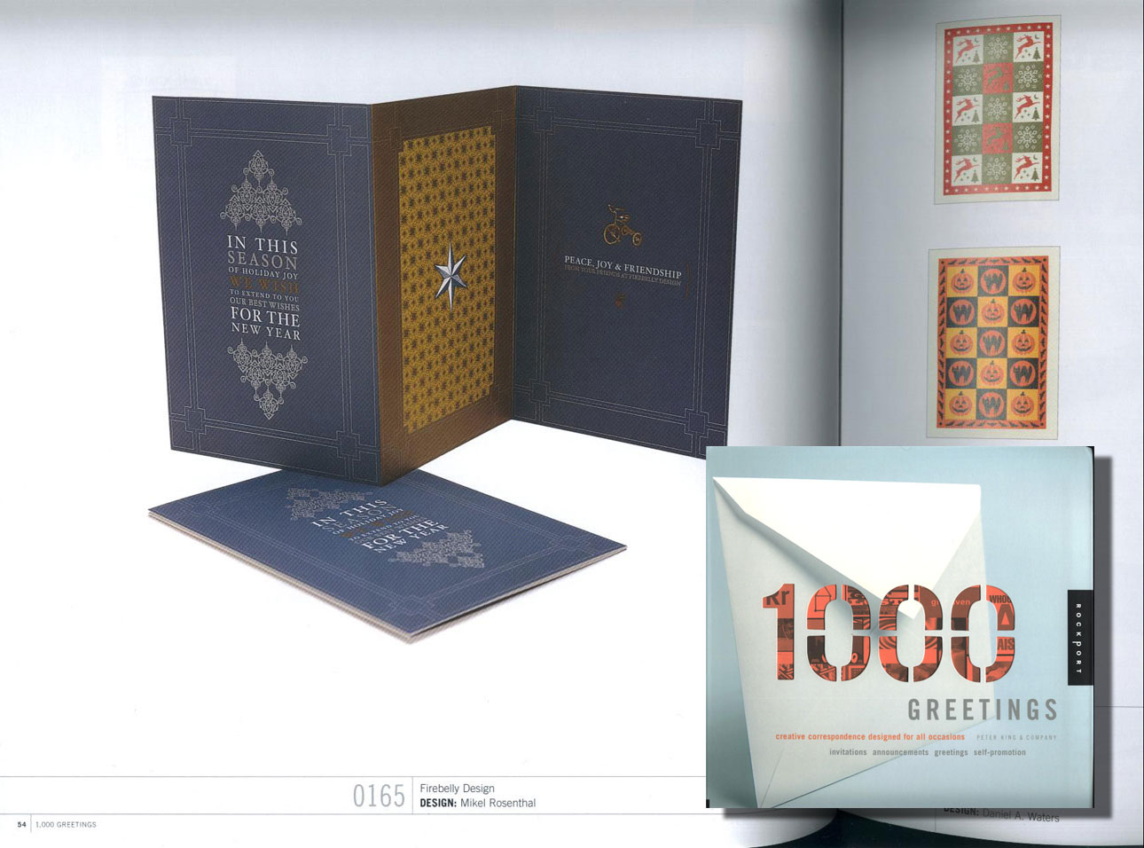
Holiday correspondence design published in the 1,000 Greetings collection — foil, pattern, and letterpress-era craft, in print for good.
RoleDesigner — credited, Firebelly DesignScopePrint · Greeting design · Published work
01The Work
The 1,000 Greetings anthology collects standout correspondence design from studios worldwide. This holiday suite of navy, ornament pattern, and metallic accents made the cut, credited under Firebelly Design with design by Mikel Rosenthal.
02The Takeaway
Print is the one medium with a spine. This work sits on shelves, not servers.