PRISM
Psychometrics
Leading end-to-end design of the PRISM™ psychometric platform — complex behavioral analytics translated into dashboards, mobile experiences, and a modular UI framework people actually act on.
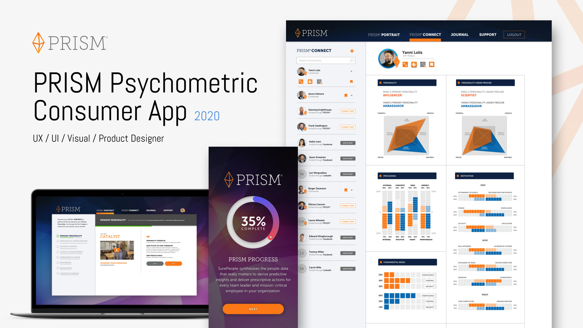
Personality data is hard UI
PRISM measures how people think, work, and relate — psychometric data that's genuinely complex and personally sensitive. The design problem: visualize it so a manager can act on it in thirty seconds, without flattening the nuance or making anyone feel reduced to a chart.
I led UX and visual design end to end: interaction models, information architecture, the data-visualization language, and the modular UI kit underneath it all.
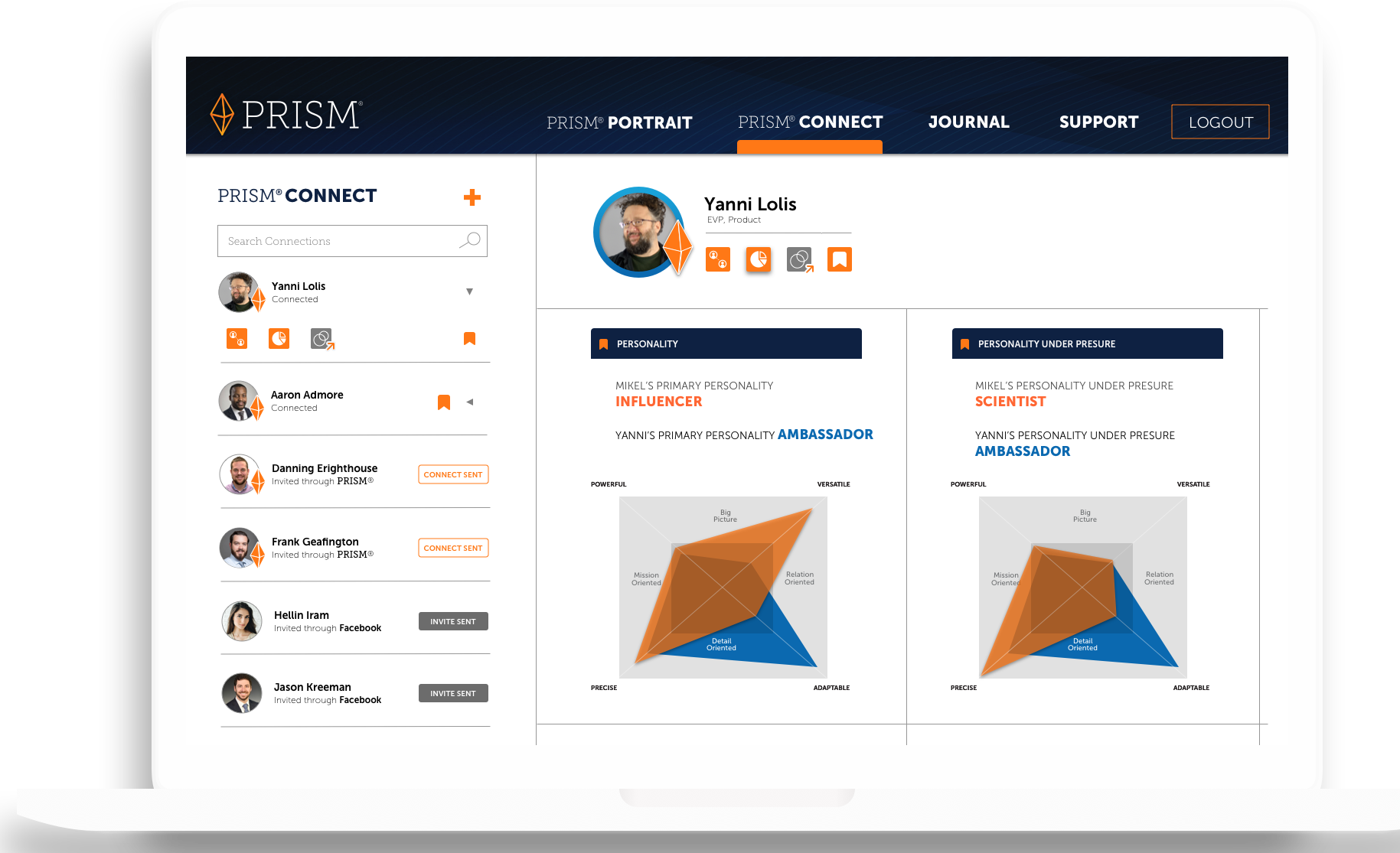
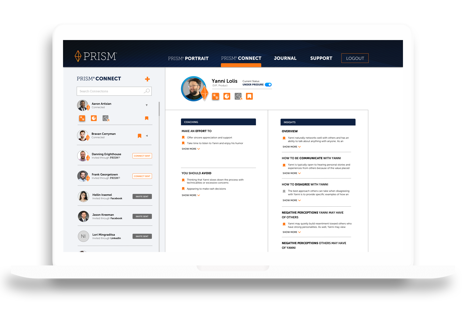
Visualization as vocabulary
The core of PRISM is its visual vocabulary for behavior: relationship maps, trait spectrums, and team composites — each a reusable pattern with defined anatomy, not a one-off chart. The same components scale from an individual profile to a team view.
Data visualization is a component problem. Defining chart anatomy like component anatomy — with states, sizes, and rules — is what makes a complex dataset feel coherent rather than overwhelming.
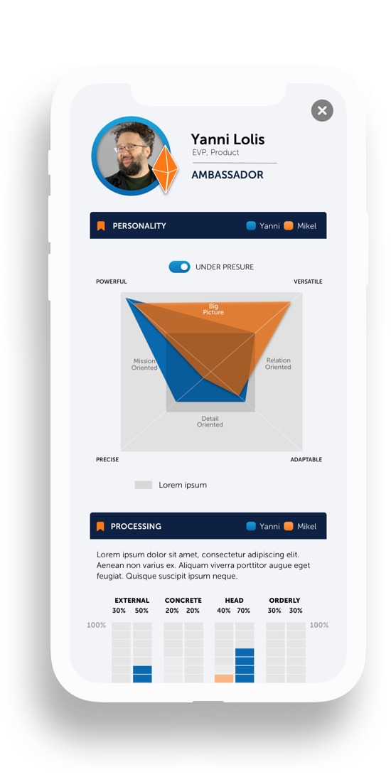
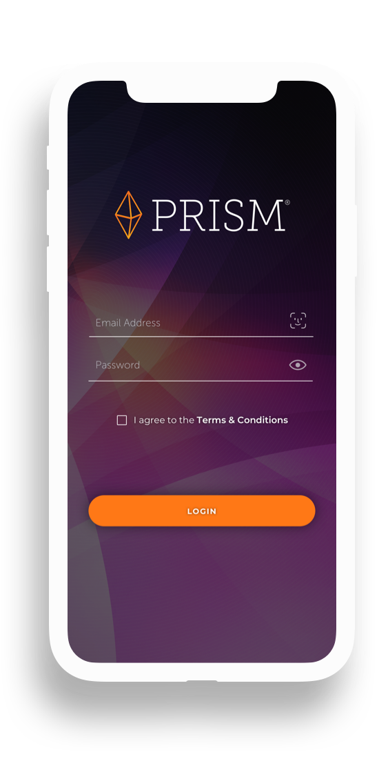
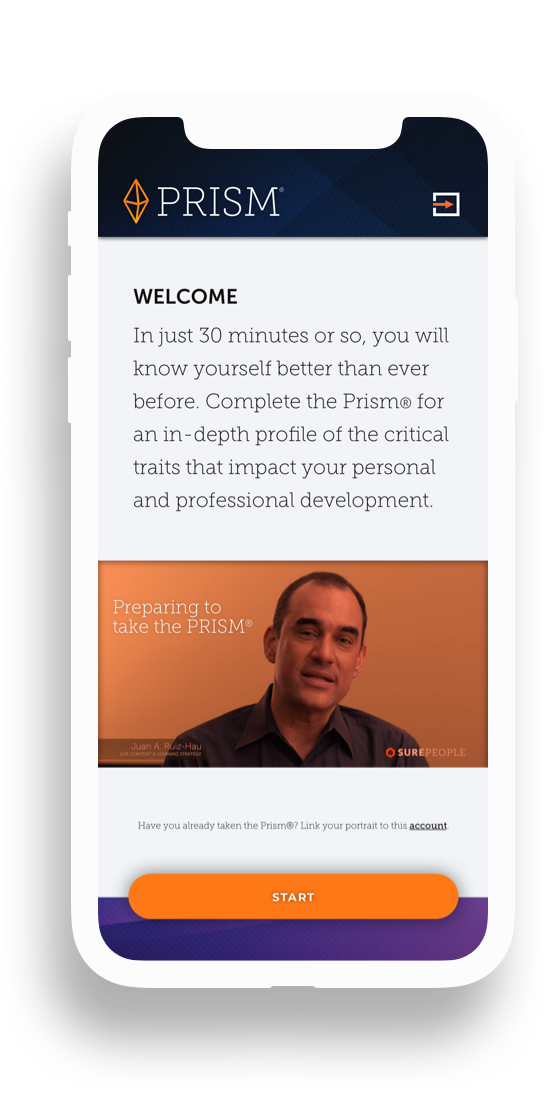
Desktop depth · Mobile moments
Desktop carries the analytical depth; mobile carries the human moments — onboarding, check-ins, and quick reads before a meeting. One modular kit, tokens shared, hierarchy re-tuned per context.
Sensitive data needs warm design. Psychometrics border on the personal; typography, color, and language did as much emotional work as the data itself.
2020
Even the densest behavioral data can feel navigable when the visualization language is designed as a system — anatomy, states, and hierarchy — instead of as individual charts.
PRISM proved that data visualization is a component problem. The same rigor that makes a button library coherent makes a psychometric dashboard coherent. Define the grammar, and the data speaks for itself.
Product imagery © SurePeople. Some details generalized per confidentiality.