Pathfinder
Design System
AVANT's first unified design system — token-driven, dual-themed, and built from zero.
Why this work existed
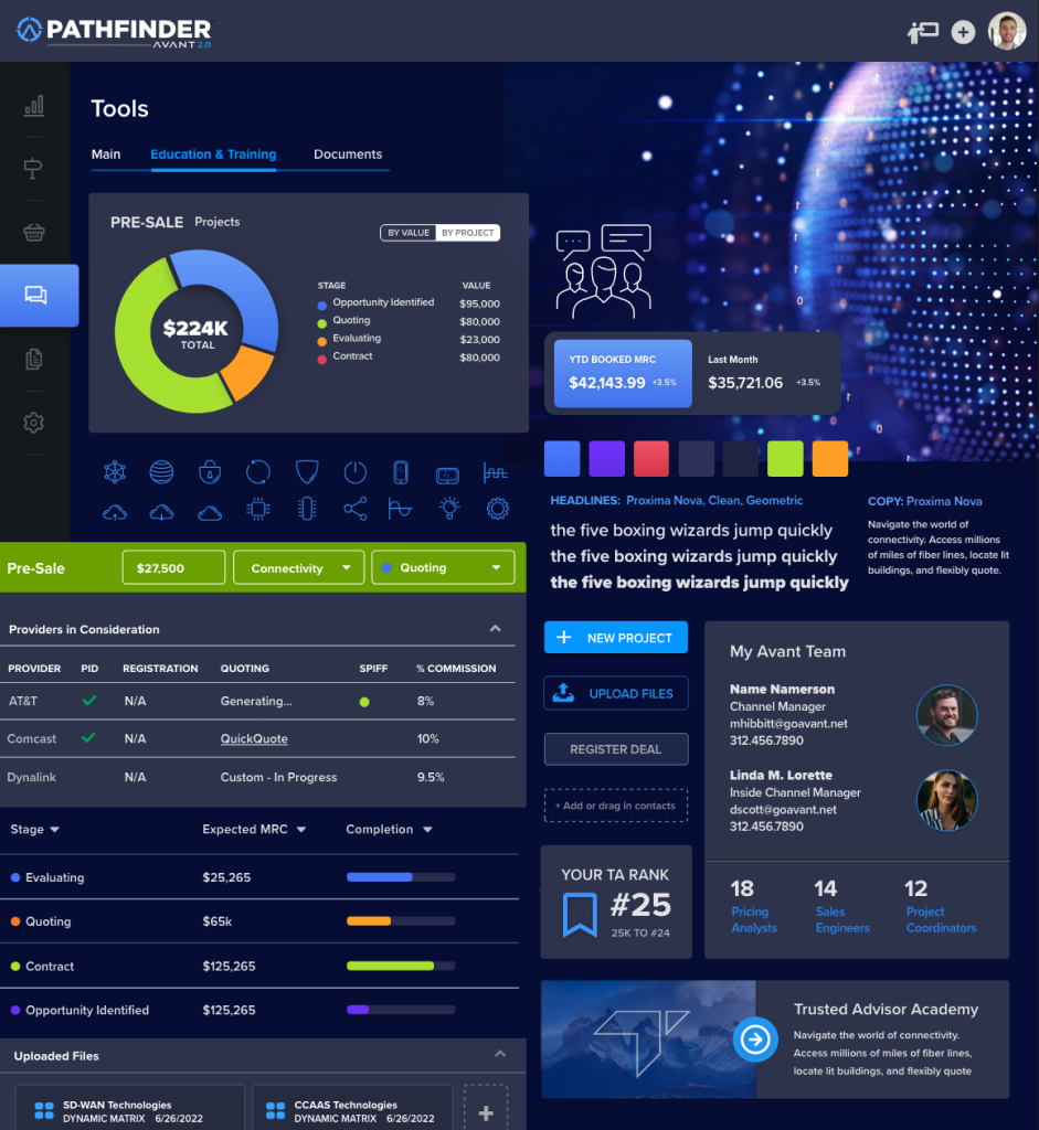
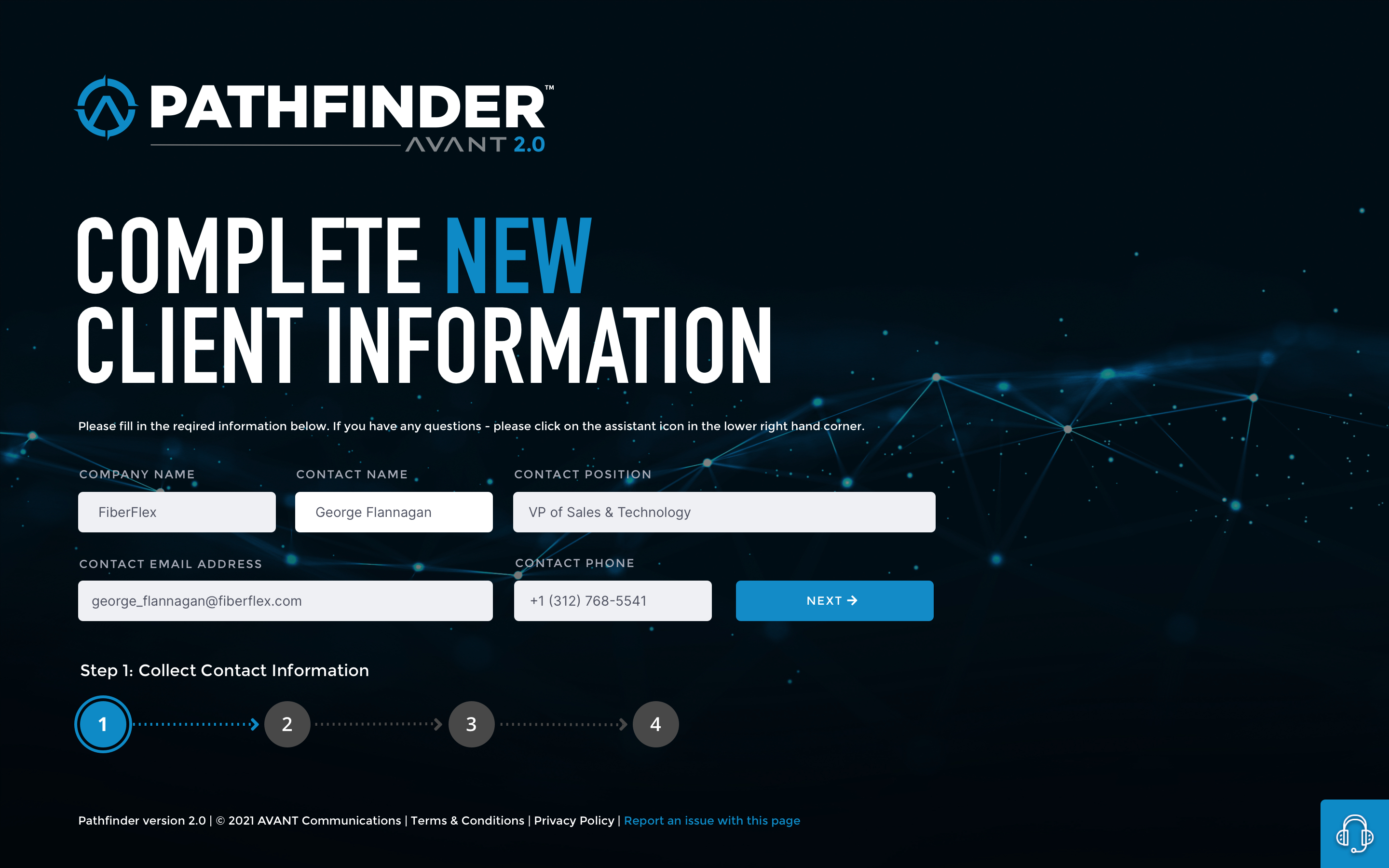
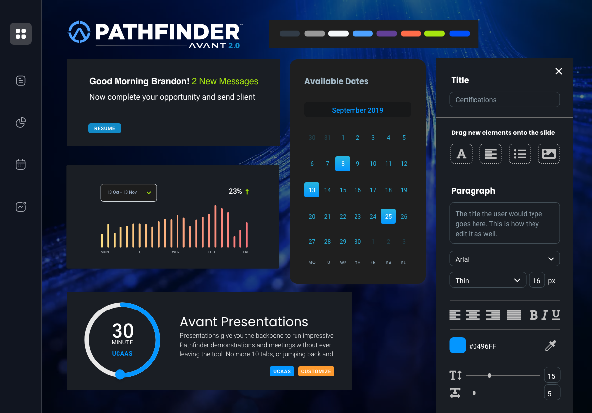
AVANT's Pathfinder platform — where technology advisors research, assess, quote, and close enterprise deals — had grown faster than its design language. Different components, different blues, different spacing decisions had layered across three years of separate teams. Marketing was producing assets at high volume with no shared foundations.
In a tool where advisors make six-figure technology recommendations in front of clients, visual fragmentation undermines trust in the data itself.
The brief I gave myself: one visual language, expressed as tokens and components, that product engineers and marketers could both ship from — without asking permission.
From zero — four pillars
I started with evidence. A full interface inventory — screenshotting every distinct screen state and marketing template, clustering by pattern. The audit made fragmentation measurable, not anecdotal. It gave the system a business case before a single component existed.
Credibility through clarity
Quote values, assessment results, and deal data get the strongest hierarchy — no exceptions.
Tokens before components
Decisions live in the token layer. Components consume intent, never raw values.
Designed or it isn't done
Loading, empty, error, and disabled states ship with v1. A pattern without failure modes is a prototype.
Adoption over mandate
Does this make the right way the easy way? That's the test for every governance decision.
Three-tier architecture: primitives (raw values) → semantic tokens (intent) → component tokens (where it applies). Engineers consume tokens, not hex codes. When the brand evolves, the system re-themes from the primitive layer — nothing downstream changes.
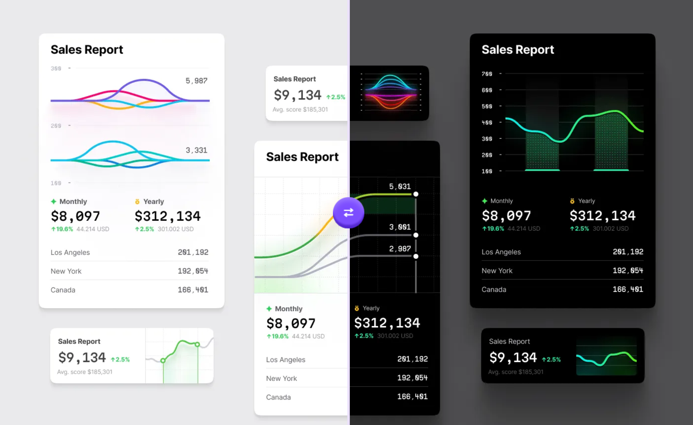
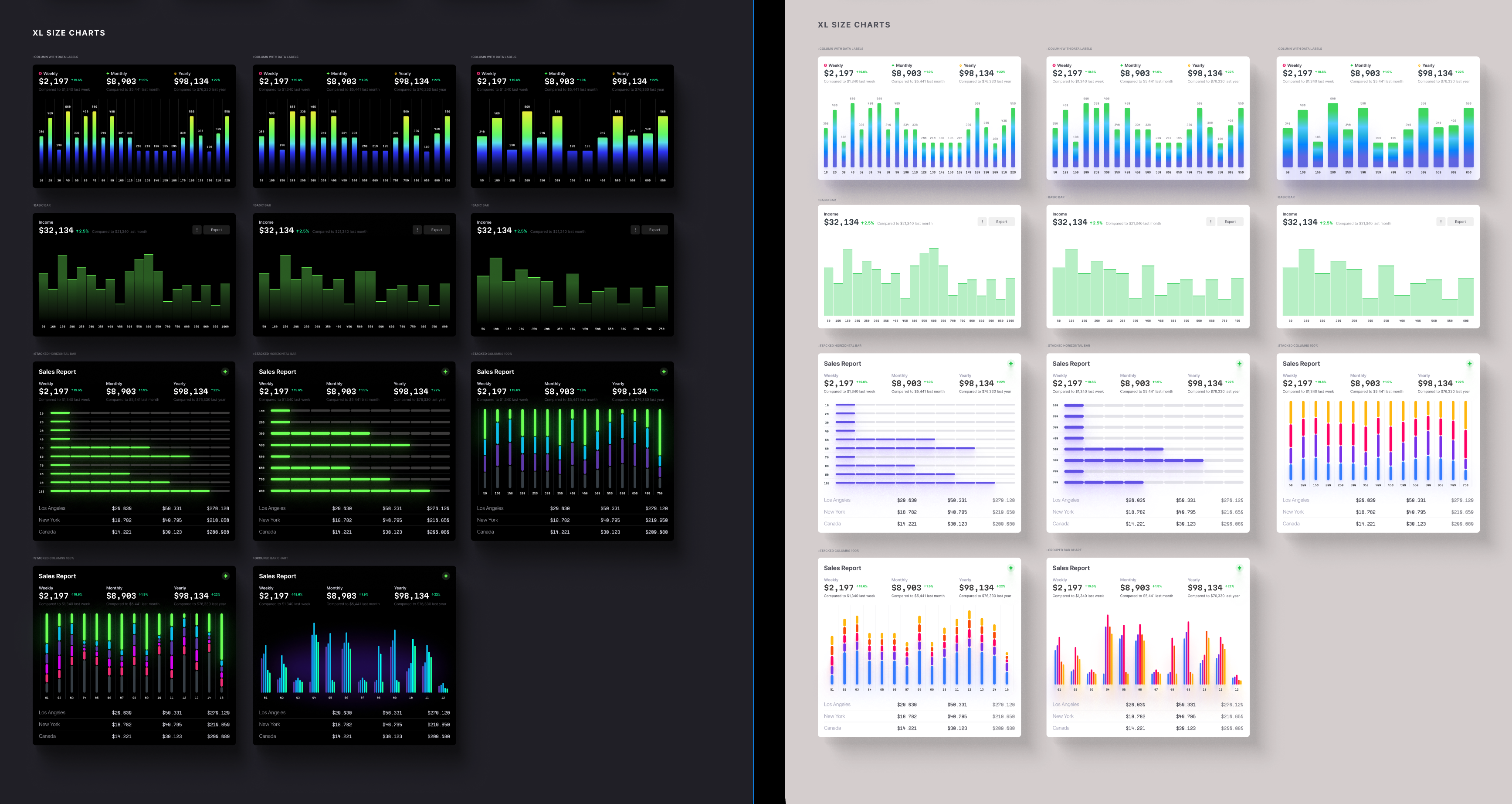
Theming was the proof. Pathfinder's product surfaces run dark — dense data reads better on dark ground. Marketing runs light. Both resolve from the same semantic layer: surface.raised and text.heading map to different primitives per theme. Nothing downstream changes.
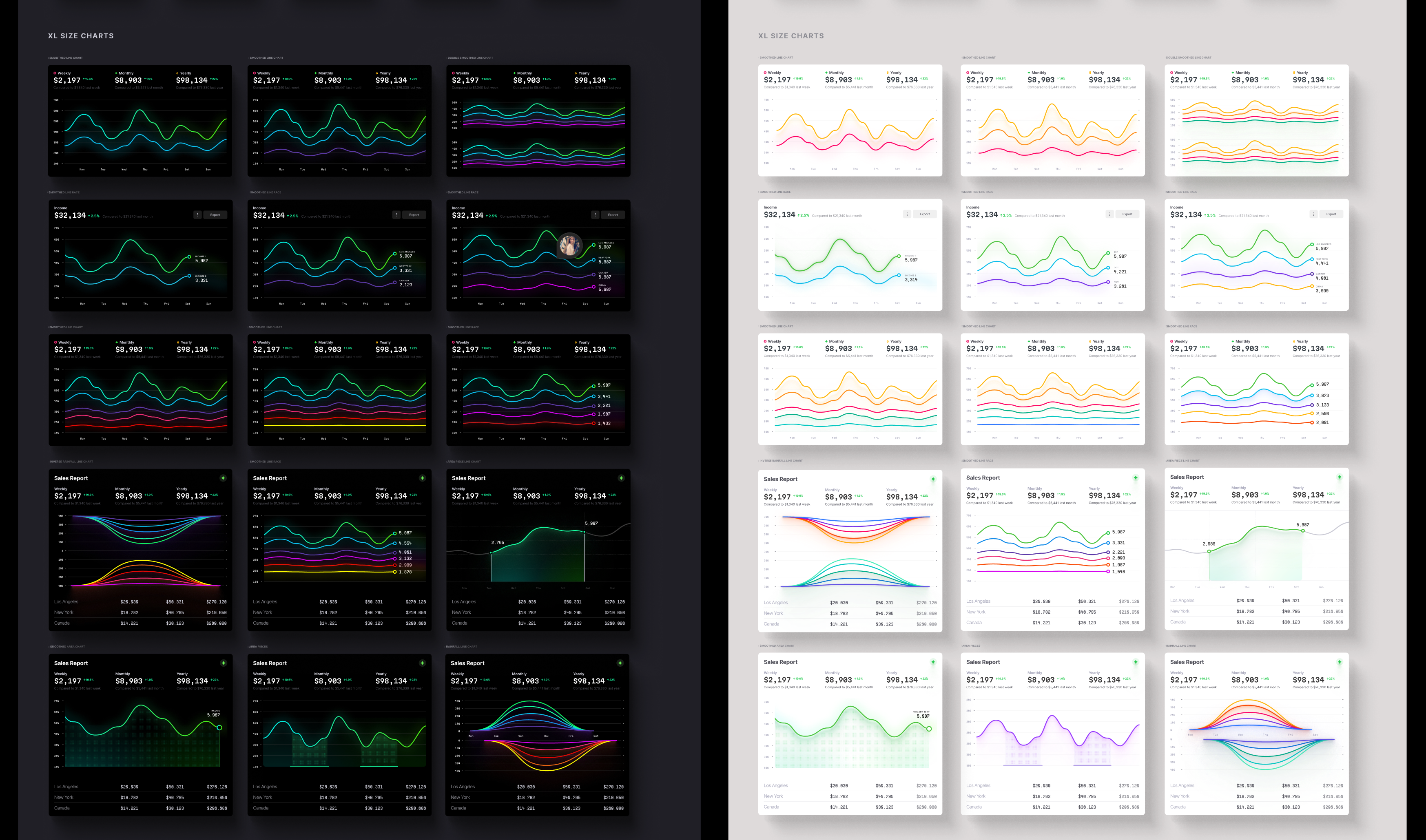
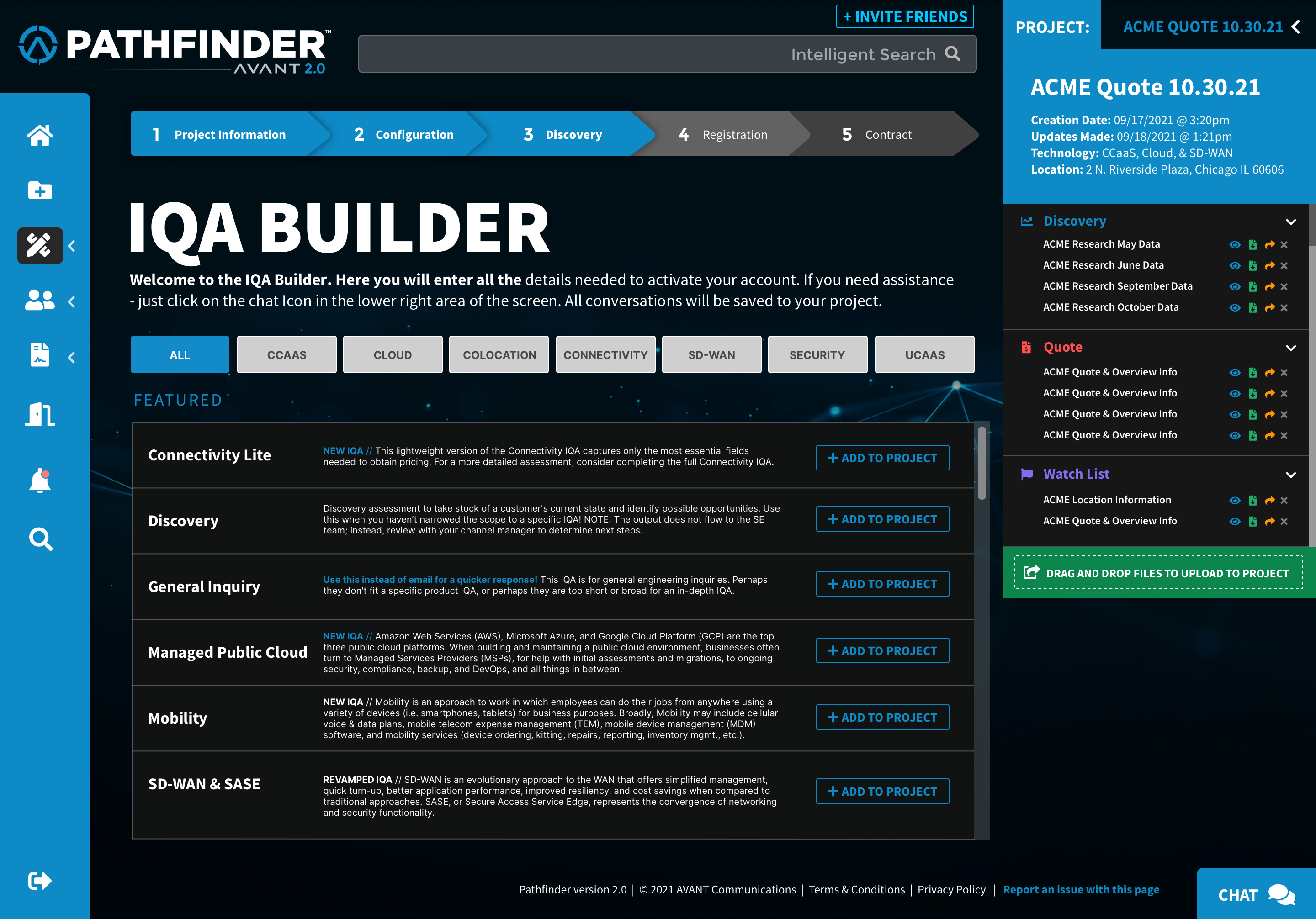
Every component shipped with documented anatomy, full state coverage, responsive behavior, and accessibility notes — built as Figma components with variables bound to the token tiers, mirrored by engineering as coded equivalents.
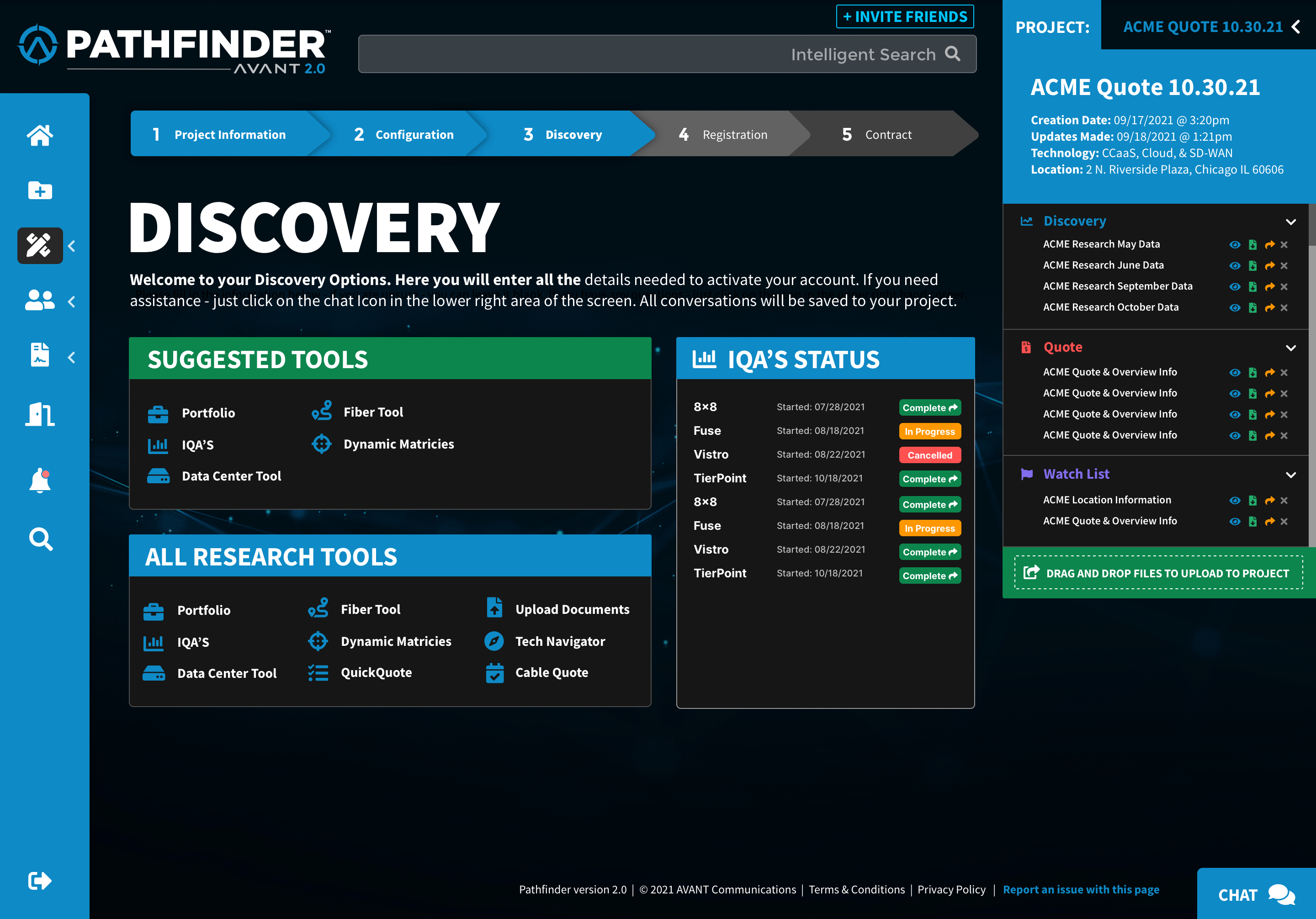
If a state isn't designed, it isn't done. Loading, error, empty, and disabled states were first-class. In a platform full of in-progress assessments and pending quotes, the in-between states are the product.
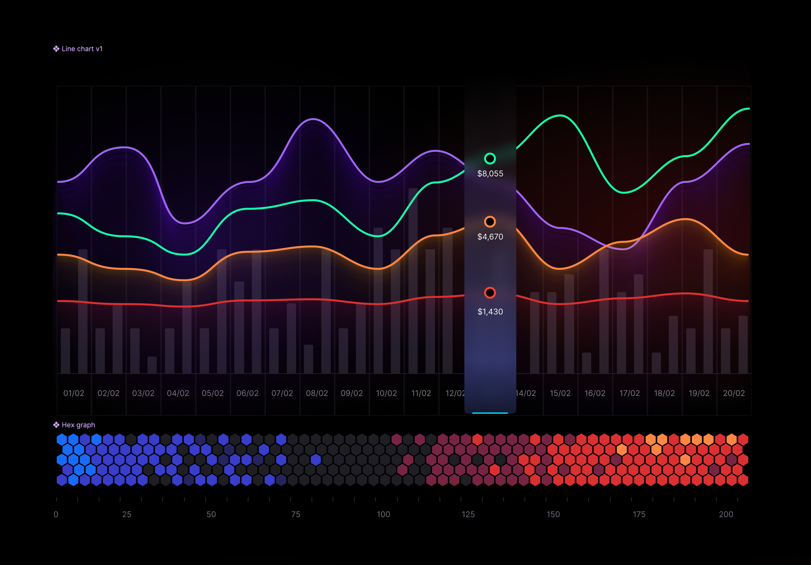
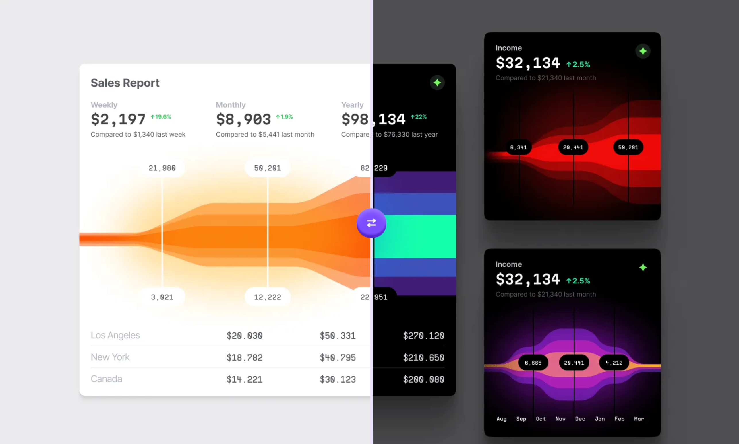
Pathfinder advisors present live revenue data to clients — making data visualization the product's credibility layer, not decoration. I designed a full chart library: line, bar, area, stream, radar, and hex — each token-driven, dual-themed, and documented to the same anatomy depth as every other component.
A system nobody uses is a wiki page. Every governance decision was tested against one question: does this make the right way the easy way?
- ModelFederated contribution — anyone could propose; a small core reviewed against documented criteria, so the system grew without rotting.
- DocsDocumentation as product — usage guidance, do/don't pairs, accessibility behavior. Written for the person shipping at 4pm Friday.
- CadenceOffice hours — a weekly forum where teams brought edge cases before they became forks.
- VersioningSemantic releases with migration notes — engineering upgraded on their own schedule, without surprise breakage.
- SignalsLibrary analytics as a health metric — a rising detach rate meant the component was wrong, not the user.
Design-to-code parity. The same token name travels from Figma variable to CSS custom property to React prop. Designers and engineers are provably talking about the same thing. Drift becomes visible — and fixable — immediately.
In production · 2021 – 2024
Audit & Foundations
Interface inventory, principles, token architecture, type and color foundations.
Components & Proof
Core component library with full state coverage; the project lifecycle as the proving ground.
Adoption & Governance
Federated contribution model, docs-as-product, office hours, semantic versioning.
Marketing Library
Token foundations extended to a self-serve marketing library; 350+ managers enabled.
2021 – 2024
The library became the default path for campaign work rather than a mandate. Brand reviews shifted from policing basics to discussing ideas. New surfaces shipped visually consistent on day one because the foundations were already in the file. Accessibility findings stopped recurring because the fixes lived in the tokens.
The system carried Pathfinder from 2.0 through 3.0 without a redesign — the architecture absorbed the evolution.
When the same feedback keeps arriving, the fix is upstream in the system, not in the individual deliverables. Pathfinder's system was that fix, applied twice — once for product, once for marketing.
Product imagery © AVANT Communications. Token names, diagrams, and some details are recreated or generalized for this case study per confidentiality.