FIBER
Design System
Blue Cross Blue Shield's first unified design system — token-driven, React-compatible foundations spanning consumer enrollment, member tools, and marketing.
Why FIBER existed
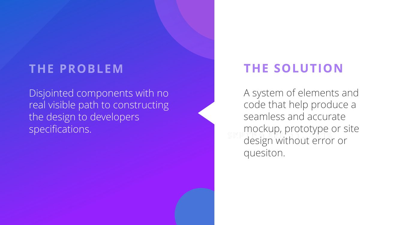
BCBS member and enrollment experiences were built by many hands across many vendors — and it showed. Components were disjointed, specifications lived nowhere, and every new flow reconstructed the basics. For a healthcare brand whose entire promise is trust, the seams were the problem.
FIBER's brief, straight from the guide I wrote: "disjointed components with no real visible path to constructing the design to developers' specifications" — solved by a system of elements and code that let teams produce mockups, prototypes, or sites without error or question.
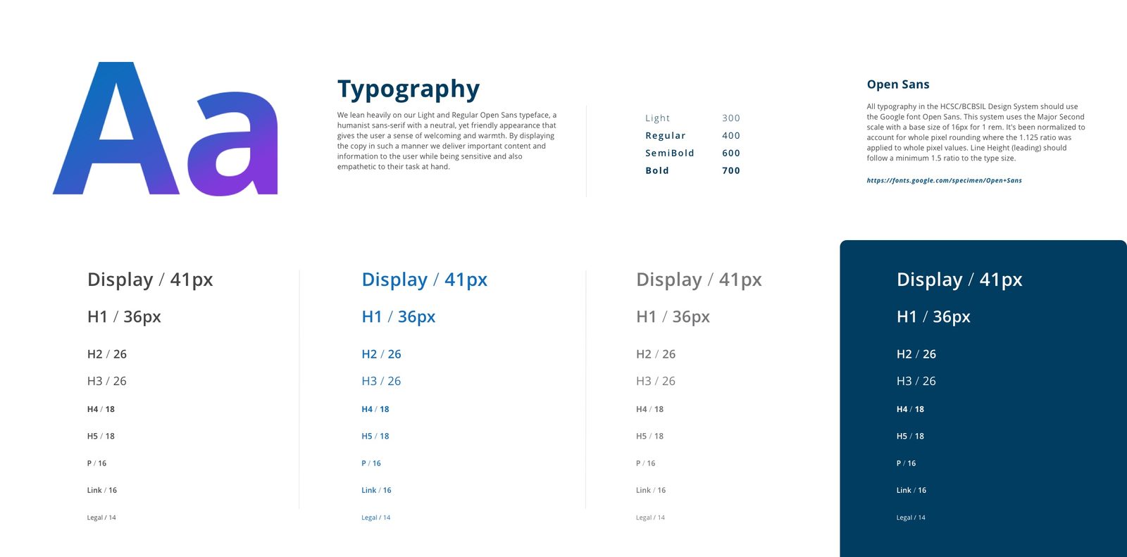
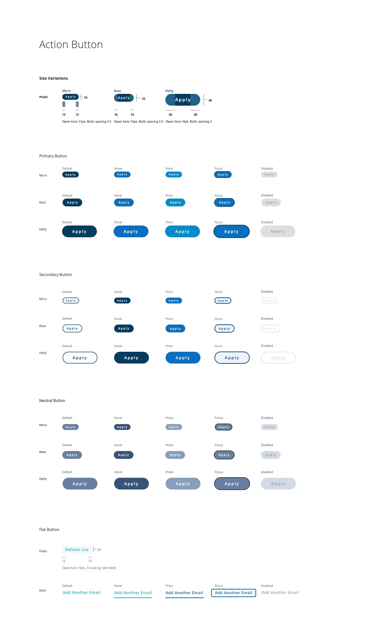
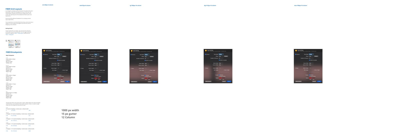
Color · Type · Icons · Grid
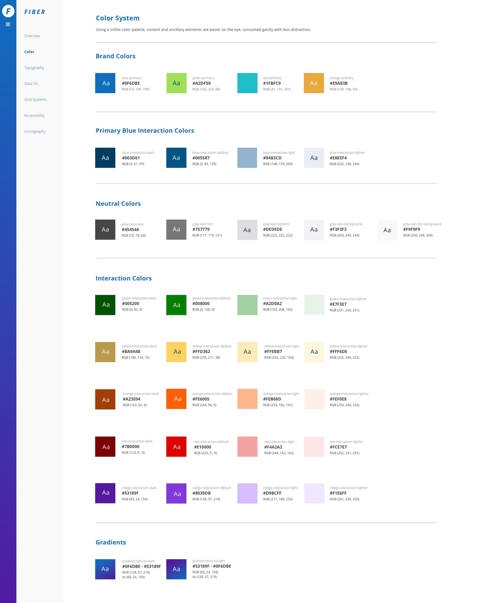
Foundations first: a color system with interaction and accessibility tiers, a typographic scale built for dense insurance content, an icon library, and grid layouts that worked from marketing pages to enrollment forms.
In healthcare, accessibility isn't an enhancement — it's the product working or not working. Contrast, focus, and plain language were baked into the foundation layer, not added after.
The system in production
FIBER proved itself on the highest-stakes consumer paths: plan selection and enrollment. Forms, payment, and confirmation patterns shipped as coded components with theming hooks — and the same foundations carried the outward-facing marketing surfaces.

2018 – 2019
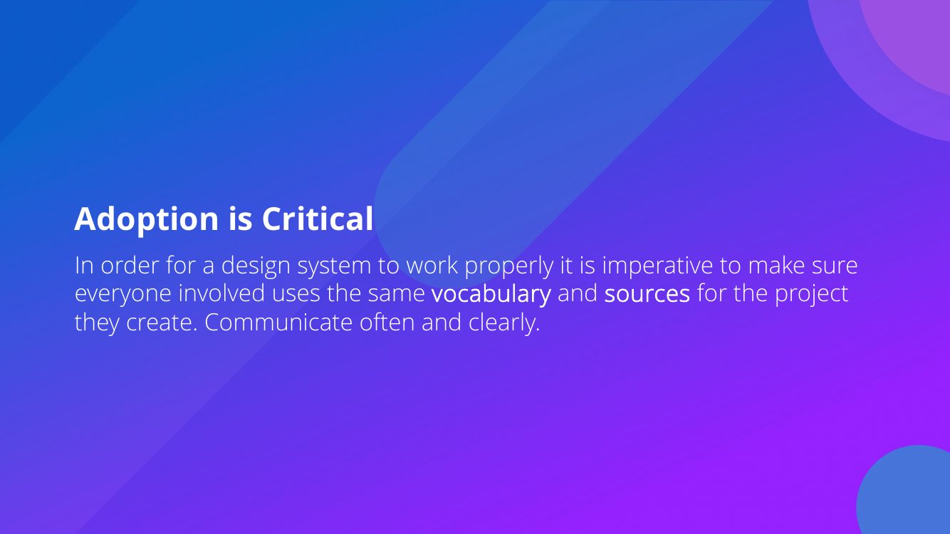
Teams stopped reconstructing the basics. Enrollment flows shipped visually consistent. The guide gave designers and developers one vocabulary — and the system accelerated concept-to-completion across BCBS's multi-product ecosystem.
Healthcare taught me accessibility discipline. Contrast, focus, and plain language aren't enhancements in insurance enrollment — they're the product working or not working. That's a standard I've carried into every system since.
Product imagery © Blue Cross Blue Shield. Some details generalized per confidentiality.