Case study · AVANT Communications

Pathfinder 2.0, audited against itself

The design system for AVANT's partner portal, run through the nine skills from the library, with the findings written down, including the five things that are wrong. Every count on this page came out of the shipped source.
Partner portal Dark, data-dense Sole systems designer v2.1.0
Open the live system ↗ Skip to the findings Read the case study
1,146
tokens declared in one stylesheet
5
findings, each traced to a file
4
things still unsourced
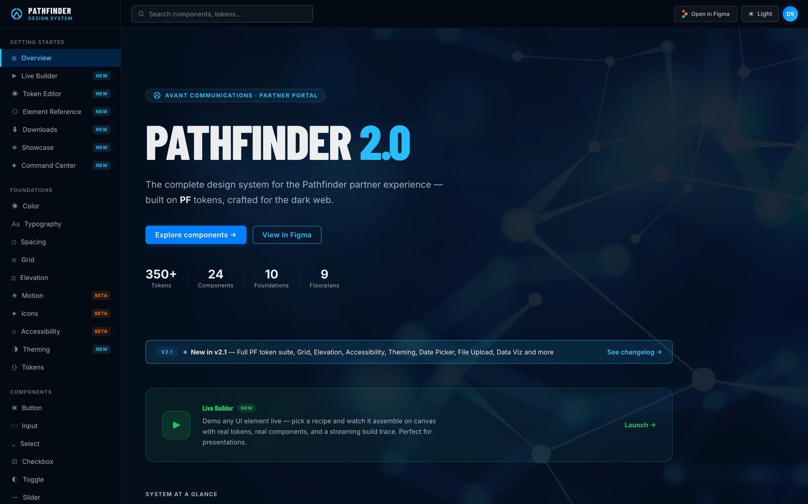
Pathfinder 2.0 overview page running in Figma Make: left navigation listing foundations and components, a hero reading Pathfinder 2.0, and counts for tokens, components, foundations and floorplans.
The system itself, running from code This page is the audit. The build is live in Figma Make, so every foundation, component and theme below can be clicked instead of taken on faith. Open it ↗
How to read the numbers
Counted, not recalled Token, class and page counts come from a grep of the exported build. None of them are estimates.
Quoted from the system Versions, release dates and the "350+ / 29 / 6 / 2" figures are Pathfinder's own published claims.
Two timelines The Avant tenure ran May 2021 to Aug 2024. Pathfinder 2.0 shipped June to August 2026. Results from one are not claimed for the other.
01 · Intake
brief-intake

What the system is for

AVANT's partners log into the portal to run their business: pipelines, orders, analytics, reporting. The screens are dense and dark, and there are a lot of them. Pathfinder's job is to keep them consistent enough that a partner doesn't relearn the interface on every page.

The second job is maintenance. One person owned the system, working with three engineers and a PM, so anything that needed that person in the room to stay correct was going to rot.

ConstraintsDark first, two themes. Token names had to sit alongside an enterprise convention already in the stack, which is why the alias layer looks like a platform API instead of something designed from scratch.
Success measureOne pattern per problem, and a theme you can change by editing tokens instead of components.
Non-goalsA rebrand. Components for screens nobody has designed. Component count as a scoreboard.

02 · Inventory
ds-inventory

Count what's actually there

This step is a grep, not a guess. The stylesheet declares 1,146 custom properties. Here is how they split.

Three tiers, one sheet1,146 total
51
Primitives. Small and closed. The healthiest part of the inventory.
243
Semantic layer. Documented as the one components use. They don't. See the first finding.
852
Alias layer. What components actually read. The real public API.
Depth of the second theme
75of 1,146 tokens overridden
The true size of "2 themes." The rest of the sheet still has dark values baked in.
Components you can import
18of 29 documented exist as classes
The other eleven are built inline in their own docs pages. Readable, not reusable.
Docs vs. system
69documentation-only classes
Against 18 component classes. The site explaining the system is bigger than the system.
Claims that don't match the code
350+ 1,146 tokens

The homepage says one, the stylesheet ships the other. Either is arguable depending on what you count. Publishing one and shipping the other isn't.

6 foundations, then 9

The stat row and the card forty pixels below it disagree. Nobody downstream can quote the system's own size.


03 · Audit
heuristic-audit

Five findings, each with a file behind it

The severities are a judgment call. The evidence isn't. Each one names where it lives, so the team can argue about the ranking without arguing about the facts.

Sev 1 Two semantic layers, and components use the wrong one

Tier 2 is documented as the layer components consume. They don't. Every component checked reads from the alias layer instead. So the 243 tokens a maintainer is told to edit aren't the ones painting the screen.

Cost: someone changes a token correctly, nothing happens, and they conclude the cascade is broken rather than bypassed.

Evidence: the tier-2 block in src/index.css against var(--pfContent_*) usage across src/pages.
Sev 1 The contrast table cites tokens this system doesn't define

Six ratios are listed against foreground names from the upstream enterprise system, not Pathfinder's own. The numbers may well be right. There's no way to check them from the page.

Cost: WCAG AA is the headline compliance claim, resting on a table that can't be traced to a token in this codebase.

Evidence: src/pages/foundations/Accessibility.tsx, lines 24–30.
Sev 2 29 documented, 18 you can use

The rest are built inline inside their own documentation pages. You can read them. You can't import them. Adoption quietly becomes copy-paste, which is how drift starts.

Evidence: 18 distinct .pf-* classes in src/index.css; 24 component pages on disk.
Sev 2 The light theme is 75 tokens deep

Seventy-five overrides out of 1,146 is a proof of concept. "2 themes" promises something the token layer can't deliver yet, and the breakage lands wherever nobody demoed in light mode.

Evidence: the [data-theme="light"] block in src/index.css.
Sev 3 The contrast ratios are typed in by hand

They sit in a page file as text, so they can't go stale and they can't fail. If a pair drops below AA, the badge stays green. Cheapest fix on this list.

Evidence: the contrastRows literal in Accessibility.tsx.
First fix

Name the alias layer as the public API and mark tier 2 internal. Then generate the contrast table from the tokens it describes.

That clears the first finding, turns the third into a scoped build task, and makes the accessibility claim something a release can fail on. The cleaner option, moving all 29 components onto tier 2, takes weeks and no partner would see a difference.


04 · Map
flow-map

How people actually move through it

Pathfinder ships a map of itself, and the part worth keeping is that the arrows are typed. If every line on a diagram means the same thing, it can't tell you what breaks when you change a token.

01 · EntryOverview: what's new, quick start
02 · FoundationsTokens, type, grid, motion, accessibility
03 · ComponentsForm controls, data display, navigation, overlays
04 · PatternsForms, data viz, search, empty, loading, error
05 · DashboardsExecutive, partner analytics, sales pipeline
06 · Resourcestokens.json, migration guides, changelog
Reading order Token dependency Composition Renders in Exports to

The map encodes a path: learn the cascade, use components, compose patterns, build dashboards. That is also the order in which a new engineer stops asking questions. That's the only adoption signal this artifact supports, and it's a soft one.


05 · Standards
copy-standards · a11y-spec

Type and contrast are part of the library

Five roles carry the whole portal, shown here in their own faces. The rule that does the most work is the last one: every number, ID and timestamp is monospaced, which is what makes a dense table scannable.

Display XL
56 · 800 · Barlow Condensed
Page heroes, one per screen
Display M
32 · 800 · Barlow Condensed
Dashboard and card headings
Body M, the default. Table cells, form values, most prose.
13 · 400 · Inter
Label · section headers, table heads, metadata keys
11 · 700 · Inter, uppercase
--pfContent_ForegroundColor · 2026-08-06 · $38,900
12 · 400 · JetBrains Mono
Every number, token, ID, timestamp
Contrast, as documented
Foreground on base16.1:1 · AAA
Label on base7.4:1 · AA
Highlight on base5.8:1 · AA
Positive on base4.7:1 · AA
Disabled on base3.1:1 · AA Large
Tick marks the 4.5:1 AA line. Quoted from the system as published. Findings two and five apply, so read these as documented rather than measured.
Rules to add before the next release
  • Status never travels by color alone. Every semantic fill gets a label or an icon.
  • An error says what happened and what to do next. "Something went wrong" is a bug, not a string.
  • Numeric columns are monospaced, right-aligned, one unit per column.
  • Contrast pairs are generated from their tokens and block the release when they fail.
  • Focus stays visible at 2px in both themes, checked in light mode too.

06 · Critique
critique

The three best arguments against this work

"1,146 tokens for 29 components means the system is serving its own documentation."
Fair. That ratio comes from mirroring an enterprise token API rather than deriving one from the product. It bought interoperability and cost legibility. The 51 primitives underneath are defensible, since they are what make the other 1,095 mechanical. Publishing all three tiers as if they were equally public is not.
"Six releases in ten weeks is velocity, not adoption."
Right, and the changelog can't tell the two apart. It shows the system was maintained, not that anyone used it. That's why section 08 is a measurement plan instead of a results section.
"A system with one contributor is a single point of failure."
True here and true at Avant. Decisions were documented, deprecations dated, and tokens exported for Figma, but none of that erases the risk. The findings above are what one author's blind spots look like when someone finally audits them. Better said in week one than found by a client at handoff.

07 · Governance
handoff-spec

Six releases, dated, with the breakage written down

The strongest governance evidence in Pathfinder is its release record. It's versioned, dated, and specific about what changed. This part transfers to a client system unchanged.

v2.1.0Aug 6, 2026The full token suite

Semantic, field, shell, chart, avatar and indication colors land together. Nav grows to five sections and 29 items.

v2.0.5Jul 22, 2026Component expansion

Badge, notification, avatar, tabs, and an eight-state input playground. Two fixes logged against named tokens rather than "polish".

v2.0.4Jul 10, 2026Showcase mode

Six preset layouts assembled from the library, for showing a stakeholder that the parts fit together.

v2.0.3Jun 28, 2026Interactive foundations

Motion becomes tokens: durations and easing curves. Spacing renamed to match the platform convention.

v2.0.2Jun 14, 2026Dark theme refinements

Disabled text brought up to AA Large, focus width unified at 2px, one token deprecated with its replacement named.

v2.0.0Jun 1, 2026Initial release

Four foundations, the core components, and theme switching by data attribute from the start rather than retrofitted.


08 · Measurement
the honest ending

What to instrument, and the rule set before the first reading

A case study usually ends with a percentage here. There isn't one for Pathfinder that can be sourced, so it ends with the part that transfers instead: the instrument, and what is agreed about the result before anyone sees it. Agreeing afterward is how a metric ends up decorating a decision that was already made.

MetricInstrumentRule, agreed in advance
Token coverageLint for raw hex and px in component sourceA new literal fails the build. Existing ones go on a dated list that only shrinks.
Theme parityTokens the light theme overrides, against the totalPublished as a number. Below the agreed floor, "2 themes" comes off the homepage.
ContrastRatios computed from tokens at build time, both themesA pair under its target blocks the release.
AdoptionImports of library components per release, by repoFlat while releases keep shipping means the library is being read, not used. That stops feature work until it's understood.
Patterns per problemA quarterly re-run of the inventory in section 02Two implementations of one problem becomes a ticket with an owner and a date.
Support contactsPartner tickets tagged with the pattern vocabularyWhatever generates the most contact is next. It's the cheapest research the business already pays for.

09 · Gaps
unsourced

Four open questions

01How much of the portal ran on system components by 2024It can't be evidenced, so no share is claimed. An import census per repo would settle it.
02Whether any of this improved a partner outcomeIt was never instrumented in a citable form. Section 08 is what should have been built instead.
03The real component count29 documented, 24 have pages, 18 exist as classes. Three numbers, three meanings, one of them published.
04Whether Figma and the coded tokens agreeThe system exports a tokens.json, but nothing checks the two directions against each other. Until something does, parity is an intention.

What transfers

Count it, cite it, say what you don't know

Dense B2B software rewards the same few habits. Inventory before you propose anything. Attach a file to every finding so the argument stays about the work. End on an instrument rather than a number you'd have to defend. The skill library is that method written down, and this page is what happens when it is pointed at its author's own system.

Read the skill library See the process deck Open Pathfinder live ↗