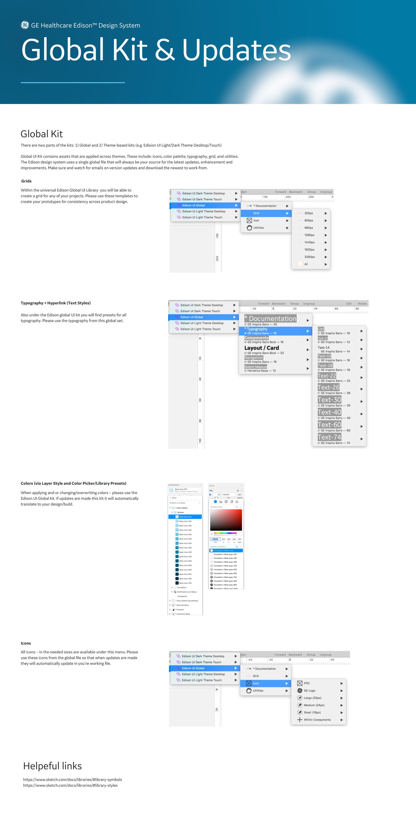
Edison: one system for 40+ clinical products
The design system that unifies GE Healthcare's imaging, monitoring and clinical workflow software. I contributed the component libraries, reusable modules and the documentation that let dozens of product teams adopt it without translation loss.
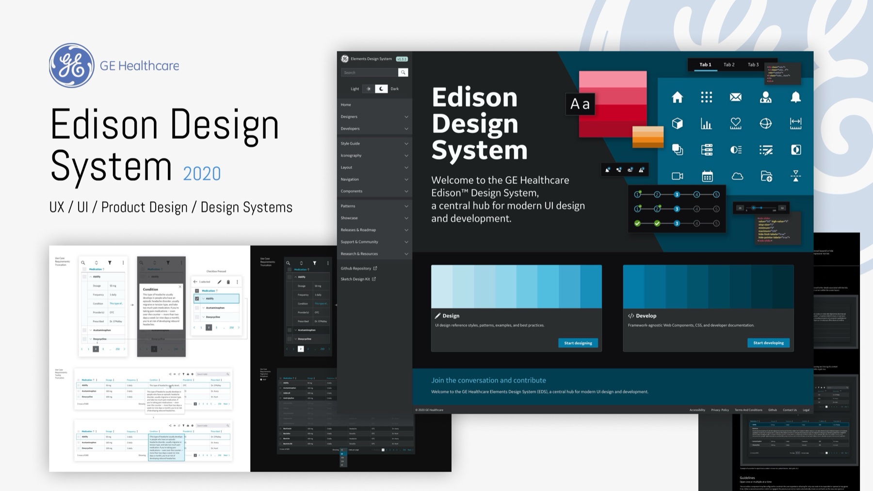
Software used in life-and-death contexts, built by teams across the globe
Edison is modular, accessible UI rigorous enough for regulated environments and flexible enough for everything from radiology workstations to touch-screen devices.
I joined as a senior design systems contributor. The system was there before me and is still running after my contract ended, which is how a system should work. My focus was the component libraries, theming, and the documentation that let product teams adopt the system on their own.
The hardest problems were about alignment. Dozens of teams had their own habits, and the documentation had to be written so those teams would actually use it.
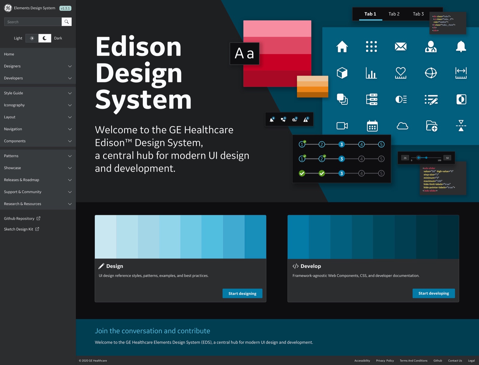
Light, dark, desktop, touch. One semantic layer.
Clinical software runs in a radiology reading room at 2 am and on a bright surgical floor the same day. Edison ships light and dark themes across desktop and touch, resolved from shared foundations so components never fork.
Four targets, one source
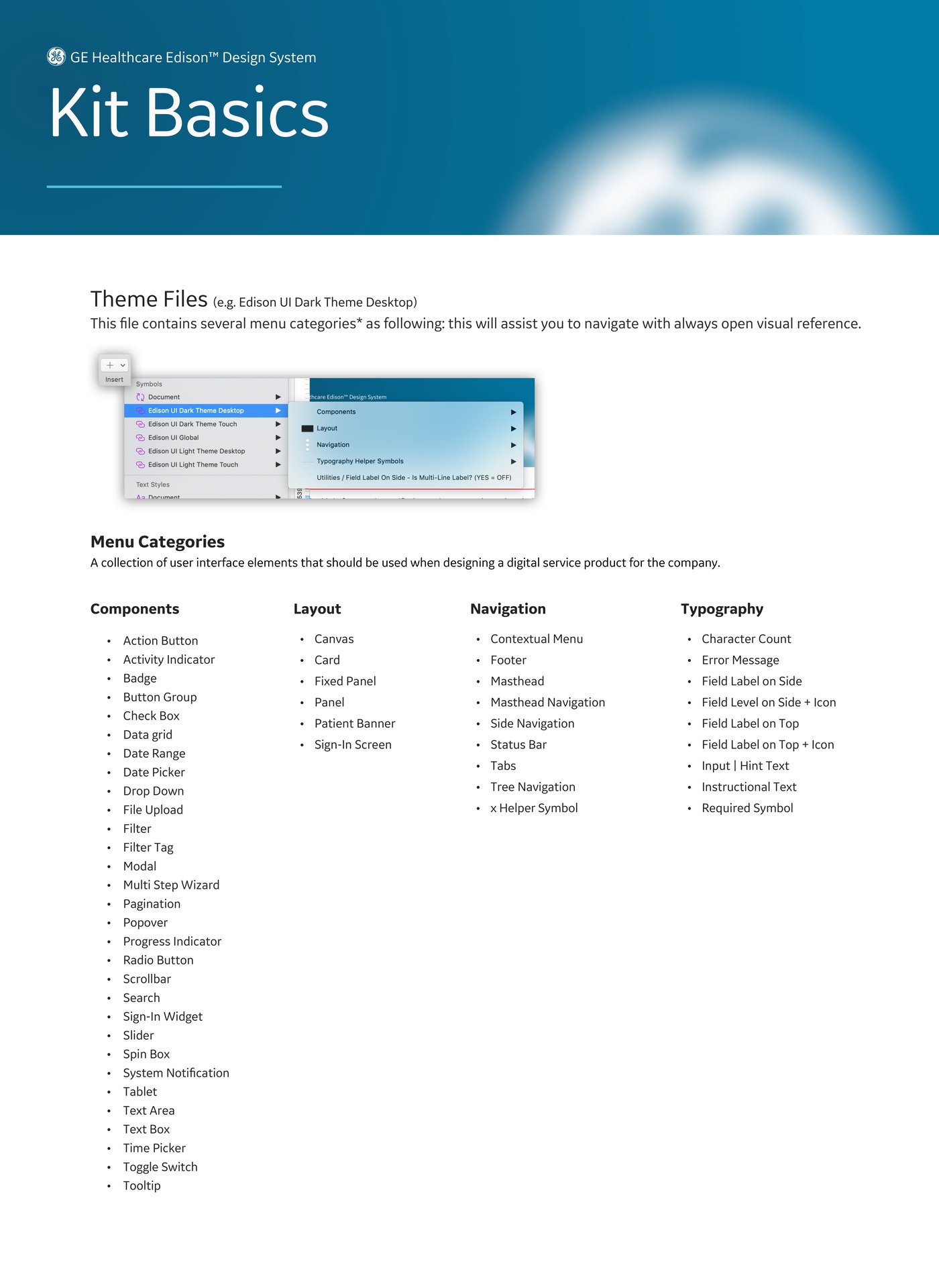
Edison UI Dark Theme Desktop, Dark Theme Touch, Light Theme Desktop, Light Theme Touch, all drawn from one global library.
Parity by construction
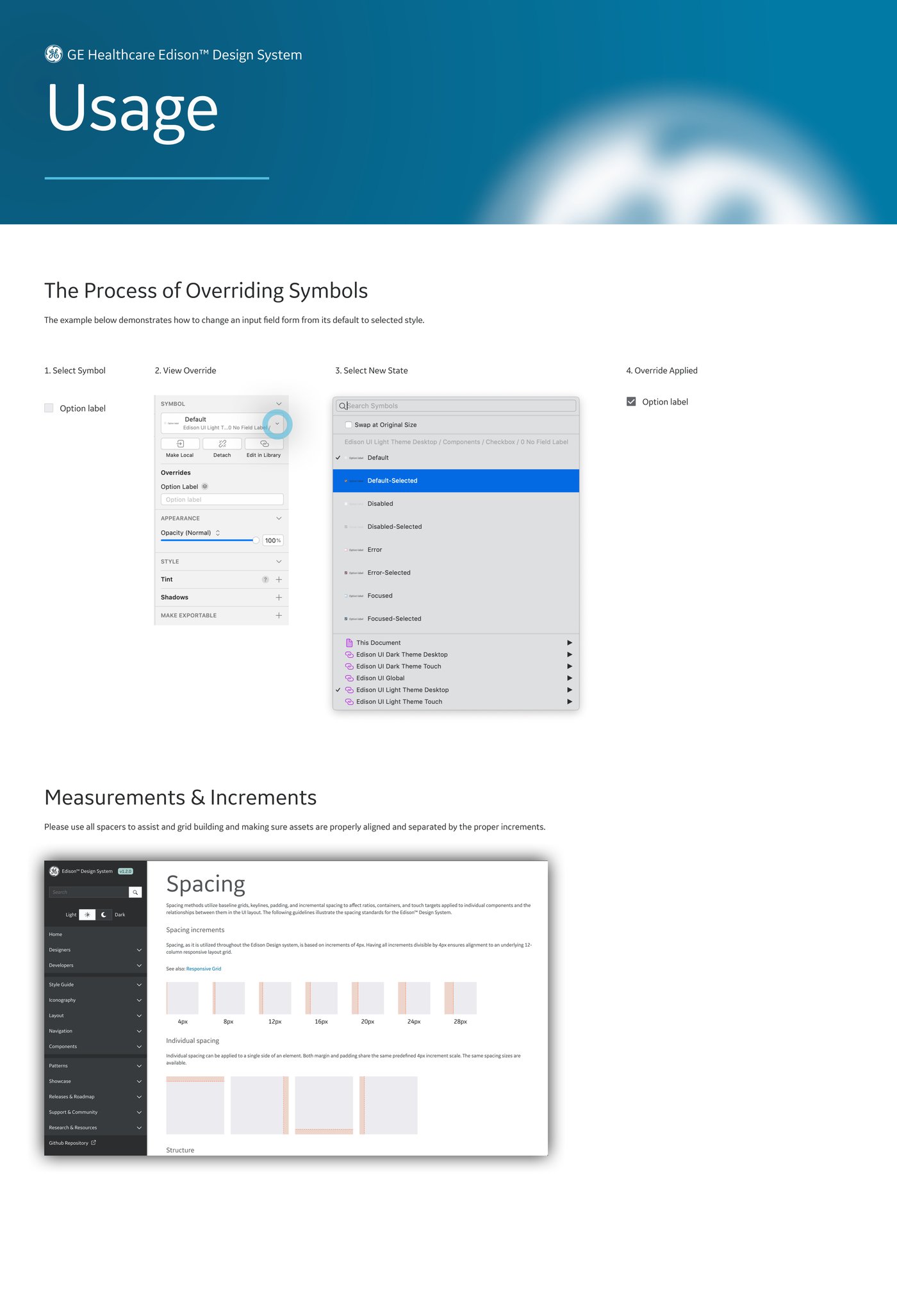
One component set, re-themed. A change to a foundation reaches every theme at once.
Clinical palettes
Color tiers for notification and status that hold contrast in both themes, because legibility here is a safety requirement.
Device scale
Touch surfaces at device scale, with hit areas and spacing resolved in the library rather than per product.
Libraries, states, documentation
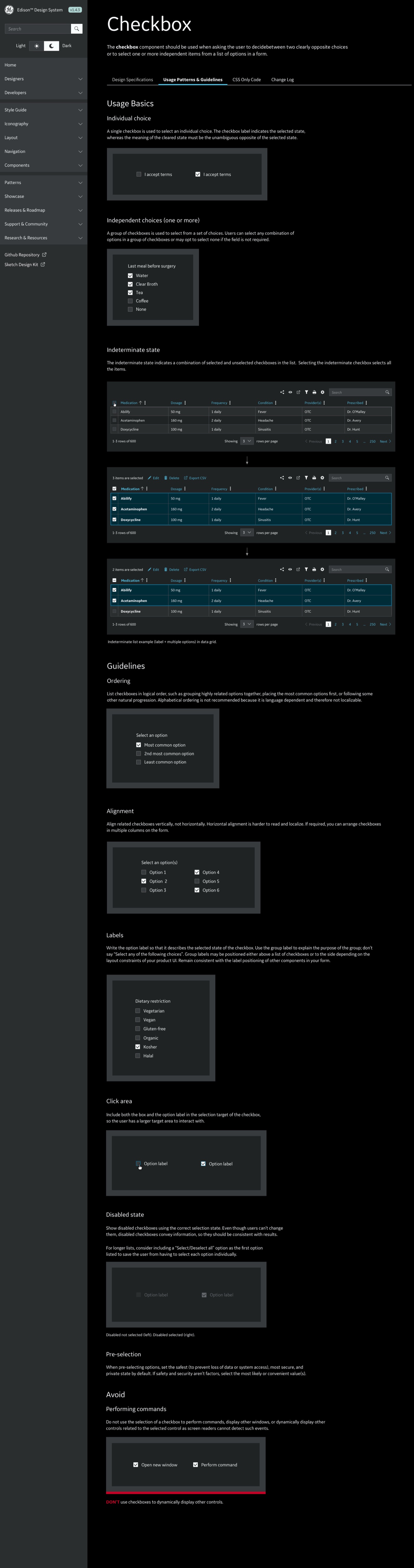
My hands-on work centered on component libraries and UX documentation: notification patterns, steppers and progress, form controls and data grids, and the icon library, each with full state coverage and accessibility behavior documented for regulated review.
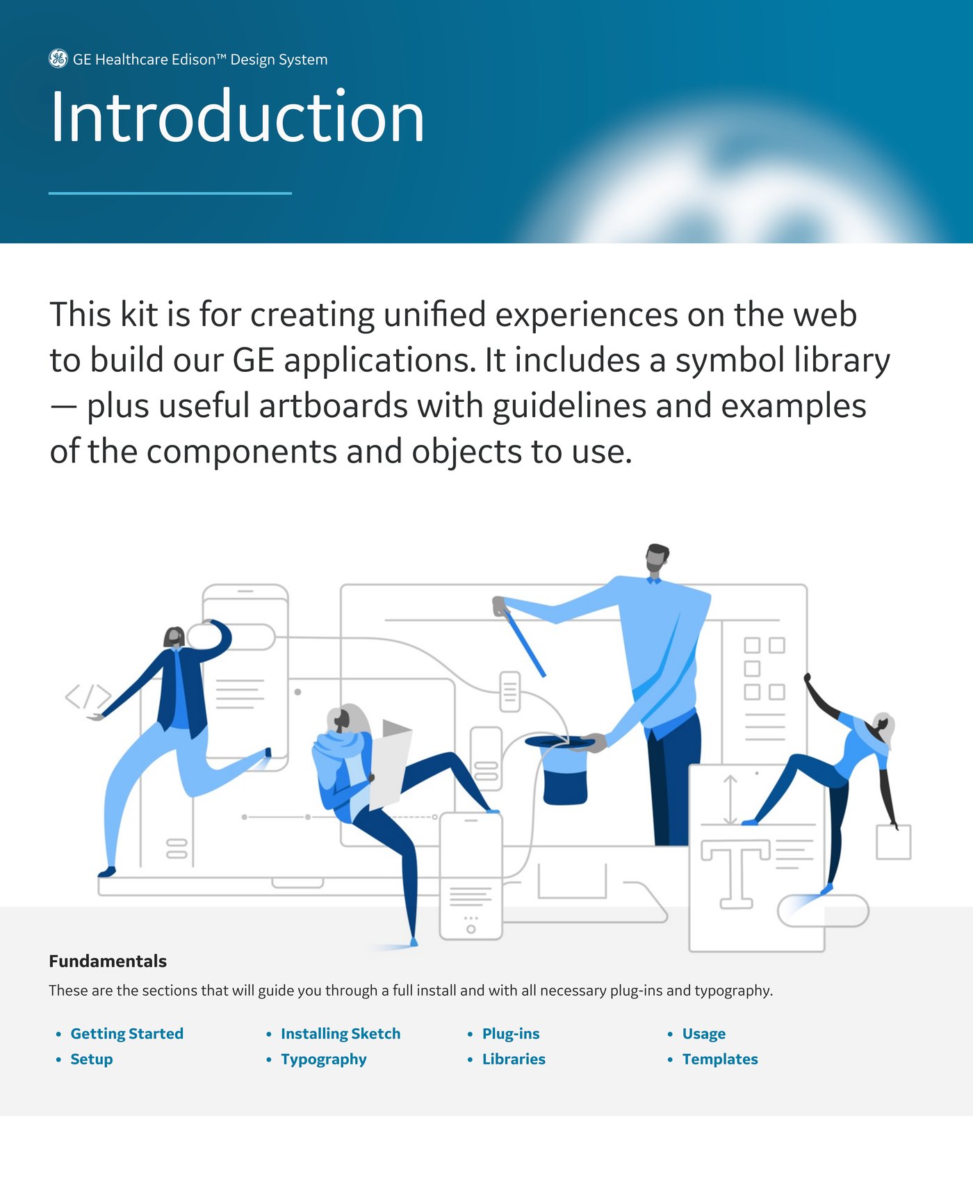
When WCAG is a legal requirement, accessibility has to live inside the component
Every component carried its states, its keyboard behavior and its error prevention rules in the documentation, and accessibility and compliance specialists reviewed them. I have built components that way ever since.
Then I took the libraries to the clinical product teams directly: design reviews, usage guidance, pattern-level support, one team at a time. Adoption held across the organization.
Most of the work was getting forty teams to use it
The team's work earned the 2020 Red Dot award for interface design, with Fast Company Innovation by Design and dmi:DVA recognition the same year. I contributed the libraries, modules and documentation behind that work, alongside designers, engineers and accessibility specialists across GE Healthcare. The awards were the team's.
Edison is still my reference for how governance works at that scale, and for the lesson I bring to every client system: a system is worth what teams adopt.